New Offer! Become a Certified Fabric Data Engineer
Check your eligibility for this 50% exam voucher offer and join us for free live learning sessions to get prepared for Exam DP-700.
Get Started- Power BI forums
- Get Help with Power BI
- Desktop
- Service
- Report Server
- Power Query
- Mobile Apps
- Developer
- DAX Commands and Tips
- Custom Visuals Development Discussion
- Health and Life Sciences
- Power BI Spanish forums
- Translated Spanish Desktop
- Training and Consulting
- Instructor Led Training
- Dashboard in a Day for Women, by Women
- Galleries
- Community Connections & How-To Videos
- COVID-19 Data Stories Gallery
- Themes Gallery
- Data Stories Gallery
- R Script Showcase
- Webinars and Video Gallery
- Quick Measures Gallery
- 2021 MSBizAppsSummit Gallery
- 2020 MSBizAppsSummit Gallery
- 2019 MSBizAppsSummit Gallery
- Events
- Ideas
- Custom Visuals Ideas
- Issues
- Issues
- Events
- Upcoming Events
Don't miss out! 2025 Microsoft Fabric Community Conference, March 31 - April 2, Las Vegas, Nevada. Use code MSCUST for a $150 discount. Prices go up February 11th. Register now.
- Power BI forums
- Forums
- Get Help with Power BI
- Developer
- Re: Clustered bar chart with bubbles for each bar ...
- Subscribe to RSS Feed
- Mark Topic as New
- Mark Topic as Read
- Float this Topic for Current User
- Bookmark
- Subscribe
- Printer Friendly Page
- Mark as New
- Bookmark
- Subscribe
- Mute
- Subscribe to RSS Feed
- Permalink
- Report Inappropriate Content
Clustered bar chart with bubbles for each bar on a 2nd y-axis
Hello and thank you for giving this a look.
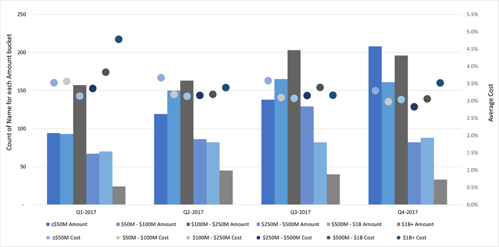
I am trying to re-create the chart I made in Excel below in PowerBI, so far with little success.
Sample pbix file is below. I need to display count of 'Name' for each 'Amount' bucket in the clustered columns on first y-axis. The second y-axis should display average 'Cost' for each bucket in the bubbles/dots. X-axis contains 'Date 1'.
https://1drv.ms/u/s!AgeVqxpmuh7I9QSR6U7kLYAmLwga?e=4jaIjX
Any help will be greatly appreciated.
Cheers!
YevD
Solved! Go to Solution.
- Mark as New
- Bookmark
- Subscribe
- Mute
- Subscribe to RSS Feed
- Permalink
- Report Inappropriate Content
Hi @YevD ,
I can't find the proper visual which same with the one in report page "Stacked chart w XY bubbles". I reupdate your sample pbix file(see the attachment), please check whether that can be used for a workaround... And currently we CAN NOT apply multiple fields on Legend Fields, you can raise a new idea and add your comments there to make this feature coming sooner.
Best Regards
If this post helps, then please consider Accept it as the solution to help the other members find it more quickly.
- Mark as New
- Bookmark
- Subscribe
- Mute
- Subscribe to RSS Feed
- Permalink
- Report Inappropriate Content
@v-yiruan-msftsorry for taking a while to get back to this. I really appreciate your help!
I actully found an article descirbing how to do this with R.
https://datakuity.com/2020/12/03/r-power-bi-add-target-marker-to-each-column-in-a-grouped-bar-chart/
- Mark as New
- Bookmark
- Subscribe
- Mute
- Subscribe to RSS Feed
- Permalink
- Report Inappropriate Content
Hi @YevD ,
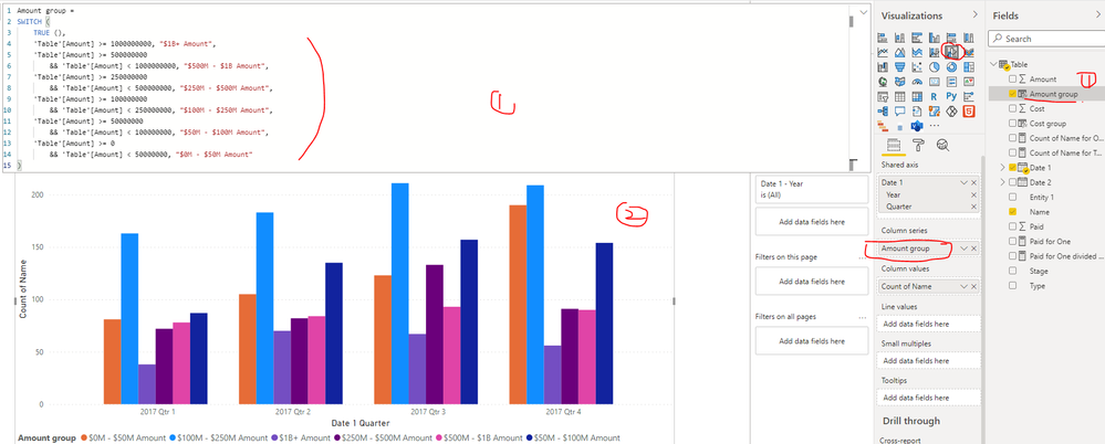
I updated your sample pbix file, please check whether that is what you want, please find the details in the attachment.
Best Regards
If this post helps, then please consider Accept it as the solution to help the other members find it more quickly.
- Mark as New
- Bookmark
- Subscribe
- Mute
- Subscribe to RSS Feed
- Permalink
- Report Inappropriate Content
Hi @v-yiruan-msft ,
Thank you so much for this. The grouping of amount is eaxactly what I was looking for. Do you know if there is a way to display average of 'Cost' for each bar?
Also, is there a way I can sort the groups in ascending order?
- Mark as New
- Bookmark
- Subscribe
- Mute
- Subscribe to RSS Feed
- Permalink
- Report Inappropriate Content
Hi @YevD ,
I can't find the proper visual which same with the one in report page "Stacked chart w XY bubbles". I reupdate your sample pbix file(see the attachment), please check whether that can be used for a workaround... And currently we CAN NOT apply multiple fields on Legend Fields, you can raise a new idea and add your comments there to make this feature coming sooner.
Best Regards
If this post helps, then please consider Accept it as the solution to help the other members find it more quickly.
- Mark as New
- Bookmark
- Subscribe
- Mute
- Subscribe to RSS Feed
- Permalink
- Report Inappropriate Content
@v-yiruan-msftsorry for taking a while to get back to this. I really appreciate your help!
I actully found an article descirbing how to do this with R.
https://datakuity.com/2020/12/03/r-power-bi-add-target-marker-to-each-column-in-a-grouped-bar-chart/
- Mark as New
- Bookmark
- Subscribe
- Mute
- Subscribe to RSS Feed
- Permalink
- Report Inappropriate Content
Did the article resolve the problem ?
Helpful resources

Join us at the Microsoft Fabric Community Conference
March 31 - April 2, 2025, in Las Vegas, Nevada. Use code MSCUST for a $150 discount! Prices go up Feb. 11th.

Power BI Monthly Update - January 2025
Check out the January 2025 Power BI update to learn about new features in Reporting, Modeling, and Data Connectivity.


