Fabric Data Days starts November 4th!
Advance your Data & AI career with 50 days of live learning, dataviz contests, hands-on challenges, study groups & certifications and more!
Get registered- Power BI forums
- Get Help with Power BI
- Desktop
- Service
- Report Server
- Power Query
- Mobile Apps
- Developer
- DAX Commands and Tips
- Custom Visuals Development Discussion
- Health and Life Sciences
- Power BI Spanish forums
- Translated Spanish Desktop
- Training and Consulting
- Instructor Led Training
- Dashboard in a Day for Women, by Women
- Galleries
- Data Stories Gallery
- Themes Gallery
- Contests Gallery
- Quick Measures Gallery
- Visual Calculations Gallery
- Notebook Gallery
- Translytical Task Flow Gallery
- TMDL Gallery
- R Script Showcase
- Webinars and Video Gallery
- Ideas
- Custom Visuals Ideas (read-only)
- Issues
- Issues
- Events
- Upcoming Events
Join us at FabCon Atlanta from March 16 - 20, 2026, for the ultimate Fabric, Power BI, AI and SQL community-led event. Save $200 with code FABCOMM. Register now.
- Power BI forums
- Forums
- Get Help with Power BI
- Developer
- Re: Circle Card showing two field values
- Subscribe to RSS Feed
- Mark Topic as New
- Mark Topic as Read
- Float this Topic for Current User
- Bookmark
- Subscribe
- Printer Friendly Page
- Mark as New
- Bookmark
- Subscribe
- Mute
- Subscribe to RSS Feed
- Permalink
- Report Inappropriate Content
Circle Card showing two field values
I just started developing a custom visual, a circle card to show two field values. Both fields are coming from the same data source (.csv) file. May i know the best approach to implement the dataRoles in the capabilities.json?
Solved! Go to Solution.
- Mark as New
- Bookmark
- Subscribe
- Mute
- Subscribe to RSS Feed
- Permalink
- Report Inappropriate Content
Hi @Anonymous,
Glad you found it useful! I'm unfortunately not 100% clear on your follow-up question, so I'll take a broad approach and maybe the answer is in there somewhere - apologies in advance if I'm telling you stuff you already know 🙂
The kind property really specifies what options are available to the end-user when they see the field in the properties pane, and how it can be mapped later on.
Let's say I have a textual field, called City (it's one I have on hand in my data model at present).
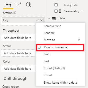
Specifying Grouping (either on its own or as GroupingOrMeasure) will allow the user to specify whether to summarise the value or not in the properties pane, e.g.:
There is some expectation that you'll need to handle this somehow in your dataViewMapping also.
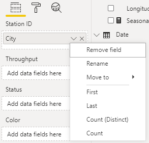
Specifying Measure for kind is a way of telling the properties pane that this is purely an aggregated value, so only offer-up the options to the end-user that make sense here. For the same textual field we now don't see the option to summarise, e.g.:
The doc is not 100% correct on this, and specifies Measure is for numeric values. I might have to figure out how to submit corrections to see if this can be cleared up.
So with that in mind, don't think of Measure as a data model measure, more that "this data role should aggregate however it can, based on its type". For numeric values, you'll get the standard numeric ones such as min, max etc.; for textual fields we get the ones above. This is how the circle card tutorial is set up, and also how the core card visual works when you add textual fields to them.
My Approach for your Visual
When you want to use multiple data roles, this is where we can get creative with the categorical dataViewMapping. We don't have to specify a categories grouping as long as there's a valid binding to values, so I would firstly revise the dataRoles for your case as follows:
"dataRoles": [
    {
        "displayName": "Station ID",
        "name": "stationID",
        "kind": "Measure"
    },
    {
        "displayName": "Throughput",
        "name": "throughput",
        "kind": "Measure"
    },
    {
        "displayName": "Status",
        "name": "status",
        "kind": "Measure"
    },
    {
        "displayName": "Color",
        "name": "color",
        "kind": "Measure"
    }
],
I'd then set up my dataViewMappings as follows:
"dataViewMappings": [
    {
        "categorical": {
            "values": {
                "select": [
                    {
                        "bind": {
                            "to": "stationID"
                        }
                    },
                    {
                        "bind": {
                            "to": "throughput"
                        }
                    },
                    {
                        "bind": {
                            "to": "status"
                        }
                    },
                    {
                        "bind": {
                            "to": "color"
                        }
                    }
                ]
            }
        }
    }
]
Note that I'm not using a categories key, just a values one (as I don't need to be doing any grouping for a "single" data point).
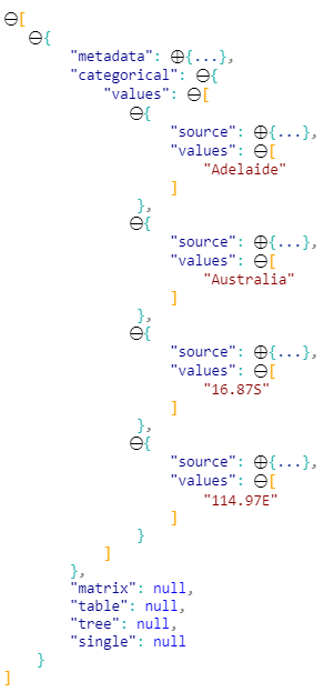
Now, when I refresh my visual and add my data, the dataView will now resolve as follows:
I'm just using whatever data I have in my model but yours should resolve similarly. Notice that everything is consolidated in the values object.
In terms of how you then access in your code thereafter, you'd swap out any instances of where you're referring to the categories object (e,g, for stationText and stationValue) and map them to the appropriate entry in the values object array instead.
Let me know if there's anything in here that doesn't make sense and I'll do my best to provide more targeted feedback 😉
Good luck!
Daniel
Did I answer your question? Mark my post as a solution!
Proud to be a Super User!
On how to ask a technical question, if you really want an answer (courtesy of SQLBI)
- Mark as New
- Bookmark
- Subscribe
- Mute
- Subscribe to RSS Feed
- Permalink
- Report Inappropriate Content
Hi @Anonymous,
If you're using the circle card tutorial as a reference point, this uses the single dataViewMapping, and this only ever supports one dataRole.
To allow more values, you'll indeed need to add a new dataRole, but also change your dataViewMapping to something else, likely categorical and map the values accordingly.
I have set up something similar in the past, with a tutorial, which does show how to convert the dataViewMapping across and might be something you can use to refer to. It's a little out of date, as the SDK has changed since I wrote and in this case, so you won't be able to lift and shift exaclty as coded, and the field is used for a tooltip but the premise is the same.
- The code repository is here
- The slide deck is here - the conversion is mentioned in Objective 5, and the following commits show the changes:
Hopefully this will help you get started. Good luck!
Daniel
Did I answer your question? Mark my post as a solution!
Proud to be a Super User!
On how to ask a technical question, if you really want an answer (courtesy of SQLBI)
- Mark as New
- Bookmark
- Subscribe
- Mute
- Subscribe to RSS Feed
- Permalink
- Report Inappropriate Content
I really appreciate your help! This is what i got in the capabilities.json and in the Visual.ts i have the below in the update method. Is it really mandatory to have a grouping if we end up multiple measures? Actually i just want to show the normal field value not really a measure from the data model.
"dataRoles": [
        {
            "displayName": "Station ID",
            "name": "stationID",
            "kind": "GroupingOrMeasure"
        },
        {
            "displayName": "Throughput",
            "name": "throughput",
            "kind": "Measure"
        },
        {
            "displayName": "Status",
            "name": "status",
            "kind": "Measure"
        },
        {
            "displayName": "Color",
            "name": "color",
            "kind": "Measure"
        }

    ],
    this.circle
            .style("fill", categoricalDataView.values[2].values[0] as string)
            .style("fill-opacity", 1)
            .style("stroke", "black")
            .style("stroke-width", this.visualSettings.circle.circleThickness)
            .attr("r", radius)
            .attr("cx", width/2)
            .attr("cy", height/2);

        let fontSizeValue: number = Math.min(width, height) / 5;

        this.stationText
            .text(categoricalDataView.categories[0].values[0] as string)
            .attr("x", width/2)
            .attr("y", height/10)
            .attr("dy", "0.35em")
            .attr("text-anchor", "middle")
            .style("font-size", fontSizeValue / 2 + "px");

        this.stationValue
            .text(categoricalDataView.categories[0].values[0] as string)
            .attr("x", "50%")
            .attr("y", "35%")
            .attr("dy", "0.35em")
            .attr("text-anchor", "middle")
            .style("font-size", fontSizeValue / 2.5 + "px");

        this.throughputValue
            .text(categoricalDataView.values[0].values[0] as string)
            .attr("x", width/2)
            .attr("y", height/2)
            .attr("dy", "0.35em")
            .attr("text-anchor", "middle")
            .style("font-size", fontSizeValue + "px");

        this.statusValue
            .text(categoricalDataView.values[1].values[0] as string)
            .attr("x", "50%")
            .attr("y", "55%")
            .attr("dy", fontSizeValue / 1.2)
            .attr("text-anchor", "middle")
            .style("font-size", fontSizeValue / 2.5 + "px");
- Mark as New
- Bookmark
- Subscribe
- Mute
- Subscribe to RSS Feed
- Permalink
- Report Inappropriate Content
Hi @Anonymous,
Glad you found it useful! I'm unfortunately not 100% clear on your follow-up question, so I'll take a broad approach and maybe the answer is in there somewhere - apologies in advance if I'm telling you stuff you already know 🙂
The kind property really specifies what options are available to the end-user when they see the field in the properties pane, and how it can be mapped later on.
Let's say I have a textual field, called City (it's one I have on hand in my data model at present).
Specifying Grouping (either on its own or as GroupingOrMeasure) will allow the user to specify whether to summarise the value or not in the properties pane, e.g.:
There is some expectation that you'll need to handle this somehow in your dataViewMapping also.
Specifying Measure for kind is a way of telling the properties pane that this is purely an aggregated value, so only offer-up the options to the end-user that make sense here. For the same textual field we now don't see the option to summarise, e.g.:
The doc is not 100% correct on this, and specifies Measure is for numeric values. I might have to figure out how to submit corrections to see if this can be cleared up.
So with that in mind, don't think of Measure as a data model measure, more that "this data role should aggregate however it can, based on its type". For numeric values, you'll get the standard numeric ones such as min, max etc.; for textual fields we get the ones above. This is how the circle card tutorial is set up, and also how the core card visual works when you add textual fields to them.
My Approach for your Visual
When you want to use multiple data roles, this is where we can get creative with the categorical dataViewMapping. We don't have to specify a categories grouping as long as there's a valid binding to values, so I would firstly revise the dataRoles for your case as follows:
"dataRoles": [
    {
        "displayName": "Station ID",
        "name": "stationID",
        "kind": "Measure"
    },
    {
        "displayName": "Throughput",
        "name": "throughput",
        "kind": "Measure"
    },
    {
        "displayName": "Status",
        "name": "status",
        "kind": "Measure"
    },
    {
        "displayName": "Color",
        "name": "color",
        "kind": "Measure"
    }
],
I'd then set up my dataViewMappings as follows:
"dataViewMappings": [
    {
        "categorical": {
            "values": {
                "select": [
                    {
                        "bind": {
                            "to": "stationID"
                        }
                    },
                    {
                        "bind": {
                            "to": "throughput"
                        }
                    },
                    {
                        "bind": {
                            "to": "status"
                        }
                    },
                    {
                        "bind": {
                            "to": "color"
                        }
                    }
                ]
            }
        }
    }
]
Note that I'm not using a categories key, just a values one (as I don't need to be doing any grouping for a "single" data point).
Now, when I refresh my visual and add my data, the dataView will now resolve as follows:
I'm just using whatever data I have in my model but yours should resolve similarly. Notice that everything is consolidated in the values object.
In terms of how you then access in your code thereafter, you'd swap out any instances of where you're referring to the categories object (e,g, for stationText and stationValue) and map them to the appropriate entry in the values object array instead.
Let me know if there's anything in here that doesn't make sense and I'll do my best to provide more targeted feedback 😉
Good luck!
Daniel
Did I answer your question? Mark my post as a solution!
Proud to be a Super User!
On how to ask a technical question, if you really want an answer (courtesy of SQLBI)
- Mark as New
- Bookmark
- Subscribe
- Mute
- Subscribe to RSS Feed
- Permalink
- Report Inappropriate Content
Wow! Great Help! You covered it in very detailed way. Much helpful. Thank you for the help and support.
- Mark as New
- Bookmark
- Subscribe
- Mute
- Subscribe to RSS Feed
- Permalink
- Report Inappropriate Content
All the best,
Daniel
Did I answer your question? Mark my post as a solution!
Proud to be a Super User!
On how to ask a technical question, if you really want an answer (courtesy of SQLBI)
- Mark as New
- Bookmark
- Subscribe
- Mute
- Subscribe to RSS Feed
- Permalink
- Report Inappropriate Content
@dm-p unrelated question. Iam enhancing the circle card to have the drillthrough option. To enable drillthrough i need to make one of the field as Grouping (eg. StationID). I did. and to get the context menu with the drill through i added the below code as per microsoft article https://powerbi.microsoft.com/en-us/blog/power-bi-developer-community-november-update-2018/. I got the context menu but without drillthrough option. Would you able to help me in getting the drill through option?
    public update(options: VisualUpdateOptions) {
        //...
        //handle context menu
        this.svg.on('contextmenu', () => {
            const mouseEvent: MouseEvent = d3.event as MouseEvent;
            const eventTarget: EventTarget = mouseEvent.target;
            let dataPoint = d3.select(eventTarget).datum();
            this.selectionManager.showContextMenu(dataPoint? dataPoint.selectionId : {}, {
                x: mouseEvent.clientX,
                y: mouseEvent.clientY
            });
            mouseEvent.preventDefault();
        });
- Mark as New
- Bookmark
- Subscribe
- Mute
- Subscribe to RSS Feed
- Permalink
- Report Inappropriate Content
Hi @Anonymous,
I'd advise creating new threads for unrelated issues as it helps other people with the same challenge to find these posts more quickly 🙂
I'll see if I can provide a quick overview on here though and this should help you get moving.
For drillthrough to appear in the context menu, you'll need two things:
- A drillthrough page with the same fields that you're using in the visual (which I presume that you've already done)
- A selectionId bound to the element's datum that utilises these, so that the selectionManager knows there is a link to the fields on the drillthrough page
I see that you have a selectionId in your code, but as I can't see how you've built it, I can only speculate as to how this is set up. If you've not reviewed the following documentation on selection, I'd start here, to ensure that you're building your selectionId correctly.
If you're still stuck after trying the above, it's probably better for me to take a look at your code when I can find a chunk of time.
Given where you're at, we'll need to look at your capabilities, view model, DOM and visual logic to see how everything ties together, so ideally, if you have the project in a shareable location such as a GitHub repo, that'd be a great help in getting to the root of the problem quickly. If you don't want to share publicly, feel free to PM me this link.
Good luck,
Daniel
Did I answer your question? Mark my post as a solution!
Proud to be a Super User!
On how to ask a technical question, if you really want an answer (courtesy of SQLBI)
- Mark as New
- Bookmark
- Subscribe
- Mute
- Subscribe to RSS Feed
- Permalink
- Report Inappropriate Content
@dm-p Sorry for continuing on this same thread. Thanks for your inputs. yes i did the drillthrough page with the same fields that iam using on the visual. Let me check and fix the selectionId as you said. Thanks again and I really appreciate your efforts helping me with the inputs.
Helpful resources

Fabric Data Days
Advance your Data & AI career with 50 days of live learning, contests, hands-on challenges, study groups & certifications and more!

Power BI Monthly Update - October 2025
Check out the October 2025 Power BI update to learn about new features.


