Join us at FabCon Vienna from September 15-18, 2025
The ultimate Fabric, Power BI, SQL, and AI community-led learning event. Save €200 with code FABCOMM.
Get registered- Power BI forums
- Get Help with Power BI
- Desktop
- Service
- Report Server
- Power Query
- Mobile Apps
- Developer
- DAX Commands and Tips
- Custom Visuals Development Discussion
- Health and Life Sciences
- Power BI Spanish forums
- Translated Spanish Desktop
- Training and Consulting
- Instructor Led Training
- Dashboard in a Day for Women, by Women
- Galleries
- Data Stories Gallery
- Themes Gallery
- Contests Gallery
- Quick Measures Gallery
- Notebook Gallery
- Translytical Task Flow Gallery
- TMDL Gallery
- R Script Showcase
- Webinars and Video Gallery
- Ideas
- Custom Visuals Ideas (read-only)
- Issues
- Issues
- Events
- Upcoming Events
Compete to become Power BI Data Viz World Champion! First round ends August 18th. Get started.
- Power BI forums
- Forums
- Get Help with Power BI
- Developer
- Chart with Multiple dimensions in Power BI
- Subscribe to RSS Feed
- Mark Topic as New
- Mark Topic as Read
- Float this Topic for Current User
- Bookmark
- Subscribe
- Printer Friendly Page
- Mark as New
- Bookmark
- Subscribe
- Mute
- Subscribe to RSS Feed
- Permalink
- Report Inappropriate Content
Chart with Multiple dimensions in Power BI
Hi Community Memebers,
I am new to Power bi Please help here i need to show the average score data against multiple dimensions . Let me know what suitable chart options in power bi where i can show both dimensions together on chart except matrix or tabular view . Any pointer or help would be appreciated !
Regards
Deepak
Solved! Go to Solution.
- Mark as New
- Bookmark
- Subscribe
- Mute
- Subscribe to RSS Feed
- Permalink
- Report Inappropriate Content
Hi @deepwadhwa2823 ,
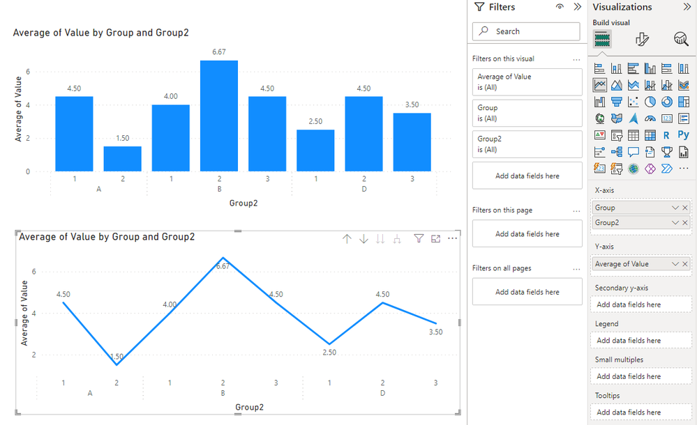
There are many visual in Power BI that can implement multiple dimensions, such as Clustered column chart and Line Chart, where you can place multiple dimensions in X-axis and Value values in Y-axis.
In X-axis, you can place multiple dimensions and display the values of different dimensions by using drill down, Power BI will display the data according to the level of drill down on the visual.
In Y-axis, you can set the aggregation operation on Value, for example, if you want to average the values, you can set Average of value in Value.
Refer to:
Visualization types in Power BI - Power BI | Microsoft Learn
If the visual that comes with Power Bi does not meet your needs, you can click on "Get more visual" to find a customized visual object that meets your needs.
Main sources for acquiring Power BI custom visuals - Power BI | Microsoft Learn
If the above information is not your expected result, if it is convenient, you can express your expected result in the form of a picture or can you provide some sample data in the form of a table or pbix file (without sensitive data), we can better help you!
Best Regards,
Liu Yang
If this post helps, then please consider Accept it as the solution to help the other members find it more quickly.
- Mark as New
- Bookmark
- Subscribe
- Mute
- Subscribe to RSS Feed
- Permalink
- Report Inappropriate Content
Thanks for the help . One question here Gauge chart. In Qlikview Gauage chart have the option to define segments of different colour . Can we define the same in power BI In Qlikview Gauage chart having 5 segments but any how in power BI i can define 3 segments not more that that. Any lead would be helpful it's urgent
- Mark as New
- Bookmark
- Subscribe
- Mute
- Subscribe to RSS Feed
- Permalink
- Report Inappropriate Content
Hi @deepwadhwa2823 ,
There are many visual in Power BI that can implement multiple dimensions, such as Clustered column chart and Line Chart, where you can place multiple dimensions in X-axis and Value values in Y-axis.
In X-axis, you can place multiple dimensions and display the values of different dimensions by using drill down, Power BI will display the data according to the level of drill down on the visual.
In Y-axis, you can set the aggregation operation on Value, for example, if you want to average the values, you can set Average of value in Value.
Refer to:
Visualization types in Power BI - Power BI | Microsoft Learn
If the visual that comes with Power Bi does not meet your needs, you can click on "Get more visual" to find a customized visual object that meets your needs.
Main sources for acquiring Power BI custom visuals - Power BI | Microsoft Learn
If the above information is not your expected result, if it is convenient, you can express your expected result in the form of a picture or can you provide some sample data in the form of a table or pbix file (without sensitive data), we can better help you!
Best Regards,
Liu Yang
If this post helps, then please consider Accept it as the solution to help the other members find it more quickly.


