FabCon is coming to Atlanta
Join us at FabCon Atlanta from March 16 - 20, 2026, for the ultimate Fabric, Power BI, AI and SQL community-led event. Save $200 with code FABCOMM.
Register now!- Power BI forums
- Get Help with Power BI
- Desktop
- Service
- Report Server
- Power Query
- Mobile Apps
- Developer
- DAX Commands and Tips
- Custom Visuals Development Discussion
- Health and Life Sciences
- Power BI Spanish forums
- Translated Spanish Desktop
- Training and Consulting
- Instructor Led Training
- Dashboard in a Day for Women, by Women
- Galleries
- Data Stories Gallery
- Themes Gallery
- Contests Gallery
- QuickViz Gallery
- Quick Measures Gallery
- Visual Calculations Gallery
- Notebook Gallery
- Translytical Task Flow Gallery
- TMDL Gallery
- R Script Showcase
- Webinars and Video Gallery
- Ideas
- Custom Visuals Ideas (read-only)
- Issues
- Issues
- Events
- Upcoming Events
The Power BI Data Visualization World Championships is back! Get ahead of the game and start preparing now! Learn more
- Power BI forums
- Forums
- Get Help with Power BI
- Developer
- Change line chart background color
- Subscribe to RSS Feed
- Mark Topic as New
- Mark Topic as Read
- Float this Topic for Current User
- Bookmark
- Subscribe
- Printer Friendly Page
- Mark as New
- Bookmark
- Subscribe
- Mute
- Subscribe to RSS Feed
- Permalink
- Report Inappropriate Content
Change line chart background color
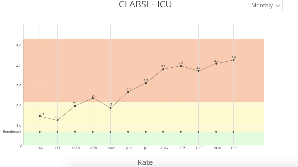
I want to make line chart report and I have attached the image what I am trying to achieve can you help me how can I do that. I want to change the background color if my y-axis value is 0 to 0.7 it will be green. If my y-axis value is 0.8 to 2.2 then it will be yellow and rest will be red.

- Mark as New
- Bookmark
- Subscribe
- Mute
- Subscribe to RSS Feed
- Permalink
- Report Inappropriate Content
Hi, I'm trying to create the same conditional background color. I was wondering if you could figure it out?
- Mark as New
- Bookmark
- Subscribe
- Mute
- Subscribe to RSS Feed
- Permalink
- Report Inappropriate Content
I don't know of a way out of the box, but here are a few ideas you can pursue.
All ideas revolve around layering visuals. The line chart will be in the foreground, and these options in the background.
1) you could just add an image with these gradients and add it behind the line chart. The drawback is that if the y-axis changes, the colors may not match up...
2) You might be able to use a heat map custom visual to control the size and color which may change as your y-axis does. You could layer elements to hide descriptions on the heatmap, then put the line chart on top... Basically it would be something like, create the heat map, turn off all title, etc. Use a white box picture to cover the remaing text, then add your line chart.
3) A final option would be to use a visual and drop in a single value so nothing shows up. remove all titles, axis, etc. and add a color for the background. You will need 3 of these, and they could serve the same purpose as #1
All these ideas are just that, ideas. i haven't tested or brought them to completion to see how they may work.
Looking for more Power BI tips, tricks & tools? Check out PowerBI.tips the site I co-own with Mike Carlo. Also, if you are near SE WI? Join our PUG Milwaukee Brew City PUG
- Mark as New
- Bookmark
- Subscribe
- Mute
- Subscribe to RSS Feed
- Permalink
- Report Inappropriate Content
I was trying to achieve the same a few weeks ago, except that in my case even the target values for the background color were dynamic too coming from a measure in the same dataset. This case nothing hardcoded could work...
I came to the conclusion that I need to create a custom visual for this purpose, that would ideally inherit from the Line Chart visual. I would add new input fields for the target limits, and fill in the background in the visual myself - while leaving the rest of the line chart as is. It sounds simple, but I couldn't get through the inheritance yet.
Helpful resources

Power BI Dataviz World Championships
The Power BI Data Visualization World Championships is back! Get ahead of the game and start preparing now!

| User | Count |
|---|---|
| 4 | |
| 3 | |
| 2 | |
| 1 | |
| 1 |
| User | Count |
|---|---|
| 4 | |
| 4 | |
| 4 | |
| 3 | |
| 2 |

