FabCon is coming to Atlanta
Join us at FabCon Atlanta from March 16 - 20, 2026, for the ultimate Fabric, Power BI, AI and SQL community-led event. Save $200 with code FABCOMM.
Register now!- Power BI forums
- Get Help with Power BI
- Desktop
- Service
- Report Server
- Power Query
- Mobile Apps
- Developer
- DAX Commands and Tips
- Custom Visuals Development Discussion
- Health and Life Sciences
- Power BI Spanish forums
- Translated Spanish Desktop
- Training and Consulting
- Instructor Led Training
- Dashboard in a Day for Women, by Women
- Galleries
- Data Stories Gallery
- Themes Gallery
- Contests Gallery
- QuickViz Gallery
- Quick Measures Gallery
- Visual Calculations Gallery
- Notebook Gallery
- Translytical Task Flow Gallery
- TMDL Gallery
- R Script Showcase
- Webinars and Video Gallery
- Ideas
- Custom Visuals Ideas (read-only)
- Issues
- Issues
- Events
- Upcoming Events
Learn from the best! Meet the four finalists headed to the FINALS of the Power BI Dataviz World Championships! Register now
- Power BI forums
- Forums
- Get Help with Power BI
- Developer
- Cascading Filters and Columns
- Subscribe to RSS Feed
- Mark Topic as New
- Mark Topic as Read
- Float this Topic for Current User
- Bookmark
- Subscribe
- Printer Friendly Page
- Mark as New
- Bookmark
- Subscribe
- Mute
- Subscribe to RSS Feed
- Permalink
- Report Inappropriate Content
Cascading Filters and Columns
Hi,
Could you help me set up my data in a way where the slicers are cascading along with the visual.
Here is a sample data:
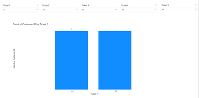
And this is how I want my visualization to look like:
To explain further, I if Ticket 1 is filtered (for example, it is filtered to A), Ticket 2 will be in the visualization (so, it should be AA and BB in the chart). But, how can I do this without dragging each column in the visual field when I change the filters.
Since, I want my chart to show Ticket 3 in the X-axis when Ticket 2 is filtered. I have to drag Ticket 3 column in the visual to do this. Is there a way to do this?
Thank you so much!
Solved! Go to Solution.
- Mark as New
- Bookmark
- Subscribe
- Mute
- Subscribe to RSS Feed
- Permalink
- Report Inappropriate Content
Hi @baconandpizza ,
I created a sample pbix file(see the attachment), please check if that is what you want.
1. Select the columns "Ticket 1", "Ticket 2","Ticket 3","Ticket 4" and "Ticket 5" and unpivot these columns
= Table.Unpivot(#"Changed Type", {"Ticket 1", "Ticket 2", "Ticket 3", "Ticket 4", "Ticket 5"}, "Ticket Type", "Value")2. Create a dimension table
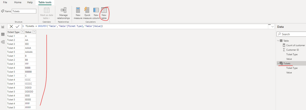
Tickets = GROUPBY('Table','Table'[Ticket Type],'Table'[Value])3. Create a measure as below to get the count of customer id which fulfill the filters
Count of customer =
VAR _selticket =
    SELECTEDVALUE ( 'Tickets'[Ticket Type] )
VAR _seltvalue =
    ALLSELECTED ( 'Tickets'[Value] )
VAR _nticket =
    (
        LEFT ( _selticket, LEN ( _selticket ) - 1 )
            & ( VALUE ( RIGHT ( _selticket, 1 ) ) + 1 )
    )
VAR _tab =
    CALCULATETABLE (
        VALUES ( 'Table'[Customer ID] ),
        FILTER (
            ALLSELECTED ( 'Table' ),
            'Table'[Ticket Type] = _selticket
                && 'Table'[Value] IN _seltvalue
        )
    )
VAR _tab2 =
    CALCULATETABLE (
        VALUES ( 'Table'[Value] ),
        FILTER (
            ALLSELECTED ( 'Table' ),
            'Table'[Ticket Type] = _nticket
                && 'Table'[Customer ID] IN _tab
        )
    )
RETURN
    CALCULATE (
        DISTINCTCOUNT ( 'Table'[Customer ID] ),
        FILTER ( 'Table', 'Table'[Value] IN _tab2 )
    )
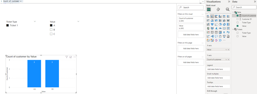
4. Create a column chart
By the way, if select "Ticket 5", what's the data should display in the visual?
Best Regards
Helpful resources

Join our Fabric User Panel
Share feedback directly with Fabric product managers, participate in targeted research studies and influence the Fabric roadmap.

Power BI Monthly Update - February 2026
Check out the February 2026 Power BI update to learn about new features.

| User | Count |
|---|---|
| 3 | |
| 2 | |
| 2 | |
| 1 | |
| 1 |
| User | Count |
|---|---|
| 3 | |
| 3 | |
| 2 | |
| 2 | |
| 2 |


