Get Fabric certified for FREE!
Don't miss your chance to take the Fabric Data Engineer (DP-600) exam for FREE! Find out how by watching the DP-600 session on-demand now through April 28th.
Learn more- Power BI forums
- Get Help with Power BI
- Desktop
- Service
- Report Server
- Power Query
- Mobile Apps
- Developer
- DAX Commands and Tips
- Custom Visuals Development Discussion
- Health and Life Sciences
- Power BI Spanish forums
- Translated Spanish Desktop
- Training and Consulting
- Instructor Led Training
- Dashboard in a Day for Women, by Women
- Galleries
- Data Stories Gallery
- Themes Gallery
- Contests Gallery
- QuickViz Gallery
- Quick Measures Gallery
- Visual Calculations Gallery
- Notebook Gallery
- Translytical Task Flow Gallery
- TMDL Gallery
- R Script Showcase
- Webinars and Video Gallery
- Ideas
- Custom Visuals Ideas (read-only)
- Issues
- Issues
- Events
- Upcoming Events
Join the FabCon + SQLCon recap series. Up next: Power BI, Real-Time Intelligence, IQ and AI, and Data Factory take center stage. All sessions are available on-demand after the live show. Register now
- Power BI forums
- Forums
- Get Help with Power BI
- Developer
- Re: Boxplot chart with a target line
- Subscribe to RSS Feed
- Mark Topic as New
- Mark Topic as Read
- Float this Topic for Current User
- Bookmark
- Subscribe
- Printer Friendly Page
- Mark as New
- Bookmark
- Subscribe
- Mute
- Subscribe to RSS Feed
- Permalink
- Report Inappropriate Content
Boxplot chart with a target line
Hello everyone,
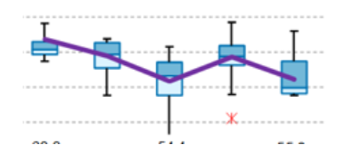
Do you know if it's possible to create a boxplot with a target line included in the graph?
Here an example :
Thank you in advance.
Do not hesitate if you need more information!
Solved! Go to Solution.
- Mark as New
- Bookmark
- Subscribe
- Mute
- Subscribe to RSS Feed
- Permalink
- Report Inappropriate Content
Hi @Civodul ,
Power BI comes with many out-of-the-box visuals that are available in the Visualizations pane of both Power BI Desktop and Power BI Service.
Many more certified Power BI visuals are available from AppSource. These visuals are created by Microsoft and Microsoft partners, and are validated by the AppSource validation team. You can download these visuals directly to your Visualizations pane.
You can also develop your own Power BI visual, or get one from a trusted friend or coworker.
If you download or receive a Power BI visual file, you have to import it to the Visualizations pane before you can use it to create Power BI content.
Please check if this visual could help you:Box and Whisker chart by MAQ Software
Best Regards,
Jianbo Li
If this post helps, then please consider Accept it as the solution to help the other members find it more quickly.
- Mark as New
- Bookmark
- Subscribe
- Mute
- Subscribe to RSS Feed
- Permalink
- Report Inappropriate Content
What visual did you end up using ? I am in similar dilema!
- Mark as New
- Bookmark
- Subscribe
- Mute
- Subscribe to RSS Feed
- Permalink
- Report Inappropriate Content
Hello,
Thank you for your answer, i will try that!
Best regards
Civodul
- Mark as New
- Bookmark
- Subscribe
- Mute
- Subscribe to RSS Feed
- Permalink
- Report Inappropriate Content
Hi @Civodul ,
Power BI comes with many out-of-the-box visuals that are available in the Visualizations pane of both Power BI Desktop and Power BI Service.
Many more certified Power BI visuals are available from AppSource. These visuals are created by Microsoft and Microsoft partners, and are validated by the AppSource validation team. You can download these visuals directly to your Visualizations pane.
You can also develop your own Power BI visual, or get one from a trusted friend or coworker.
If you download or receive a Power BI visual file, you have to import it to the Visualizations pane before you can use it to create Power BI content.
Please check if this visual could help you:Box and Whisker chart by MAQ Software
Best Regards,
Jianbo Li
If this post helps, then please consider Accept it as the solution to help the other members find it more quickly.
Helpful resources

Power BI Monthly Update - April 2026
Check out the April 2026 Power BI update to learn about new features.

New to Fabric Survey
If you have recently started exploring Fabric, we'd love to hear how it's going. Your feedback can help with product improvements.

Power BI DataViz World Championships - June 2026
A new Power BI DataViz World Championship is coming this June! Don't miss out on submitting your entry.

| User | Count |
|---|---|
| 2 | |
| 2 | |
| 1 | |
| 1 | |
| 1 |

