FabCon is coming to Atlanta
Join us at FabCon Atlanta from March 16 - 20, 2026, for the ultimate Fabric, Power BI, AI and SQL community-led event. Save $200 with code FABCOMM.
Register now!- Power BI forums
- Get Help with Power BI
- Desktop
- Service
- Report Server
- Power Query
- Mobile Apps
- Developer
- DAX Commands and Tips
- Custom Visuals Development Discussion
- Health and Life Sciences
- Power BI Spanish forums
- Translated Spanish Desktop
- Training and Consulting
- Instructor Led Training
- Dashboard in a Day for Women, by Women
- Galleries
- Data Stories Gallery
- Themes Gallery
- Contests Gallery
- QuickViz Gallery
- Quick Measures Gallery
- Visual Calculations Gallery
- Notebook Gallery
- Translytical Task Flow Gallery
- TMDL Gallery
- R Script Showcase
- Webinars and Video Gallery
- Ideas
- Custom Visuals Ideas (read-only)
- Issues
- Issues
- Events
- Upcoming Events
View all the Fabric Data Days sessions on demand. View schedule
- Power BI forums
- Forums
- Get Help with Power BI
- Desktop
- why does format change when change slicer value
- Subscribe to RSS Feed
- Mark Topic as New
- Mark Topic as Read
- Float this Topic for Current User
- Bookmark
- Subscribe
- Printer Friendly Page
- Mark as New
- Bookmark
- Subscribe
- Mute
- Subscribe to RSS Feed
- Permalink
- Report Inappropriate Content
why does format change when change slicer value
I have a scatter plot visual
I have 3 layers of data, so I can show concentric circles, each representing a different category.
- the bottom layer represents country - US, CAN, Mex
- the second layer represents type of account - A, B, C
- the top layer is to get the information about the point, project name
I set it up on all the data so that it works fine, but when I select a slicer for a different month, the visual changes.Any suggestions as to why this occurs.
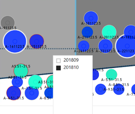
Here is how I want it:
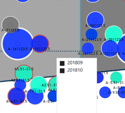
Here is what happens when I select all slicer options. Bubbles increase in size a little
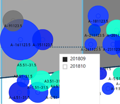
Here is what happens when I select a different month - I do not want this, but want to know why it occurred. All of the columns and logic are the same for the month that I do want. Bubbles increase in size a lot and lose the border bubble
Here is a snippet of the relevant data
| name | size | country | size2 | size3 | Month |
| A-161123.5 | 1 | CAN | 1.2 | 1.8 | 201809 |
| beta | 0.5 | US | 0.6 | 0.9 | 201809 |
| A-161123.5 | 1 | CAN | 1.2 | 1.8 | 201810 |
| beta | 0.5 | US | 0.6 | 0.9 | 201810 |
- Mark as New
- Bookmark
- Subscribe
- Mute
- Subscribe to RSS Feed
- Permalink
- Report Inappropriate Content
hi, @ahuhn
This is a normal phenomenon when you filter the data by slicer, the visual will respond to the change.
and you could custom some of them in "Format".
Best Regards,
Lin
If this post helps, then please consider Accept it as the solution to help the other members find it more quickly.
Helpful resources

Power BI Monthly Update - November 2025
Check out the November 2025 Power BI update to learn about new features.

Fabric Data Days
Advance your Data & AI career with 50 days of live learning, contests, hands-on challenges, study groups & certifications and more!


