Get Fabric certified for FREE!
Don't miss your chance to take the Fabric Data Engineer (DP-600) exam for FREE! Find out how by attending the DP-600 session on April 23rd (pacific time), live or on-demand.
Learn more- Power BI forums
- Get Help with Power BI
- Desktop
- Service
- Report Server
- Power Query
- Mobile Apps
- Developer
- DAX Commands and Tips
- Custom Visuals Development Discussion
- Health and Life Sciences
- Power BI Spanish forums
- Translated Spanish Desktop
- Training and Consulting
- Instructor Led Training
- Dashboard in a Day for Women, by Women
- Galleries
- Data Stories Gallery
- Themes Gallery
- Contests Gallery
- QuickViz Gallery
- Quick Measures Gallery
- Visual Calculations Gallery
- Notebook Gallery
- Translytical Task Flow Gallery
- TMDL Gallery
- R Script Showcase
- Webinars and Video Gallery
- Ideas
- Custom Visuals Ideas (read-only)
- Issues
- Issues
- Events
- Upcoming Events
Next up in the FabCon + SQLCon recap series: The roadmap for Microsoft SQL and Maximizing Developer experiences in Fabric. All sessions are available on-demand after the live show. Register now
- Power BI forums
- Forums
- Get Help with Power BI
- Desktop
- undefined
- Subscribe to RSS Feed
- Mark Topic as New
- Mark Topic as Read
- Float this Topic for Current User
- Bookmark
- Subscribe
- Printer Friendly Page
- Mark as New
- Bookmark
- Subscribe
- Mute
- Subscribe to RSS Feed
- Permalink
- Report Inappropriate Content
undefined
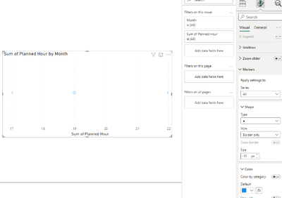
Is there a way to change the marker style on scatterplots to "unfilled"? The style option is grayed out and defaulted to "fill only".
- Mark as New
- Bookmark
- Subscribe
- Mute
- Subscribe to RSS Feed
- Permalink
- Report Inappropriate Content
Hi @pstaggers ,
After my testing did not have the same issue, please check the fields of the scatter plot and if Power BI dsektop is upgraded to the latest version.
You can refer to the following documents that may be helpful to you:
Scatter, bubble, and dot plot charts in Power BI - Power BI | Microsoft Learn
How To Use Scatter Charts in Power BI - Foresight BI - Achieve More With Less
Power BI Scatter Chart: Conditional Formatting - Enterprise DNA
Best Regards,
Neeko Tang
If this post helps, then please consider Accept it as the solution to help the other members find it more quickly.
- Mark as New
- Bookmark
- Subscribe
- Mute
- Subscribe to RSS Feed
- Permalink
- Report Inappropriate Content
Can you show an example of the plot? You have either turned a format visual slider off or it doesn't work with the fields you have inputted into your scatter plot.
Helpful resources

New to Fabric Survey
If you have recently started exploring Fabric, we'd love to hear how it's going. Your feedback can help with product improvements.

Power BI DataViz World Championships - June 2026
A new Power BI DataViz World Championship is coming this June! Don't miss out on submitting your entry.

FabCon &SQLCon Highlights
Experience the highlights from FabCon & SQLCon, available live and on-demand starting April 14th.

| User | Count |
|---|---|
| 48 | |
| 40 | |
| 40 | |
| 20 | |
| 16 |
| User | Count |
|---|---|
| 70 | |
| 67 | |
| 32 | |
| 27 | |
| 26 |


