FabCon is coming to Atlanta
Join us at FabCon Atlanta from March 16 - 20, 2026, for the ultimate Fabric, Power BI, AI and SQL community-led event. Save $200 with code FABCOMM.
Register now!- Power BI forums
- Get Help with Power BI
- Desktop
- Service
- Report Server
- Power Query
- Mobile Apps
- Developer
- DAX Commands and Tips
- Custom Visuals Development Discussion
- Health and Life Sciences
- Power BI Spanish forums
- Translated Spanish Desktop
- Training and Consulting
- Instructor Led Training
- Dashboard in a Day for Women, by Women
- Galleries
- Data Stories Gallery
- Themes Gallery
- Contests Gallery
- QuickViz Gallery
- Quick Measures Gallery
- Visual Calculations Gallery
- Notebook Gallery
- Translytical Task Flow Gallery
- TMDL Gallery
- R Script Showcase
- Webinars and Video Gallery
- Ideas
- Custom Visuals Ideas (read-only)
- Issues
- Issues
- Events
- Upcoming Events
The Power BI Data Visualization World Championships is back! Get ahead of the game and start preparing now! Learn more
- Power BI forums
- Forums
- Get Help with Power BI
- Desktop
- two different Dates count in one dashboard
- Subscribe to RSS Feed
- Mark Topic as New
- Mark Topic as Read
- Float this Topic for Current User
- Bookmark
- Subscribe
- Printer Friendly Page
- Mark as New
- Bookmark
- Subscribe
- Mute
- Subscribe to RSS Feed
- Permalink
- Report Inappropriate Content
two different Dates count in one dashboard
hello Community
i have my table withe the following columns Assetnum(identity),claasification, Arrival date(year) , Decomissioning date(year)
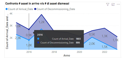
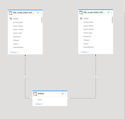
what i am trying to do is to have the count of dates in one dashboard that have the year in axis thus for example for the years after 2016 i want to know the count of arrival date and the count of decomissioning date to do so i had to create another table that have the years from 2016 and on, and duplicate my table and i joined the year table to my original table and the duplicate table and i got the desired results , my problem now is that i have to filter the dashboard using the classification column wish results on filtering just one of the two dates is there anyway to do it ? or another way to achieve the same result ?
here is my dashboard
and here is my model
Solved! Go to Solution.
- Mark as New
- Bookmark
- Subscribe
- Mute
- Subscribe to RSS Feed
- Permalink
- Report Inappropriate Content
Have a single calendar table with each date a unique value.
Create two relationships between your fact table and your calendar table:
- Calendar[Date] ---> Fact[Arrival Date] (one to many)
- Calendar[Date] ---> Fact[Decomissioning Date] (one to many) Inactive
Then you can have two measure to display on the same chart:
Rows (Arrival) = COUNTROWS('Fact Table Name')And
Rows (Decommission) = Calculate(COUNTROWS('Fact Table Name'), USERELATIONSHIP('Calendar'[Date],'Fact Table Name'[Decommission Date]))This should do it- you switch the relationship within the DAX measure, without a duplicate calendar table.
Data analyst by day, hockey goalie by night.
Did I help? Then please hit that "kudos" or "accept as a solution" button!
- Mark as New
- Bookmark
- Subscribe
- Mute
- Subscribe to RSS Feed
- Permalink
- Report Inappropriate Content
Note that this is a stacked area chart. This is the expected behavior.
Either:
1. Change into a (non-stacked) area chart
or 2. Switch the order of the measures in the visualization pane:
Data analyst by day, hockey goalie by night.
Did I help? Then please hit that "kudos" or "accept as a solution" button!
- Mark as New
- Bookmark
- Subscribe
- Mute
- Subscribe to RSS Feed
- Permalink
- Report Inappropriate Content
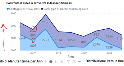
@rbriga taking a small look into my graph i noticed a small problem taking a look at the year 2016 the count with the small amount (886) is above the hiegher count (1803) looking at the Y axis this should be the other way is there anyway to fix this ?
thanks
- Mark as New
- Bookmark
- Subscribe
- Mute
- Subscribe to RSS Feed
- Permalink
- Report Inappropriate Content
Note that this is a stacked area chart. This is the expected behavior.
Either:
1. Change into a (non-stacked) area chart
or 2. Switch the order of the measures in the visualization pane:
Data analyst by day, hockey goalie by night.
Did I help? Then please hit that "kudos" or "accept as a solution" button!
- Mark as New
- Bookmark
- Subscribe
- Mute
- Subscribe to RSS Feed
- Permalink
- Report Inappropriate Content
well thanks that worked just fine
- Mark as New
- Bookmark
- Subscribe
- Mute
- Subscribe to RSS Feed
- Permalink
- Report Inappropriate Content
Have a single calendar table with each date a unique value.
Create two relationships between your fact table and your calendar table:
- Calendar[Date] ---> Fact[Arrival Date] (one to many)
- Calendar[Date] ---> Fact[Decomissioning Date] (one to many) Inactive
Then you can have two measure to display on the same chart:
Rows (Arrival) = COUNTROWS('Fact Table Name')And
Rows (Decommission) = Calculate(COUNTROWS('Fact Table Name'), USERELATIONSHIP('Calendar'[Date],'Fact Table Name'[Decommission Date]))This should do it- you switch the relationship within the DAX measure, without a duplicate calendar table.
Data analyst by day, hockey goalie by night.
Did I help? Then please hit that "kudos" or "accept as a solution" button!
- Mark as New
- Bookmark
- Subscribe
- Mute
- Subscribe to RSS Feed
- Permalink
- Report Inappropriate Content
thanks that worked just fine !!
Helpful resources

Power BI Dataviz World Championships
The Power BI Data Visualization World Championships is back! Get ahead of the game and start preparing now!

| User | Count |
|---|---|
| 41 | |
| 38 | |
| 36 | |
| 30 | |
| 28 |
| User | Count |
|---|---|
| 129 | |
| 88 | |
| 79 | |
| 68 | |
| 63 |


