Join us at the 2025 Microsoft Fabric Community Conference
Microsoft Fabric Community Conference 2025, March 31 - April 2, Las Vegas, Nevada. Use code FABINSIDER for a $400 discount.
Register now- Power BI forums
- Get Help with Power BI
- Desktop
- Service
- Report Server
- Power Query
- Mobile Apps
- Developer
- DAX Commands and Tips
- Custom Visuals Development Discussion
- Health and Life Sciences
- Power BI Spanish forums
- Translated Spanish Desktop
- Training and Consulting
- Instructor Led Training
- Dashboard in a Day for Women, by Women
- Galleries
- Webinars and Video Gallery
- Data Stories Gallery
- Themes Gallery
- Power BI DataViz World Championships Gallery
- Quick Measures Gallery
- R Script Showcase
- COVID-19 Data Stories Gallery
- Community Connections & How-To Videos
- 2021 MSBizAppsSummit Gallery
- 2020 MSBizAppsSummit Gallery
- 2019 MSBizAppsSummit Gallery
- Events
- Ideas
- Custom Visuals Ideas (read-only)
- Issues
- Issues
- Events
- Upcoming Events
The Power BI DataViz World Championships are on! With four chances to enter, you could win a spot in the LIVE Grand Finale in Las Vegas. Show off your skills.
- Power BI forums
- Forums
- Get Help with Power BI
- Desktop
- Re: tab order get's messed up
- Subscribe to RSS Feed
- Mark Topic as New
- Mark Topic as Read
- Float this Topic for Current User
- Bookmark
- Subscribe
- Printer Friendly Page
- Mark as New
- Bookmark
- Subscribe
- Mute
- Subscribe to RSS Feed
- Permalink
- Report Inappropriate Content
tab order get's messed up
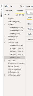
Hi I need a proper tab order (Creating accessible reports in Power BI - Power BI | Microsoft Learn) for accessibility reasons. I defined it as shown in the documentation, but everytime I publish the dashboard the order is still messed up and not in order as displayed here:
Is there anything I can do to fix this issue?
- Mark as New
- Bookmark
- Subscribe
- Mute
- Subscribe to RSS Feed
- Permalink
- Report Inappropriate Content
HI @v-yalanwu-msft ,
thanks for the answer. So the screenshot above is my desired tab order which I configured manually as described in the link you sent (Tab Order Enhances Power BI Report Accessibility – Data Savvy).
Although, when I publish the report the actual tab order is like this:
| actual tab order | configured tab order |
| 1. Appbar | 1. Appbar |
| 2. PrimaryButton | 2. SecondaryButton |
| 3. TertiaryButton | 3. TextBox |
| 4. SecondaryButton | 4. PrimarySlicer |
5. DataView | 5. HelpBox |
... | ... |
Best Regards
- Mark as New
- Bookmark
- Subscribe
- Mute
- Subscribe to RSS Feed
- Permalink
- Report Inappropriate Content
Hi, @Anonymous ;
Can you share a screenshot about the sequential screenshot of the dashboard after publishing it for comparison. Depending on the pictures you provide, the order is normal.
Tab Order Enhances Power BI Report Accessibility – Data Savvy
Best Regards,
Community Support Team _ Yalan Wu
If this post helps, then please consider Accept it as the solution to help the other members find it more quickly.
- Mark as New
- Bookmark
- Subscribe
- Mute
- Subscribe to RSS Feed
- Permalink
- Report Inappropriate Content
Wondering if you ever sorted this problem, I am in the same situation of trying to create an accessible report and tab order changes when I publish
- Mark as New
- Bookmark
- Subscribe
- Mute
- Subscribe to RSS Feed
- Permalink
- Report Inappropriate Content
@Power_burgo, no unfortunately not. The only workaround I used, is to group the elements properly, so even if the order get's messed up it's only within the respective hierarchy and therefore in smaller areas of the UI.
Helpful resources

Join us at the Microsoft Fabric Community Conference
March 31 - April 2, 2025, in Las Vegas, Nevada. Use code MSCUST for a $150 discount!

Power BI Monthly Update - February 2025
Check out the February 2025 Power BI update to learn about new features.

| User | Count |
|---|---|
| 82 | |
| 79 | |
| 52 | |
| 39 | |
| 35 |
| User | Count |
|---|---|
| 94 | |
| 79 | |
| 51 | |
| 47 | |
| 47 |

