- Power BI forums
- Get Help with Power BI
- Desktop
- Service
- Report Server
- Power Query
- Mobile Apps
- Developer
- DAX Commands and Tips
- Custom Visuals Development Discussion
- Health and Life Sciences
- Power BI Spanish forums
- Translated Spanish Desktop
- Training and Consulting
- Instructor Led Training
- Dashboard in a Day for Women, by Women
- Galleries
- Data Stories Gallery
- Themes Gallery
- Contests Gallery
- QuickViz Gallery
- Quick Measures Gallery
- Visual Calculations Gallery
- Notebook Gallery
- Translytical Task Flow Gallery
- TMDL Gallery
- R Script Showcase
- Webinars and Video Gallery
- Ideas
- Custom Visuals Ideas (read-only)
- Issues
- Issues
- Events
- Upcoming Events
Learn from the best! Meet the four finalists headed to the FINALS of the Power BI Dataviz World Championships! Register now
- Power BI forums
- Forums
- Get Help with Power BI
- Desktop
- simple scatter plot?
- Subscribe to RSS Feed
- Mark Topic as New
- Mark Topic as Read
- Float this Topic for Current User
- Bookmark
- Subscribe
- Printer Friendly Page
- Mark as New
- Bookmark
- Subscribe
- Mute
- Subscribe to RSS Feed
- Permalink
- Report Inappropriate Content
simple scatter plot?
I'm at a loss. I can't figure out how to render a simple scatter plot.
I have a table (from sharepoint). I can export that table into excel, click on two columns, and insert -> scatter.
I can successfully "get data", the same sharepoint list, into Power BI Desktop. But it wants to aggregate the columns, and won't render a normal, typical, usual, boring old scatter plot.
How do I do that?
Solved! Go to Solution.
- Mark as New
- Bookmark
- Subscribe
- Mute
- Subscribe to RSS Feed
- Permalink
- Report Inappropriate Content
The fields you're using for the X Axis and Y Axis both need to be numeric types, and you have to have Details populated with something.
- Mark as New
- Bookmark
- Subscribe
- Mute
- Subscribe to RSS Feed
- Permalink
- Report Inappropriate Content
The fields you're using for the X Axis and Y Axis both need to be numeric types, and you have to have Details populated with something.
- Mark as New
- Bookmark
- Subscribe
- Mute
- Subscribe to RSS Feed
- Permalink
- Report Inappropriate Content
I tried this, both my X and Y axis are numberic and I odn't get a scatterplot.
What kind of data goes into Details field? Thank you! Any help appreciated.
- Mark as New
- Bookmark
- Subscribe
- Mute
- Subscribe to RSS Feed
- Permalink
- Report Inappropriate Content
It can be literally almost anything in the details field. The easiest way to select something is what would you want to show up in the tooltip if a user hovers over a particular point (the X, Y, and Detail values will be displayed in the tooltip).
- Mark as New
- Bookmark
- Subscribe
- Mute
- Subscribe to RSS Feed
- Permalink
- Report Inappropriate Content
Ah! Not intuitive, but it works. I suppose if I keep playing with it I might even figure out the best/appropriate/correct data to put in the Details field.
Thank you
- Mark as New
- Bookmark
- Subscribe
- Mute
- Subscribe to RSS Feed
- Permalink
- Report Inappropriate Content
Hey @Anonymous,
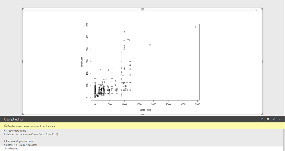
This can easily be done with an R visual. Just put the 2 columns into the "Values" and type "plot(dataset)" in the console.
Best,
Alan
Helpful resources

New to Fabric Survey
If you have recently started exploring Fabric, we'd love to hear how it's going. Your feedback can help with product improvements.

Power BI DataViz World Championships - June 2026
A new Power BI DataViz World Championship is coming this June! Don't miss out on submitting your entry.

Join our Fabric User Panel
Share feedback directly with Fabric product managers, participate in targeted research studies and influence the Fabric roadmap.

| User | Count |
|---|---|
| 57 | |
| 38 | |
| 33 | |
| 19 | |
| 16 |
| User | Count |
|---|---|
| 69 | |
| 66 | |
| 42 | |
| 32 | |
| 25 |

