FabCon is coming to Atlanta
Join us at FabCon Atlanta from March 16 - 20, 2026, for the ultimate Fabric, Power BI, AI and SQL community-led event. Save $200 with code FABCOMM.
Register now!- Power BI forums
- Get Help with Power BI
- Desktop
- Service
- Report Server
- Power Query
- Mobile Apps
- Developer
- DAX Commands and Tips
- Custom Visuals Development Discussion
- Health and Life Sciences
- Power BI Spanish forums
- Translated Spanish Desktop
- Training and Consulting
- Instructor Led Training
- Dashboard in a Day for Women, by Women
- Galleries
- Data Stories Gallery
- Themes Gallery
- Contests Gallery
- QuickViz Gallery
- Quick Measures Gallery
- Visual Calculations Gallery
- Notebook Gallery
- Translytical Task Flow Gallery
- TMDL Gallery
- R Script Showcase
- Webinars and Video Gallery
- Ideas
- Custom Visuals Ideas (read-only)
- Issues
- Issues
- Events
- Upcoming Events
The Power BI Data Visualization World Championships is back! Get ahead of the game and start preparing now! Learn more
- Power BI forums
- Forums
- Get Help with Power BI
- Desktop
- Re: showing subtotal as pie chart slice
- Subscribe to RSS Feed
- Mark Topic as New
- Mark Topic as Read
- Float this Topic for Current User
- Bookmark
- Subscribe
- Printer Friendly Page
- Mark as New
- Bookmark
- Subscribe
- Mute
- Subscribe to RSS Feed
- Permalink
- Report Inappropriate Content
showing subtotal as pie chart slice
Super newbie here,
A simple question:
I have a table with 2 rows:
| Sent | 1000 |
| Lost | 120 |
I would like to show the data in a pie where the total is "sent" and a slice shows "Lost"
many thanks in advance
- Mark as New
- Bookmark
- Subscribe
- Mute
- Subscribe to RSS Feed
- Permalink
- Report Inappropriate Content
Sure, here's how you can show the data in a pie chart:
First, you need to calculate the percentage of lost items compared to the total number of sent items. To do this, divide the number of lost items (120) by the total number of sent items (1000) and multiply the result by 100.
120 / 1000 = 0.12 0.12 x 100 = 12%
So, the slice representing "Lost" should be 12% of the pie chart, and the rest of the pie chart should represent "Sent."
You can use any graphing or visualization tool to create the pie chart. Most tools have a pie chart option where you can input the data and adjust the slice sizes accordingly. Make sure to label the chart appropriately so that the viewer knows what each slice represents.
- Mark as New
- Bookmark
- Subscribe
- Mute
- Subscribe to RSS Feed
- Permalink
- Report Inappropriate Content
Thanks a lot, but I don't know how to implement that in Power BI, I'm not sure how to go from my simple 2 rows table (as in my original post) to the final rapresentation.
- Mark as New
- Bookmark
- Subscribe
- Mute
- Subscribe to RSS Feed
- Permalink
- Report Inappropriate Content
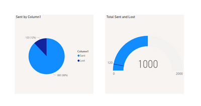
I would like to create a chart that shows a total of 1000 (the sent records) and a subtotal for the "lost" records.
Basically a graph that shows:
"out of 1000 sent we had 120 lost packages"
Basically the lost packages are a subgroup of the total sent.
I hope it makes sense!
- Mark as New
- Bookmark
- Subscribe
- Mute
- Subscribe to RSS Feed
- Permalink
- Report Inappropriate Content
- Mark as New
- Bookmark
- Subscribe
- Mute
- Subscribe to RSS Feed
- Permalink
- Report Inappropriate Content
yes! the second option, possibly with % of lost (12%)
many thanks
- Mark as New
- Bookmark
- Subscribe
- Mute
- Subscribe to RSS Feed
- Permalink
- Report Inappropriate Content
Helpful resources

Power BI Dataviz World Championships
The Power BI Data Visualization World Championships is back! Get ahead of the game and start preparing now!

Power BI Monthly Update - November 2025
Check out the November 2025 Power BI update to learn about new features.

| User | Count |
|---|---|
| 59 | |
| 46 | |
| 42 | |
| 23 | |
| 18 |
| User | Count |
|---|---|
| 193 | |
| 123 | |
| 99 | |
| 67 | |
| 49 |

