Fabric Data Days starts November 4th!
Advance your Data & AI career with 50 days of live learning, dataviz contests, hands-on challenges, study groups & certifications and more!
Get registered- Power BI forums
- Get Help with Power BI
- Desktop
- Service
- Report Server
- Power Query
- Mobile Apps
- Developer
- DAX Commands and Tips
- Custom Visuals Development Discussion
- Health and Life Sciences
- Power BI Spanish forums
- Translated Spanish Desktop
- Training and Consulting
- Instructor Led Training
- Dashboard in a Day for Women, by Women
- Galleries
- Data Stories Gallery
- Themes Gallery
- Contests Gallery
- QuickViz Gallery
- Quick Measures Gallery
- Visual Calculations Gallery
- Notebook Gallery
- Translytical Task Flow Gallery
- TMDL Gallery
- R Script Showcase
- Webinars and Video Gallery
- Ideas
- Custom Visuals Ideas (read-only)
- Issues
- Issues
- Events
- Upcoming Events
Get Fabric Certified for FREE during Fabric Data Days. Don't miss your chance! Request now
- Power BI forums
- Forums
- Get Help with Power BI
- Desktop
- Re: showing range data on chart
- Subscribe to RSS Feed
- Mark Topic as New
- Mark Topic as Read
- Float this Topic for Current User
- Bookmark
- Subscribe
- Printer Friendly Page
- Mark as New
- Bookmark
- Subscribe
- Mute
- Subscribe to RSS Feed
- Permalink
- Report Inappropriate Content
showing range data on chart
I have below data & I want to plot it on suitable chart. Can you pls suggest a suitable chart & also help me to know how can i show these ranges on chart instead of values
Year - 2019, 2020, 2021, 2022
Value range for each of the above year respectively- 20-25, 25,30, 40-45, 50-60
I want to show ranges on chart and specific values.
Solved! Go to Solution.
- Mark as New
- Bookmark
- Subscribe
- Mute
- Subscribe to RSS Feed
- Permalink
- Report Inappropriate Content
Hi, @harshadrokade
According to your description, I think the stacked area chart can perfectly help you to achieve your requirement, you can create two measures for the chart first:
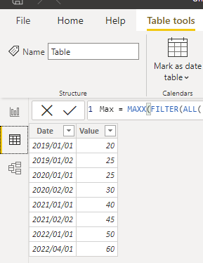
This is the test data I created based on your requirement:
You can create these two measures:
Min = MINX(FILTER(ALL('Table'),YEAR([Date])=YEAR(MAX([Date]))),[Value])Max = MAXX(FILTER(ALL('Table'),YEAR([Date])=YEAR(MAX([Date]))),[Value])
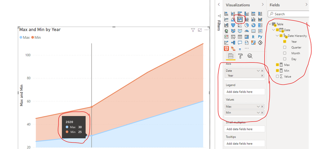
Then you can go to create a stacked area chart and place it like this:
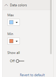
You can change the color for the data range:
And you can get what you want.
You can download my test pbix file below
Stacked Area Chart in Power BI
If this result is not what you want, you can post some sample data(without sensitive data) and your expected result.
How to Get Your Question Answered Quickly
Thank you very much!
Best Regards,
Community Support Team _Robert Qin
If this post helps, then please consider Accept it as the solution to help the other members find it more quickly.
- Mark as New
- Bookmark
- Subscribe
- Mute
- Subscribe to RSS Feed
- Permalink
- Report Inappropriate Content
Thanks a lot sit. Very helpful
Helpful resources

Power BI Monthly Update - November 2025
Check out the November 2025 Power BI update to learn about new features.

Fabric Data Days
Advance your Data & AI career with 50 days of live learning, contests, hands-on challenges, study groups & certifications and more!


