Fabric Data Days starts November 4th!
Advance your Data & AI career with 50 days of live learning, dataviz contests, hands-on challenges, study groups & certifications and more!
Get registered- Power BI forums
- Get Help with Power BI
- Desktop
- Service
- Report Server
- Power Query
- Mobile Apps
- Developer
- DAX Commands and Tips
- Custom Visuals Development Discussion
- Health and Life Sciences
- Power BI Spanish forums
- Translated Spanish Desktop
- Training and Consulting
- Instructor Led Training
- Dashboard in a Day for Women, by Women
- Galleries
- Data Stories Gallery
- Themes Gallery
- Contests Gallery
- Quick Measures Gallery
- Visual Calculations Gallery
- Notebook Gallery
- Translytical Task Flow Gallery
- TMDL Gallery
- R Script Showcase
- Webinars and Video Gallery
- Ideas
- Custom Visuals Ideas (read-only)
- Issues
- Issues
- Events
- Upcoming Events
Join us at FabCon Atlanta from March 16 - 20, 2026, for the ultimate Fabric, Power BI, AI and SQL community-led event. Save $200 with code FABCOMM. Register now.
- Power BI forums
- Forums
- Get Help with Power BI
- Desktop
- Re: problem visualizing in a line chart
- Subscribe to RSS Feed
- Mark Topic as New
- Mark Topic as Read
- Float this Topic for Current User
- Bookmark
- Subscribe
- Printer Friendly Page
- Mark as New
- Bookmark
- Subscribe
- Mute
- Subscribe to RSS Feed
- Permalink
- Report Inappropriate Content
problem visualizing in a line chart
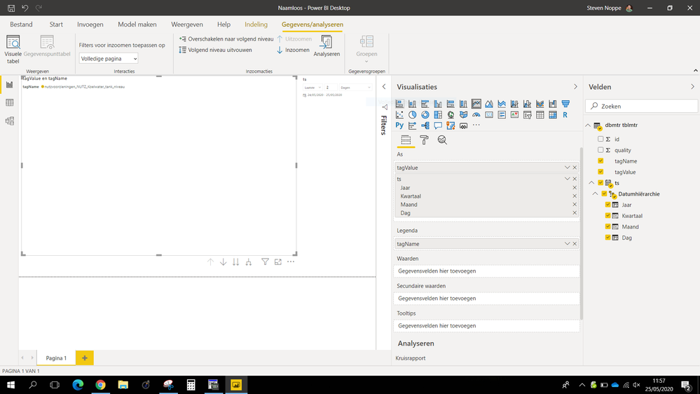
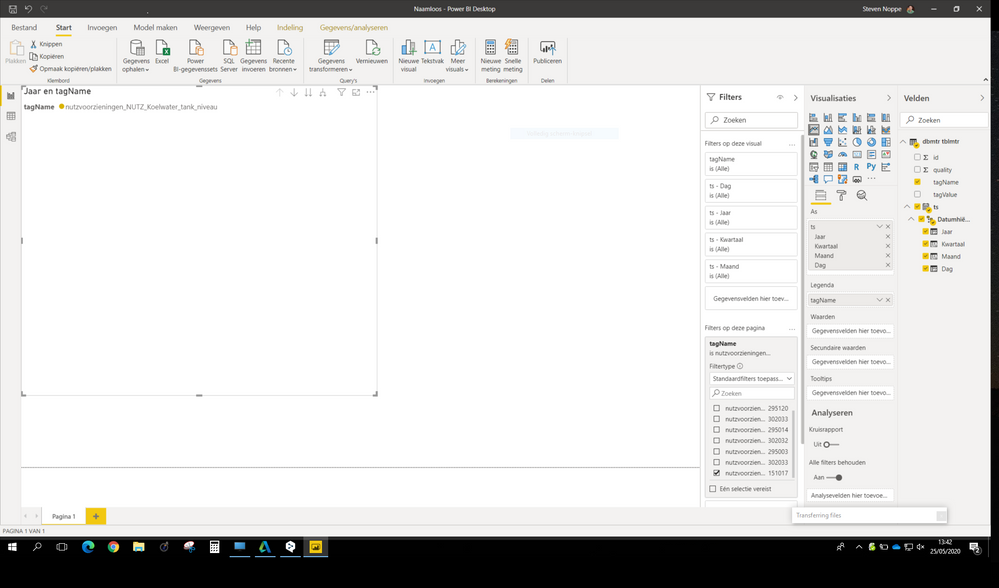
I'm totally new to Power BI and I'm having problems visualizing my data in a line chart.
When I choose my columns, I have the impression that my date/time isn't showing correctly.
see also attachments
Can someone point me in the right direction?
Solved! Go to Solution.
- Mark as New
- Bookmark
- Subscribe
- Mute
- Subscribe to RSS Feed
- Permalink
- Report Inappropriate Content
Hi @Vetex_steven ,
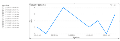
You can add the datetime column to AXIS field.
Then create a new table as slicer.
Table 2 = DISTINCT('Table'[datetime])Since the min level of date range for the defult slicer is day, we need to create a measure as below and add it to visual level filter.
Measure = IF(SELECTEDVALUE('Table'[datetime])>=MIN('Table 2'[datetime])&&SELECTEDVALUE('Table'[datetime])<=MAX('Table 2'[datetime]),1,0)You will need to select two value in the slicer (min time and max time).
Best Regards,
Jay
Community Support Team _ Jay Wang
If this post helps, then please consider Accept it as the solution to help the other members find it more quickly.
- Mark as New
- Bookmark
- Subscribe
- Mute
- Subscribe to RSS Feed
- Permalink
- Report Inappropriate Content
Good day everyone
When I charge my reports to Power bi report server you can't see the graphs and in some cases the tables.
Original Report
Reporte en Power Bi report server
I look forward to your support from someone, thank you.
Best regards
GM
- Mark as New
- Bookmark
- Subscribe
- Mute
- Subscribe to RSS Feed
- Permalink
- Report Inappropriate Content
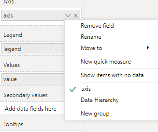
@Vetex_steven , In both cases, I am not able so anything for value in the visual. Also in case of the date you have the option choose Date or Date Hierarchy. Right-click on the name in visual panel
- Mark as New
- Bookmark
- Subscribe
- Mute
- Subscribe to RSS Feed
- Permalink
- Report Inappropriate Content
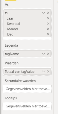
Because you have added two columns (tagValue and ts) to the axis field. You can remove TagValue from the X-axis field and add a measure or decimal/whole number column to the value field. By default, date hierarchy is enabled so you will see Year level data. You can drill down to the next level to see QTR, monthly data.
https://docs.microsoft.com/en-us/power-bi/consumer/end-user-drill
Did I answer your question? Mark my post as a solution!
Appreciate with a kudos 🙂
- Mark as New
- Bookmark
- Subscribe
- Mute
- Subscribe to RSS Feed
- Permalink
- Report Inappropriate Content
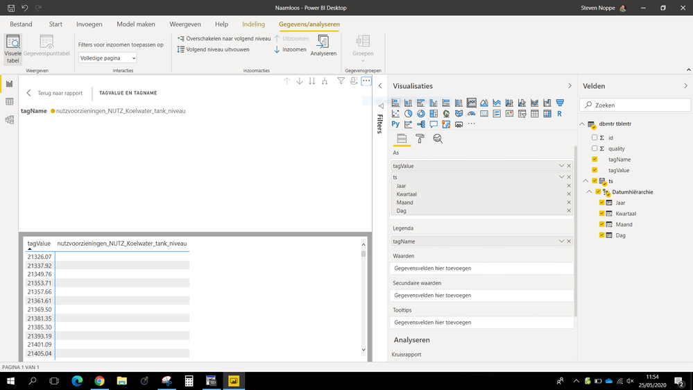
I removed the "tagValue" from the X-axis, but still nothing 😞
see attachment,
but I do understand now what "drilling" is 🙂
- Mark as New
- Bookmark
- Subscribe
- Mute
- Subscribe to RSS Feed
- Permalink
- Report Inappropriate Content
@Vetex_steven You have to add column/measure into the value field.
Did I answer your question? Mark my post as a solution!
Appreciate with a kudos 🙂
- Mark as New
- Bookmark
- Subscribe
- Mute
- Subscribe to RSS Feed
- Permalink
- Report Inappropriate Content
When I add the "TagValue" into the Values, I anly get the "total of TagValues"
I do not find a way to change this
- Mark as New
- Bookmark
- Subscribe
- Mute
- Subscribe to RSS Feed
- Permalink
- Report Inappropriate Content
Hi @Vetex_steven ,
You will need Axis, legend, values fields and put the column to right field.
You can manage these fields by click the dropdown menu "V".
Best Regards,
Jay
Community Support Team _ Jay Wang
If this post helps, then please consider Accept it as the solution to help the other members find it more quickly.
- Mark as New
- Bookmark
- Subscribe
- Mute
- Subscribe to RSS Feed
- Permalink
- Report Inappropriate Content
hello,
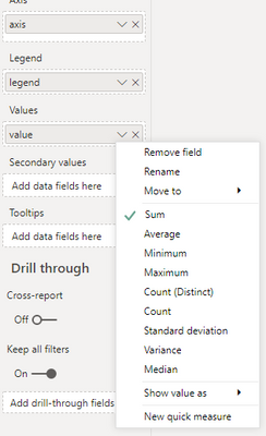
the problem is that when putting the column "tagvalues" in the values, it always shows me the sum of my "tagvalues" or the "count".
I cannot seem to visualize my "tagvalues" without Power BI doing a calculation on them.
edit : ok, now I understand : because I'm showing the multiple values over the course of 1 to 7 days, my only option is to show me the minimum, maximum or average value for that day!
But how do I show a line chart of the last few hours?
- Mark as New
- Bookmark
- Subscribe
- Mute
- Subscribe to RSS Feed
- Permalink
- Report Inappropriate Content
Hi @Vetex_steven ,
I'm not sure what you mean "show a line chart of the last few hours".
Is your axis column a date value or datatime value?
You want the axis show with hours instead of days? Or you have let's say 10 hours and you just want to show last 5 hours?
Best Regards,
Jay
- Mark as New
- Bookmark
- Subscribe
- Mute
- Subscribe to RSS Feed
- Permalink
- Report Inappropriate Content
hello,
my axis is a date/time value
all my values are stored each 5 seconds
I would like to show all these values in a line chart where I can choose between which time
eg between 5 am and 6 am
or zoom in more => 5:30 am and 6 am ....
- Mark as New
- Bookmark
- Subscribe
- Mute
- Subscribe to RSS Feed
- Permalink
- Report Inappropriate Content
Hi @Vetex_steven ,
You can add the datetime column to AXIS field.
Then create a new table as slicer.
Table 2 = DISTINCT('Table'[datetime])Since the min level of date range for the defult slicer is day, we need to create a measure as below and add it to visual level filter.
Measure = IF(SELECTEDVALUE('Table'[datetime])>=MIN('Table 2'[datetime])&&SELECTEDVALUE('Table'[datetime])<=MAX('Table 2'[datetime]),1,0)You will need to select two value in the slicer (min time and max time).
Best Regards,
Jay
Community Support Team _ Jay Wang
If this post helps, then please consider Accept it as the solution to help the other members find it more quickly.
Helpful resources

FabCon Global Hackathon
Join the Fabric FabCon Global Hackathon—running virtually through Nov 3. Open to all skill levels. $10,000 in prizes!

Power BI Monthly Update - October 2025
Check out the October 2025 Power BI update to learn about new features.

| User | Count |
|---|---|
| 85 | |
| 42 | |
| 30 | |
| 27 | |
| 27 |
