FabCon is coming to Atlanta
Join us at FabCon Atlanta from March 16 - 20, 2026, for the ultimate Fabric, Power BI, AI and SQL community-led event. Save $200 with code FABCOMM.
Register now!- Power BI forums
- Get Help with Power BI
- Desktop
- Service
- Report Server
- Power Query
- Mobile Apps
- Developer
- DAX Commands and Tips
- Custom Visuals Development Discussion
- Health and Life Sciences
- Power BI Spanish forums
- Translated Spanish Desktop
- Training and Consulting
- Instructor Led Training
- Dashboard in a Day for Women, by Women
- Galleries
- Data Stories Gallery
- Themes Gallery
- Contests Gallery
- QuickViz Gallery
- Quick Measures Gallery
- Visual Calculations Gallery
- Notebook Gallery
- Translytical Task Flow Gallery
- TMDL Gallery
- R Script Showcase
- Webinars and Video Gallery
- Ideas
- Custom Visuals Ideas (read-only)
- Issues
- Issues
- Events
- Upcoming Events
The Power BI Data Visualization World Championships is back! Get ahead of the game and start preparing now! Learn more
- Power BI forums
- Forums
- Get Help with Power BI
- Desktop
- Re: pie chart extracted values
- Subscribe to RSS Feed
- Mark Topic as New
- Mark Topic as Read
- Float this Topic for Current User
- Bookmark
- Subscribe
- Printer Friendly Page
- Mark as New
- Bookmark
- Subscribe
- Mute
- Subscribe to RSS Feed
- Permalink
- Report Inappropriate Content
pie chart extracted values
I have a dataset where each row is a survey response. In one of the columns, it is an answer to a question. Which the users can select more than one option, that is currently sepated by a semi-column (using the query editor).
What I'm trying to do is show a pie chart of the answers, and its treating the answers with multi-values as a unique answer, rather than splitting and counting as distinct individual values on the pie chart.
Is there a way to handle this?
e..g.
SurveyID | Answer
1 | Red; Yellow
2 | Yellow
3| Green; Red
4 | Yellow
The pie chart would show: Red = 2, Yellow = 3, Green = 1
Solved! Go to Solution.
- Mark as New
- Bookmark
- Subscribe
- Mute
- Subscribe to RSS Feed
- Permalink
- Report Inappropriate Content
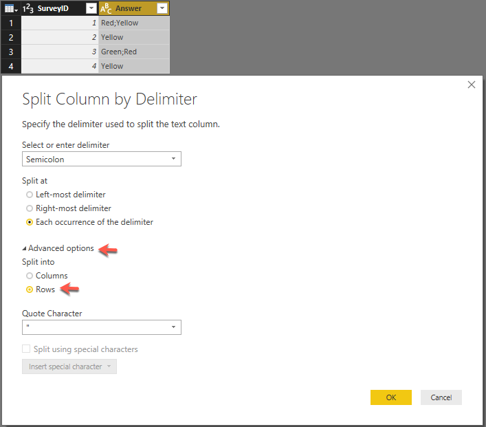
When you do the split, in the advanced options you should be able to split into rows:
The result should look like:
Now if you create a pie chart it should give you what you are looking for:
- Mark as New
- Bookmark
- Subscribe
- Mute
- Subscribe to RSS Feed
- Permalink
- Report Inappropriate Content
Pie chart will always aggregate the data on category level. So when you put Answer into Pie chart, it will count the number of Answers for different colors.
In your scenario, if you want to analysis data on each survey level, it's better to use other type of chart, like Column chart. You can put Survey on X-axis, and put Answer on Legend. Then use Count of Answers as Value.
Regards,
- Mark as New
- Bookmark
- Subscribe
- Mute
- Subscribe to RSS Feed
- Permalink
- Report Inappropriate Content
One of many options is you can right-click on the "Answer" column in the Query Editor and "Split Column -> By Delimiter...". In the "Advanced Options" split into "Rows". Make sure you Trim the column to remove the leading spaces. The resulting dataset should work well with the pie chart.
- Mark as New
- Bookmark
- Subscribe
- Mute
- Subscribe to RSS Feed
- Permalink
- Report Inappropriate Content
Split column is disabled on this column. Right now each row redners in Query Editor as "[List]".
I can extract values and do as 'colon'. Then Ican split. But it creates a new column with ".1" and ".2". I'm guessing if there are more mutliple selections you'd get more of these too.
Then when I try to use both columns in the pie chart. I drag both columns onto legend and both as counts onto values. but as not all columns have values, it shows a count on some blank. If I try an do an advanced filter. ANd "is not blank" it removes rows from pie chart.
How do I do this properly so it shows all?
- Mark as New
- Bookmark
- Subscribe
- Mute
- Subscribe to RSS Feed
- Permalink
- Report Inappropriate Content
When you do the split, in the advanced options you should be able to split into rows:
The result should look like:
Now if you create a pie chart it should give you what you are looking for:
Helpful resources

Power BI Dataviz World Championships
The Power BI Data Visualization World Championships is back! Get ahead of the game and start preparing now!

| User | Count |
|---|---|
| 38 | |
| 36 | |
| 33 | |
| 32 | |
| 28 |
| User | Count |
|---|---|
| 129 | |
| 88 | |
| 79 | |
| 68 | |
| 63 |


