Join us at FabCon Vienna from September 15-18, 2025
The ultimate Fabric, Power BI, SQL, and AI community-led learning event. Save €200 with code FABCOMM.
Get registered- Power BI forums
- Get Help with Power BI
- Desktop
- Service
- Report Server
- Power Query
- Mobile Apps
- Developer
- DAX Commands and Tips
- Custom Visuals Development Discussion
- Health and Life Sciences
- Power BI Spanish forums
- Translated Spanish Desktop
- Training and Consulting
- Instructor Led Training
- Dashboard in a Day for Women, by Women
- Galleries
- Data Stories Gallery
- Themes Gallery
- Contests Gallery
- Quick Measures Gallery
- Notebook Gallery
- Translytical Task Flow Gallery
- TMDL Gallery
- R Script Showcase
- Webinars and Video Gallery
- Ideas
- Custom Visuals Ideas (read-only)
- Issues
- Issues
- Events
- Upcoming Events
Compete to become Power BI Data Viz World Champion! First round ends August 18th. Get started.
- Power BI forums
- Forums
- Get Help with Power BI
- Desktop
- overlapping scatter charts to display border of di...
- Subscribe to RSS Feed
- Mark Topic as New
- Mark Topic as Read
- Float this Topic for Current User
- Bookmark
- Subscribe
- Printer Friendly Page
- Mark as New
- Bookmark
- Subscribe
- Mute
- Subscribe to RSS Feed
- Permalink
- Report Inappropriate Content
overlapping scatter charts to display border of different colours
I want to add a border of a different colour (based on another dimension) to shape in a scatter plot. This cannot be curerntly done in power bi, so I thought of a work around.
I will make one scatter plot, and set its size of 1:4.
I made another scatter plot visual, whose size is 2x value in the above plot.
I planned to overlap them, so that the larger shapes would overlap the smaller shapes, thus creating a halo around the smaller shape. Then I can colour the halo by category.
Unfortunately, this does not work, and the shape sizes are identical when I overlap them.
Any suggestions on a possible work around?
here is my data:
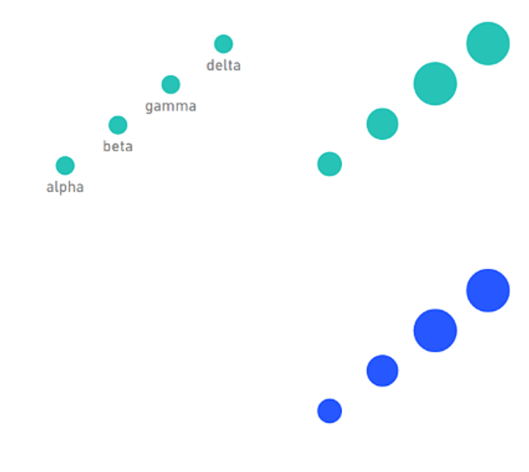
here is what each look like when I plot
1- labels on, default size
2- labels with size
3- labels with size2
here is what it looks like when i overlap 1 on top of 2 - which is good
here is what it looks like when i overlap 2 on top of 3 - which is not good
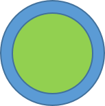
what i want is to be able to have the plot 2 on top of 3, and have the halo of 3 surrounding 2, like this (made in ppt)
Any suggestions?
Solved! Go to Solution.
- Mark as New
- Bookmark
- Subscribe
- Mute
- Subscribe to RSS Feed
- Permalink
- Report Inappropriate Content
Hi @ahuhn
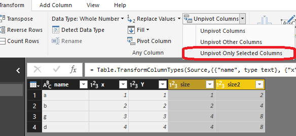
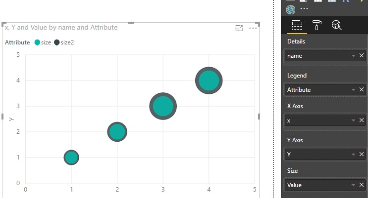
You may use 'Unpivot Columns' in Query Editor first. Then you may create the visual as requested. Here is the sample file for your reference.
Regards,
Cherie
If this post helps, then please consider Accept it as the solution to help the other members find it more quickly.


