FabCon is coming to Atlanta
Join us at FabCon Atlanta from March 16 - 20, 2026, for the ultimate Fabric, Power BI, AI and SQL community-led event. Save $200 with code FABCOMM.
Register now!- Power BI forums
- Get Help with Power BI
- Desktop
- Service
- Report Server
- Power Query
- Mobile Apps
- Developer
- DAX Commands and Tips
- Custom Visuals Development Discussion
- Health and Life Sciences
- Power BI Spanish forums
- Translated Spanish Desktop
- Training and Consulting
- Instructor Led Training
- Dashboard in a Day for Women, by Women
- Galleries
- Data Stories Gallery
- Themes Gallery
- Contests Gallery
- Quick Measures Gallery
- Notebook Gallery
- Translytical Task Flow Gallery
- TMDL Gallery
- R Script Showcase
- Webinars and Video Gallery
- Ideas
- Custom Visuals Ideas (read-only)
- Issues
- Issues
- Events
- Upcoming Events
Calling all Data Engineers! Fabric Data Engineer (Exam DP-700) live sessions are back! Starting October 16th. Sign up.
- Power BI forums
- Forums
- Get Help with Power BI
- Desktop
- measures in a table/matrix
- Subscribe to RSS Feed
- Mark Topic as New
- Mark Topic as Read
- Float this Topic for Current User
- Bookmark
- Subscribe
- Printer Friendly Page
- Mark as New
- Bookmark
- Subscribe
- Mute
- Subscribe to RSS Feed
- Permalink
- Report Inappropriate Content
measures in a table/matrix
Hi,
I am a student currently doing a work placement. I have been tasked with creating a visual based on the clients needs they would like this to be in the form of a matrix. I have been able to create the measures required to achieve this but am currently struggling with being able to visualise it the way they have asked.
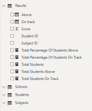
Field List:
Calculated columns :
Measures:
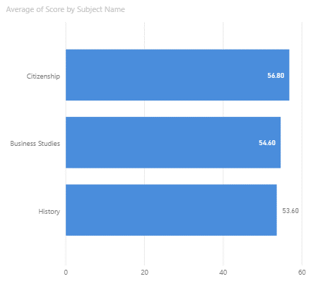
Here is an example of a chart I already have which shows the average score for each subject across all schools.
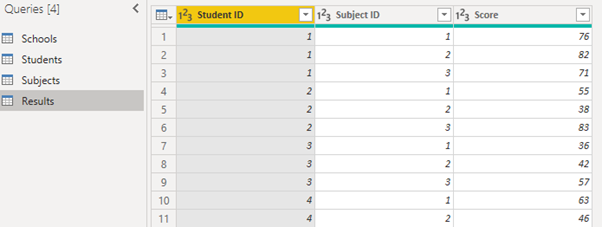
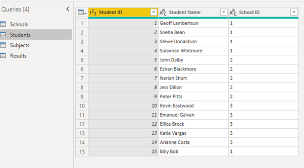
Below are the tables I have for my dataset:
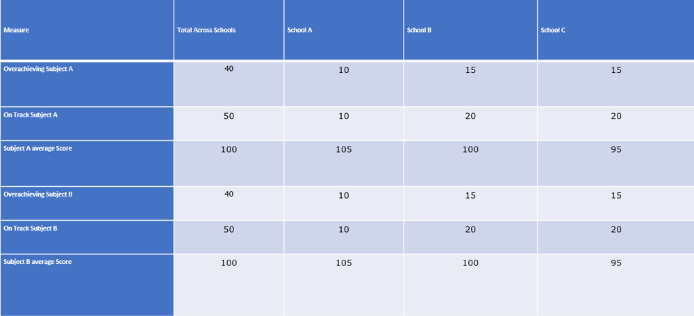
Below is an example of how they would like the outcome to be presented which I am struggling with:
- Mark as New
- Bookmark
- Subscribe
- Mute
- Subscribe to RSS Feed
- Permalink
- Report Inappropriate Content
Hi @Anonymous ,
Based on your description and sample data, not certain what is your expected output.
In your datasets, there are only 4 students from school A, what about others? Have you created relationships between these tables?
Could you please consider sharing more details about this issue or a sample file for further discussion?
In addtion, if you want to use a matrix to show the result which is simliar with the last picture, I'm afraid you could not achieve this because measrue can not be used as rows / columns in matrix.
Best Regards,
Community Support Team _ Yingjie Li
If this post helps, then please consider Accept it as the solution to help the other members find it more quickly.
- Mark as New
- Bookmark
- Subscribe
- Mute
- Subscribe to RSS Feed
- Permalink
- Report Inappropriate Content
Have you set up the table relationships?
The visual you want is a matrix. What have you got so far?
Helpful resources

FabCon Global Hackathon
Join the Fabric FabCon Global Hackathon—running virtually through Nov 3. Open to all skill levels. $10,000 in prizes!

Power BI Monthly Update - September 2025
Check out the September 2025 Power BI update to learn about new features.

