FabCon is coming to Atlanta
Join us at FabCon Atlanta from March 16 - 20, 2026, for the ultimate Fabric, Power BI, AI and SQL community-led event. Save $200 with code FABCOMM.
Register now!- Power BI forums
- Get Help with Power BI
- Desktop
- Service
- Report Server
- Power Query
- Mobile Apps
- Developer
- DAX Commands and Tips
- Custom Visuals Development Discussion
- Health and Life Sciences
- Power BI Spanish forums
- Translated Spanish Desktop
- Training and Consulting
- Instructor Led Training
- Dashboard in a Day for Women, by Women
- Galleries
- Data Stories Gallery
- Themes Gallery
- Contests Gallery
- QuickViz Gallery
- Quick Measures Gallery
- Visual Calculations Gallery
- Notebook Gallery
- Translytical Task Flow Gallery
- TMDL Gallery
- R Script Showcase
- Webinars and Video Gallery
- Ideas
- Custom Visuals Ideas (read-only)
- Issues
- Issues
- Events
- Upcoming Events
The Power BI Data Visualization World Championships is back! Get ahead of the game and start preparing now! Learn more
- Power BI forums
- Forums
- Get Help with Power BI
- Desktop
- Re: measures do not work in line charts
- Subscribe to RSS Feed
- Mark Topic as New
- Mark Topic as Read
- Float this Topic for Current User
- Bookmark
- Subscribe
- Printer Friendly Page
- Mark as New
- Bookmark
- Subscribe
- Mute
- Subscribe to RSS Feed
- Permalink
- Report Inappropriate Content
measures do not work in line charts
Measures do not work in some charts. Line charts for example. Yet they do work in others. Scatter plots for example. Why the inconsistency? When will this be fixed?
- Mark as New
- Bookmark
- Subscribe
- Mute
- Subscribe to RSS Feed
- Permalink
- Report Inappropriate Content
Hi @friedcc,
What version of PBI are you using? And how are you setting up you line chart, this can happen due to context on your chart I have several charts with several measures and they all work not one that as error.
Regards,
Mfelix
Regards
Miguel Félix
Did I answer your question? Mark my post as a solution!
Proud to be a Super User!
Check out my blog: Power BI em Português- Mark as New
- Bookmark
- Subscribe
- Mute
- Subscribe to RSS Feed
- Permalink
- Report Inappropriate Content
I have two measures:
Meas **bleep** Total = CALCULATE ( SUM ( WM_FIELD[REC_RES]),
ALL ( WM_FIELD ),
WM_FIELD[DISC_DATE2] <= EARLIER (WM_FIELD[DISC_DATE2])
Meas Seq No = CALCULATE ( COUNTROWS(WM_FIELD),
FILTER ( ALLSELECTED ( WM_FIELD ), WM_FIELD[DISC_DATE2] <= MAX ( WM_FIELD[DISC_DATE2]) ))
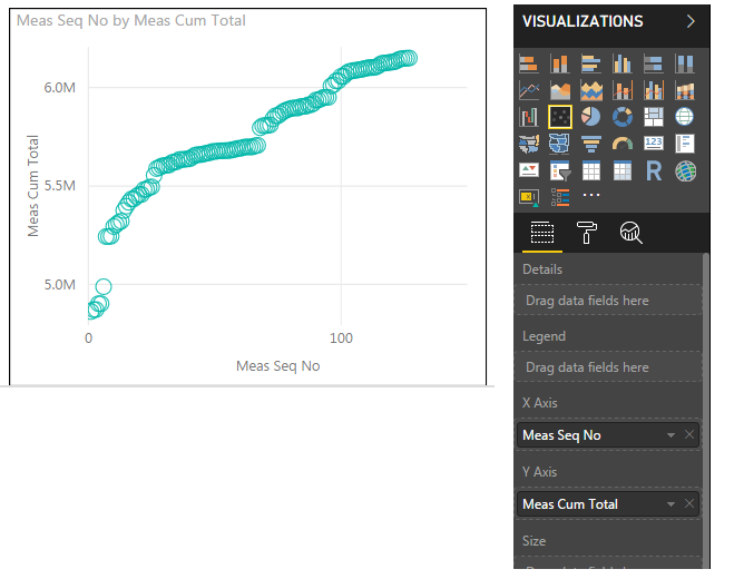
They *sometimes* work in scatter plots:
They never work in line charts (or bar charts, I have not all the other visualizations):

- Mark as New
- Bookmark
- Subscribe
- Mute
- Subscribe to RSS Feed
- Permalink
- Report Inappropriate Content
Hi @friedcc,
This is not a bug it's related with the type of charts you choose, on a line or column chart you need to select a column as your axis and a measure will no work, however since the scatter plots is a way to show correlation between two variables you are able to use the measures.
Depend on what you want to show and how.
Regards,
MFelix
Regards
Miguel Félix
Did I answer your question? Mark my post as a solution!
Proud to be a Super User!
Check out my blog: Power BI em Português- Mark as New
- Bookmark
- Subscribe
- Mute
- Subscribe to RSS Feed
- Permalink
- Report Inappropriate Content
So this is not a "bug" it is a "feature." Classic.
- Mark as New
- Bookmark
- Subscribe
- Mute
- Subscribe to RSS Feed
- Permalink
- Report Inappropriate Content
What do you exactly want to achieve? Can you give some sample data?
Maybe it's not a question of using the measures but the way you setup your data.
Regards,
MFelix
Regards
Miguel Félix
Did I answer your question? Mark my post as a solution!
Proud to be a Super User!
Check out my blog: Power BI em Português- Mark as New
- Bookmark
- Subscribe
- Mute
- Subscribe to RSS Feed
- Permalink
- Report Inappropriate Content
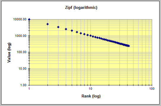
Below inserted is a small sample of data. I do not see anyway to attach a file here, so this is pretty limited. It should however be sufficient to demonstrate that Power BI cannot do what is needed. What is needed are charts like the following, which can be filtered to show the curve for different subsets of data. Here Value would be the Quantity, and Rank would be the Meas Seq number. That MUST be a measure, as when filters are applied, the data must be resequenced. In the past I have worked around PBI limitations by doing complex queries in SQL before importing to PBI. However in this case, with the requirement to resequence after filtering in PBI, that is not possible. So I guess we will have to stick with Excel, as it appears to me (at least with the PBI "feature" that measures can not be used in most charts) that Power BI is incapable of producing this chart 😞
Name	Meas Seq	Quantity	Meas Running Total	WD_CLASS	SortUniq
oven	1	154.42	154.42	Shallow water	1975012522869
driver	2	312.69	467.11	Shallow water	1975071722867
discussion	3	41.72	508.83	Shallow water	1976013122461
airport	4	34.53	543.36	Shallow water	1976052022460
fact	5	69.06	612.42	Deepwater	197708178551
payment	6	122.56	734.98	Deepwater	197708179382
two	7	5.37	740.35	Shallow water	1981051534692
product	8	107.01	847.36	Deepwater	198105189193
permission	9	231.99	1079.35	Deepwater	198105189396
disk	10	59.41	1138.76	Deepwater	198108048499
poem	11	77.86	1216.62	Deepwater	198108049392
attitude	12	4.7	1221.32	Deepwater	198110068471
garbage	13	154.62	1375.94	Deepwater	198310108463
maintenance	14	5.26	1381.2	Deepwater	1983122234607
youth	15	0.1	1381.3	Deepwater	198401278484
growth	16	1.47	1382.77	Deepwater	198401279397
ambition	17	53.49	1436.26	Deepwater	198404048447
accident	18	4.88	1441.14	Deepwater	198404208493
ad	19	3.98	1445.12	Deepwater	1984070622698
proposal	20	18.44	1463.56	Deepwater	198407148513
tale	21	4.88	1468.44	Deepwater	198411248544
importance	22	80.63	1549.07	Deepwater	198412078541
disease	23	100.63	1649.7	Deepwater	198502248532
location	24	0.26	1649.96	Deepwater	198504278474
ear	25	119.43	1769.39	Deepwater	198504278530
singer	26	258.55	2027.94	Deepwater	198505248533
conclusion	27	1.08	2029.02	Deepwater	198506029278
tea	28	7.64	2036.66	Deepwater	198507119402
poet	29	5.52	2042.18	Deepwater	1986021231032
context	30	5.88	2048.06	Deepwater	198603188458
woman	31	12.85	2060.91	Deepwater	198605048515
argument	32	153.4	2214.31	Ultra Deepwater	198702238516
addition	33	2.52	2216.83	Deepwater	198707238482
environment	34	5.84	2222.67	Deepwater	198708188535
performance	35	178.13	2400.8	Ultra Deepwater	198709078500
- Mark as New
- Bookmark
- Subscribe
- Mute
- Subscribe to RSS Feed
- Permalink
- Report Inappropriate Content
Hi @friedcc,
Clearly on your chart this is a scatter chart and not a line chart because you have a relation between the two axis.
What is the base of the ranking? What is the value you want to sum/average/count and the value (Log) is based on what column.
Regarding the adding files just put your files on Onedrive / Google drive / Wetranfer and add the link to the post.
regards
MFelix
Regards
Miguel Félix
Did I answer your question? Mark my post as a solution!
Proud to be a Super User!
Check out my blog: Power BI em Português- Mark as New
- Bookmark
- Subscribe
- Mute
- Subscribe to RSS Feed
- Permalink
- Report Inappropriate Content
Ok, here is a subset of sanitized data:
https://docs.google.com/spreadsheets/d/1AKjXhV8OGbhMF00GqLdP4y5SiFAJXGbx9H0ilVfMoU4/edit?usp=sharing
This was built in Excel, but Google docs appears to have converted that to Google's format. But there is a chart in that worksheet of a running total vs a sequence number. Both would be measures in Power BI, as they need to recalculate when the rows are filtered. Unfortunately, PBI charts do not work with measures for axis values. The PBI scatter plot visualization seems to accept them sometimes, although I find that is not consistent.
What use are measures if you can't use them in visualizations?
Clearly this seems to be a bug, as it is not documented anywhere that I can find, and there is no error or warning message when attempts are made to use measures in visualizations. At this point, I can only conclude that PBI is not able to do what is needed, and we will have to leave this application in Excel. Sadly, that is more difficult to publish, and it is a reversal of our efforts to move to PBI for this kind of thing.
Thank you for any help you may be able to provide.
- Mark as New
- Bookmark
- Subscribe
- Mute
- Subscribe to RSS Feed
- Permalink
- Report Inappropriate Content
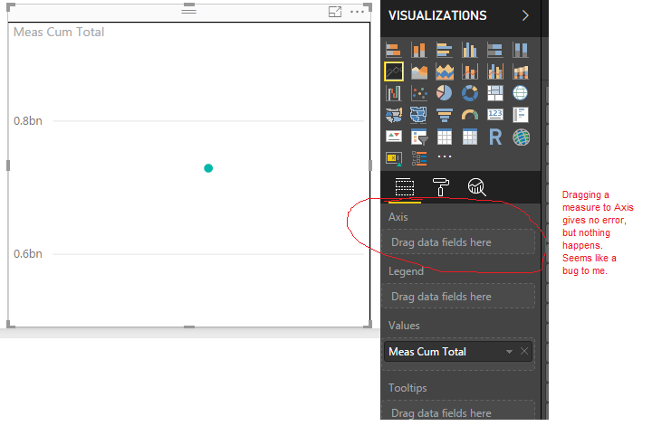
I just downloaded the Desktop January 2018 update. There is not much to setting up a line chart. I add a line chart to the report, then I try to drag and drop into the Axis and Values fields. If I drag a field or calculated column from a table into Axis, it works. If I drag a measure, nothing happens.
How can I change the "context" of a line chart?
Helpful resources

Power BI Dataviz World Championships
The Power BI Data Visualization World Championships is back! Get ahead of the game and start preparing now!

| User | Count |
|---|---|
| 41 | |
| 38 | |
| 36 | |
| 30 | |
| 28 |
| User | Count |
|---|---|
| 129 | |
| 88 | |
| 79 | |
| 68 | |
| 63 |


