Get certified for free when you join Fabric Data Days 2026 and dive into Fabric, Power BI, SQL, AI, and other essential data skills.
Join nowJuly 7 - July 17 | Round 2 of the Power BI Dataviz World Championships. Don't miss your chance! Learn more
Hi everyone,
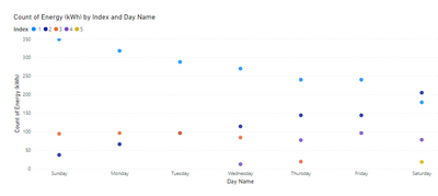
Does anyone here knows how to construct a scatter diagram using matplotlib, the expected output would be like this:
Is it possible to have a classification index added to the data ?
Ive tried with this code, however the graph is not showing up.
Please Help
Hi @Anonymous ,
Please refer to the following video about creating a scatter plot using Python visual Power BI to see if it helps you.
https://www.youtube.com/watch?v=me9aEpfSS0o
Best Regards
Community Support Team _ Polly
If this post helps, then please consider Accept it as the solution to help the other members find it more quickly
@Anonymous , You can add index in power query and then pass it python visual ?
https://stackoverflow.com/questions/45715963/creating-an-index-column-for-power-bi
ive tried indexing it but its not working as well
Join us in Barcelona for FabCon and SQLCon, the Fabric, Power BI, SQL, and AI community event. Save €200 with code FABCMTY200.
Join Data Days 2026: 60 days of free live/on-demand sessions, challenges, study groups, and certification opportunities.
| User | Count |
|---|---|
| 28 | |
| 23 | |
| 18 | |
| 18 | |
| 15 |
| User | Count |
|---|---|
| 47 | |
| 44 | |
| 43 | |
| 34 | |
| 30 |