FabCon is coming to Atlanta
Join us at FabCon Atlanta from March 16 - 20, 2026, for the ultimate Fabric, Power BI, AI and SQL community-led event. Save $200 with code FABCOMM.
Register now!- Power BI forums
- Get Help with Power BI
- Desktop
- Service
- Report Server
- Power Query
- Mobile Apps
- Developer
- DAX Commands and Tips
- Custom Visuals Development Discussion
- Health and Life Sciences
- Power BI Spanish forums
- Translated Spanish Desktop
- Training and Consulting
- Instructor Led Training
- Dashboard in a Day for Women, by Women
- Galleries
- Data Stories Gallery
- Themes Gallery
- Contests Gallery
- QuickViz Gallery
- Quick Measures Gallery
- Visual Calculations Gallery
- Notebook Gallery
- Translytical Task Flow Gallery
- TMDL Gallery
- R Script Showcase
- Webinars and Video Gallery
- Ideas
- Custom Visuals Ideas (read-only)
- Issues
- Issues
- Events
- Upcoming Events
The Power BI Data Visualization World Championships is back! Get ahead of the game and start preparing now! Learn more
- Power BI forums
- Forums
- Get Help with Power BI
- Desktop
- line graph display
- Subscribe to RSS Feed
- Mark Topic as New
- Mark Topic as Read
- Float this Topic for Current User
- Bookmark
- Subscribe
- Printer Friendly Page
- Mark as New
- Bookmark
- Subscribe
- Mute
- Subscribe to RSS Feed
- Permalink
- Report Inappropriate Content
line graph display
hi
i have a line graph showing data for entire last year and current year 2 months but my current year data is displaying in right side
i am looking for data to be displayed left side below jan 2020 i want jan 2021.
Solved! Go to Solution.
- Mark as New
- Bookmark
- Subscribe
- Mute
- Subscribe to RSS Feed
- Permalink
- Report Inappropriate Content
Hi @Anonymous,
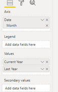
You can use date hieracrchy as:
Here is the output:
Best Regards,
Link
- Mark as New
- Bookmark
- Subscribe
- Mute
- Subscribe to RSS Feed
- Permalink
- Report Inappropriate Content
@Anonymous
Did you create a calendar table that connected with your Data table ? If no , then you need to create it. You can find million scripts to create it , if you can't find any let me know.
Then connect calendar table with your "Date" field as a key with your data table.
Then Create a measure for current year : Revenue_CY = Sum(gross_sales)
For LY you need to create a measure like this : Revenue_LY = Calculate(Revenue_CY ,sameaslastperiod(calendar[date])) or Revenue_LY = Calculate(Revenue_CY ,dateadd(calendar[date],-1,Year))
Hope that can work for you as worked for me.
Don't forget to give thumbs up 👍and accept this as a solution if it helped you.
- Mark as New
- Bookmark
- Subscribe
- Mute
- Subscribe to RSS Feed
- Permalink
- Report Inappropriate Content
Hi @Anonymous,
You can use date hieracrchy as:
Here is the output:
Best Regards,
Link
- Mark as New
- Bookmark
- Subscribe
- Mute
- Subscribe to RSS Feed
- Permalink
- Report Inappropriate Content
You need to use common Axis X for both lines. Make a chart with 2021 line only. Then create a measure for last year data (it must return Jan 2020 value if selected period is Jan 2021 and so on, you can use https://docs.microsoft.com/en-us/dax/sameperiodlastyear-function-dax) and use this measure for your second line.
Helpful resources

Power BI Dataviz World Championships
The Power BI Data Visualization World Championships is back! Get ahead of the game and start preparing now!

| User | Count |
|---|---|
| 37 | |
| 37 | |
| 33 | |
| 32 | |
| 29 |
| User | Count |
|---|---|
| 130 | |
| 88 | |
| 82 | |
| 68 | |
| 64 |


