FabCon is coming to Atlanta
Join us at FabCon Atlanta from March 16 - 20, 2026, for the ultimate Fabric, Power BI, AI and SQL community-led event. Save $200 with code FABCOMM.
Register now!- Power BI forums
- Get Help with Power BI
- Desktop
- Service
- Report Server
- Power Query
- Mobile Apps
- Developer
- DAX Commands and Tips
- Custom Visuals Development Discussion
- Health and Life Sciences
- Power BI Spanish forums
- Translated Spanish Desktop
- Training and Consulting
- Instructor Led Training
- Dashboard in a Day for Women, by Women
- Galleries
- Data Stories Gallery
- Themes Gallery
- Contests Gallery
- QuickViz Gallery
- Quick Measures Gallery
- Visual Calculations Gallery
- Notebook Gallery
- Translytical Task Flow Gallery
- TMDL Gallery
- R Script Showcase
- Webinars and Video Gallery
- Ideas
- Custom Visuals Ideas (read-only)
- Issues
- Issues
- Events
- Upcoming Events
The Power BI Data Visualization World Championships is back! Get ahead of the game and start preparing now! Learn more
- Power BI forums
- Forums
- Get Help with Power BI
- Desktop
- Re: line chart/KPI disappears while selecting filt...
- Subscribe to RSS Feed
- Mark Topic as New
- Mark Topic as Read
- Float this Topic for Current User
- Bookmark
- Subscribe
- Printer Friendly Page
- Mark as New
- Bookmark
- Subscribe
- Mute
- Subscribe to RSS Feed
- Permalink
- Report Inappropriate Content
line chart/KPI disappears while selecting filter
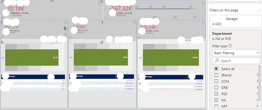
I have the below Visualization in Power BI Desktop.
When I apply filter at page level then the line chart disappears except one. All the line charts have forecasting. Is there any way/setting to handle this blank line charts.
NOTE: I have another page in this visualization in which KPI is going blank
Before applying Filter
After applying Filter
Solved! Go to Solution.
- Mark as New
- Bookmark
- Subscribe
- Mute
- Subscribe to RSS Feed
- Permalink
- Report Inappropriate Content
Hi @Anonymous ,
What do you mean by:
Is there any way/setting to handle this blank line charts.
The charts are base on the the information you have so for those filtered values probably there is no information.
Regards
Miguel Félix
Did I answer your question? Mark my post as a solution!
Proud to be a Super User!
Check out my blog: Power BI em Português- Mark as New
- Bookmark
- Subscribe
- Mute
- Subscribe to RSS Feed
- Permalink
- Report Inappropriate Content
Yes @MFelix, I do know that there is no information for the filtered value but is there any handling for the charts from going disapear.
- Mark as New
- Bookmark
- Subscribe
- Mute
- Subscribe to RSS Feed
- Permalink
- Report Inappropriate Content
Hi @Anonymous ,
The chart didn't disappeard the the result is blank.
My questions is do you want to have the line with all the values so no matter the filter changes you always get the same chart or you just want to show that there is a chart in that area?
I believe this is more a visual problem correct? you don't want that space empty?
Regards
Miguel Félix
Did I answer your question? Mark my post as a solution!
Proud to be a Super User!
Check out my blog: Power BI em Português- Mark as New
- Bookmark
- Subscribe
- Mute
- Subscribe to RSS Feed
- Permalink
- Report Inappropriate Content
Yes @MFelix, If some value is filtered and there is no value/data in the chart/KPI, i would like to see zero but the visual shouldn't disappear or appear empty.
- Mark as New
- Bookmark
- Subscribe
- Mute
- Subscribe to RSS Feed
- Permalink
- Report Inappropriate Content
Hi @Anonymous ,
In this case you need to make the use of a measure, that way you can influence the result.
Don't know what is your setup and if you are using a column from your model or a measure if you have a measure like this:
Total = SUM(Table[column])This will show blanks if there aren't any values if you change your measure to:
Total = SUM(Table[column]) + 0
This will return 0 instead of blanks.
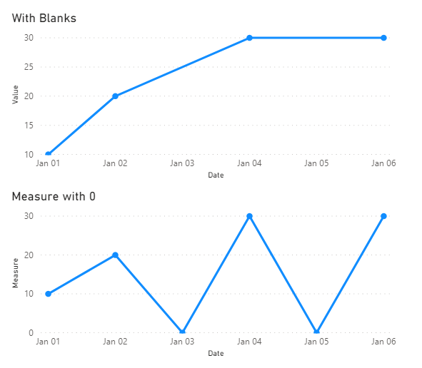
But be aware using this will affect all the visualization so looking at your chart if you have a continuous line because some values are blank abnd when you place it on the they don't show if you use the +0 then you will show those value look at the image below to better see what I mean.
This can be overcome maybe using a measure that checks if all your values are blank:
Total with blanks =
IF (
    CALCULATE ( SUM ( 'Table'[Value] ); ALLSELECTED ( 'Table'[CAT] ) ) = BLANK ();
    SUM ( 'Table'[Value] ) + 0;
    SUM ( 'Table'[Value] )
)
As you can see below when I select two values that are blank the chart show a row with 0.
Check PBIX attach so you can play around. (don't mind the formatting of the axis is just to show the value
Regards
Miguel Félix
Did I answer your question? Mark my post as a solution!
Proud to be a Super User!
Check out my blog: Power BI em PortuguêsHelpful resources

Power BI Dataviz World Championships
The Power BI Data Visualization World Championships is back! Get ahead of the game and start preparing now!

| User | Count |
|---|---|
| 37 | |
| 37 | |
| 33 | |
| 32 | |
| 29 |
| User | Count |
|---|---|
| 130 | |
| 88 | |
| 82 | |
| 68 | |
| 64 |


