Join us at FabCon Vienna from September 15-18, 2025
The ultimate Fabric, Power BI, SQL, and AI community-led learning event. Save €200 with code FABCOMM.
Get registered- Power BI forums
- Get Help with Power BI
- Desktop
- Service
- Report Server
- Power Query
- Mobile Apps
- Developer
- DAX Commands and Tips
- Custom Visuals Development Discussion
- Health and Life Sciences
- Power BI Spanish forums
- Translated Spanish Desktop
- Training and Consulting
- Instructor Led Training
- Dashboard in a Day for Women, by Women
- Galleries
- Data Stories Gallery
- Themes Gallery
- Contests Gallery
- Quick Measures Gallery
- Notebook Gallery
- Translytical Task Flow Gallery
- TMDL Gallery
- R Script Showcase
- Webinars and Video Gallery
- Ideas
- Custom Visuals Ideas (read-only)
- Issues
- Issues
- Events
- Upcoming Events
Enhance your career with this limited time 50% discount on Fabric and Power BI exams. Ends August 31st. Request your voucher.
- Power BI forums
- Forums
- Get Help with Power BI
- Desktop
- Re: Line charts showing the last 6 months by date
- Subscribe to RSS Feed
- Mark Topic as New
- Mark Topic as Read
- Float this Topic for Current User
- Bookmark
- Subscribe
- Printer Friendly Page
- Mark as New
- Bookmark
- Subscribe
- Mute
- Subscribe to RSS Feed
- Permalink
- Report Inappropriate Content
last 6 months by date
I have line charts that I want to show the last 6 months based on the date filter. how can I do that?
- Mark as New
- Bookmark
- Subscribe
- Mute
- Subscribe to RSS Feed
- Permalink
- Report Inappropriate Content
Hi, @sonya7
You can try the following methods.
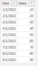
Sample data:
Create a new date table as a slicer.
Date table:
Date = CALENDAR(MIN('Table'[Date]),MAX('Table'[Date]))Measure =
Var Maxdate=SELECTEDVALUE('Date'[Date])
Var Mindate=eomonth(Maxdate, -6)
return
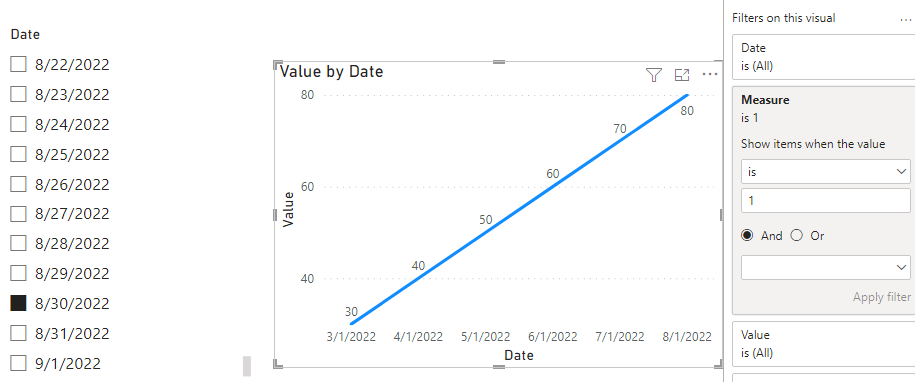
IF(SELECTEDVALUE('Table'[Date])>=Mindate&&SELECTEDVALUE('Table'[Date])<=Maxdate,1,0)Put the measure in the line chart and set equal to 1.
Is this the result you expect?
Best Regards,
Community Support Team _Charlotte
If this post helps, then please consider Accept it as the solution to help the other members find it more quickly.
- Mark as New
- Bookmark
- Subscribe
- Mute
- Subscribe to RSS Feed
- Permalink
- Report Inappropriate Content
it worked but why is it showing more than 6 months months? a metric is required to give the last 6 months of that year
- Mark as New
- Bookmark
- Subscribe
- Mute
- Subscribe to RSS Feed
- Permalink
- Report Inappropriate Content
@sonya7 , If you want select a date and then want to show 6 month data, the slicer needs to be on an independent date table
example
//Date1 is independent Date table, Date is joined with Table
new measure =
var _max = maxx(allselected(Date1),Date1[Date])
var _min = eomonth(_max, -6) +1
return
calculate( sum(Table[Value]), filter('Date', 'Date'[Date] >=_min && 'Date'[Date] <=_max))
Need of an Independent Date Table:https://www.youtube.com/watch?v=44fGGmg9fHI
Helpful resources
| User | Count |
|---|---|
| 77 | |
| 76 | |
| 36 | |
| 31 | |
| 29 |
| User | Count |
|---|---|
| 93 | |
| 79 | |
| 57 | |
| 48 | |
| 48 |


