FabCon is coming to Atlanta
Join us at FabCon Atlanta from March 16 - 20, 2026, for the ultimate Fabric, Power BI, AI and SQL community-led event. Save $200 with code FABCOMM.
Register now!- Power BI forums
- Get Help with Power BI
- Desktop
- Service
- Report Server
- Power Query
- Mobile Apps
- Developer
- DAX Commands and Tips
- Custom Visuals Development Discussion
- Health and Life Sciences
- Power BI Spanish forums
- Translated Spanish Desktop
- Training and Consulting
- Instructor Led Training
- Dashboard in a Day for Women, by Women
- Galleries
- Data Stories Gallery
- Themes Gallery
- Contests Gallery
- Quick Measures Gallery
- Notebook Gallery
- Translytical Task Flow Gallery
- TMDL Gallery
- R Script Showcase
- Webinars and Video Gallery
- Ideas
- Custom Visuals Ideas (read-only)
- Issues
- Issues
- Events
- Upcoming Events
Calling all Data Engineers! Fabric Data Engineer (Exam DP-700) live sessions are back! Starting October 16th. Sign up.
- Power BI forums
- Forums
- Get Help with Power BI
- Desktop
- Re: how to modify hierarchy name in Tool tip
- Subscribe to RSS Feed
- Mark Topic as New
- Mark Topic as Read
- Float this Topic for Current User
- Bookmark
- Subscribe
- Printer Friendly Page
- Mark as New
- Bookmark
- Subscribe
- Mute
- Subscribe to RSS Feed
- Permalink
- Report Inappropriate Content
how to modify hierarchy name in Tool tip
Good day all,
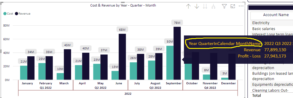
I have a heirarchy for date. when i put it in barchart, it shows me long format in the tool tip as in the below pic.
How can i shorten this so it doesn't look that ugly. How can i modify it?
I appreciate your support
Solved! Go to Solution.
- Mark as New
- Bookmark
- Subscribe
- Mute
- Subscribe to RSS Feed
- Permalink
- Report Inappropriate Content
Hi @Anonymous
After testing, there is no way to modify the elements’ name of this date hierarchy in x-axis
You might try the following ways:
Display the x-axis as dates only
Then create a measure:
Year&Qr&Mon = CONCATENATE(SELECTEDVALUE('Table'[Datemoodod].[Year])," "&QUARTER(SELECTEDVALUE('Table'[Datemoodod]))&" "&MONTH(SELECTEDVALUE('Table'[Datemoodod])))
Place the measure in tooltips
Best Regards,
Yolo Zhu
If this post helps, then please consider Accept it as the solution to help the other members find it more quickly.
- Mark as New
- Bookmark
- Subscribe
- Mute
- Subscribe to RSS Feed
- Permalink
- Report Inappropriate Content
Hi,
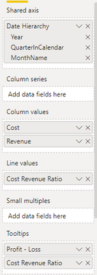
this field is not in the Tool Tip. kindly check below
Thanks.
- Mark as New
- Bookmark
- Subscribe
- Mute
- Subscribe to RSS Feed
- Permalink
- Report Inappropriate Content
Hi @Anonymous
After testing, there is no way to modify the elements’ name of this date hierarchy in x-axis
You might try the following ways:
Display the x-axis as dates only
Then create a measure:
Year&Qr&Mon = CONCATENATE(SELECTEDVALUE('Table'[Datemoodod].[Year])," "&QUARTER(SELECTEDVALUE('Table'[Datemoodod]))&" "&MONTH(SELECTEDVALUE('Table'[Datemoodod])))
Place the measure in tooltips
Best Regards,
Yolo Zhu
If this post helps, then please consider Accept it as the solution to help the other members find it more quickly.
- Mark as New
- Bookmark
- Subscribe
- Mute
- Subscribe to RSS Feed
- Permalink
- Report Inappropriate Content
Hi Yolo, thank you for taking the time.
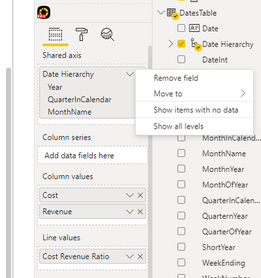
I do not have renaming option since this is a hierarchy, please check the below
- Mark as New
- Bookmark
- Subscribe
- Mute
- Subscribe to RSS Feed
- Permalink
- Report Inappropriate Content
Hi @Anonymous ,
You can change the field name, please refer to the following picture.
Best Regards,
Yolo Zhu
If this post helps, then please consider Accept it as the solution to help the other members find it more quickly.


