Become a Certified Power BI Data Analyst!
Join us for an expert-led overview of the tools and concepts you'll need to pass exam PL-300. The first session starts on June 11th. See you there!
Get registered- Power BI forums
- Get Help with Power BI
- Desktop
- Service
- Report Server
- Power Query
- Mobile Apps
- Developer
- DAX Commands and Tips
- Custom Visuals Development Discussion
- Health and Life Sciences
- Power BI Spanish forums
- Translated Spanish Desktop
- Training and Consulting
- Instructor Led Training
- Dashboard in a Day for Women, by Women
- Galleries
- Webinars and Video Gallery
- Data Stories Gallery
- Themes Gallery
- Contests Gallery
- Quick Measures Gallery
- Notebook Gallery
- Translytical Task Flow Gallery
- R Script Showcase
- Ideas
- Custom Visuals Ideas (read-only)
- Issues
- Issues
- Events
- Upcoming Events
Power BI is turning 10! Let’s celebrate together with dataviz contests, interactive sessions, and giveaways. Register now.
- Power BI forums
- Forums
- Get Help with Power BI
- Desktop
- how to add the percentage line(trend line) to bar ...
- Subscribe to RSS Feed
- Mark Topic as New
- Mark Topic as Read
- Float this Topic for Current User
- Bookmark
- Subscribe
- Printer Friendly Page
- Mark as New
- Bookmark
- Subscribe
- Mute
- Subscribe to RSS Feed
- Permalink
- Report Inappropriate Content
how to add the percentage line(trend line) to bar chart?
Hi Gurus,
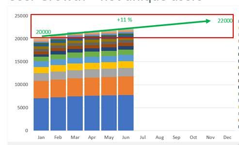
Need your help. Could you please let me know how to add a percentage line to my bar chart? I am newbie to Power BI. thanks for your support. Attaching the screen shot of the image which I would like to replicate.
Thanks for your time and help.
Regards,
Ratish
- Mark as New
- Bookmark
- Subscribe
- Mute
- Subscribe to RSS Feed
- Permalink
- Report Inappropriate Content
Hi @Anonymous
if you use clustered column chart, you could add a trend line as below, then add a shape "arrow" on the line.
Based on test, stacked column chart doesn't support add a trend line like this.
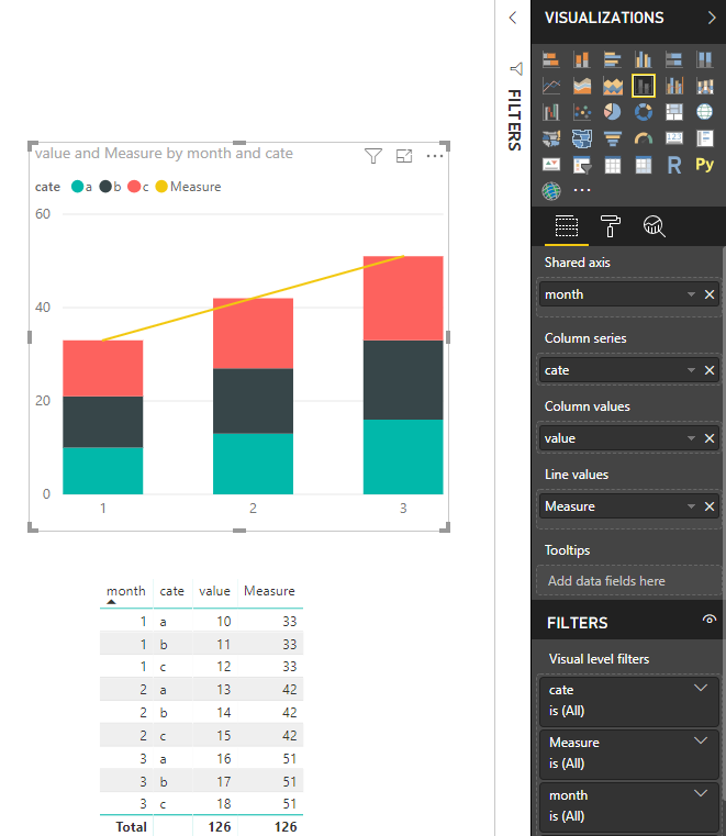
If you have to use stacked bar chart, here is a workaround.
use Line and Stacked column chart instead, assume you have such dataset,
create a measure, add this measure to the "Line Values"
Measure = CALCULATE(SUM(Sheet1[value]),ALLEXCEPT(Sheet1,Sheet1[month]))
Best Regards
Maggie
“
Community Support Team _ Maggie Li
If this post helps, then please consider Accept it as the solution to help the other members find it more quickly.
“
- Mark as New
- Bookmark
- Subscribe
- Mute
- Subscribe to RSS Feed
- Permalink
- Report Inappropriate Content
Hi Maggie,
Thanks for your reply and help, it surely helped, I also want the percentage to be displayed. Like every month a percent value on top of the line should be seen.
For this I might have to create a new measure is it?
Thanks & Regards,
Ratish
Helpful resources
| User | Count |
|---|---|
| 84 | |
| 78 | |
| 70 | |
| 46 | |
| 42 |
| User | Count |
|---|---|
| 106 | |
| 50 | |
| 49 | |
| 40 | |
| 40 |


