Fabric Data Days starts November 4th!
Advance your Data & AI career with 50 days of live learning, dataviz contests, hands-on challenges, study groups & certifications and more!
Get registered- Power BI forums
- Get Help with Power BI
- Desktop
- Service
- Report Server
- Power Query
- Mobile Apps
- Developer
- DAX Commands and Tips
- Custom Visuals Development Discussion
- Health and Life Sciences
- Power BI Spanish forums
- Translated Spanish Desktop
- Training and Consulting
- Instructor Led Training
- Dashboard in a Day for Women, by Women
- Galleries
- Data Stories Gallery
- Themes Gallery
- Contests Gallery
- QuickViz Gallery
- Quick Measures Gallery
- Visual Calculations Gallery
- Notebook Gallery
- Translytical Task Flow Gallery
- TMDL Gallery
- R Script Showcase
- Webinars and Video Gallery
- Ideas
- Custom Visuals Ideas (read-only)
- Issues
- Issues
- Events
- Upcoming Events
Get Fabric Certified for FREE during Fabric Data Days. Don't miss your chance! Request now
- Power BI forums
- Forums
- Get Help with Power BI
- Desktop
- graph count of value after math
- Subscribe to RSS Feed
- Mark Topic as New
- Mark Topic as Read
- Float this Topic for Current User
- Bookmark
- Subscribe
- Printer Friendly Page
- Mark as New
- Bookmark
- Subscribe
- Mute
- Subscribe to RSS Feed
- Permalink
- Report Inappropriate Content
graph count of value after math
Hello again,
This is my second time posting this questions, after the first one kicked me out when posting. I'm very new to Power Bi and Dax is completely foregn to me. I'm not sure how to properly ask this question other than by explaining what I am trying to do.
Okay. I have multiple customers (A, B, C), that purchased mutliple products (X, Y, Z), in different months (Jan 2020, Feb 2020, etc), and each customer has a non-return rate (0.8, 0.85, 0.9) that the product and date have no impact on. I would like to graph the non-return rate for each customer by product by month.
Below is some sample data. In this example. Customer A bought 10 X product in January 2020. They have a non-return rate of 0.8, and therefore I would expect them to return 2 of the 10 I sent them. I would like to graph the 8, that I sent them. I would like to do this for all the products and each month. I for the life of me can't search the right terms to figure this out.
Thanks in advance, a frustrated Bi beginner.
| Customer | Date | Product | Non-Return Rate |
| A | 1/1/20 | X | 0.8 |
| A | 1/1/20 | X | 0.8 |
| A | 1/1/20 | X | 0.8 |
| A | 1/1/20 | X | 0.8 |
| A | 1/1/20 | X | 0.8 |
| A | 1/1/20 | X | 0.8 |
| A | 1/1/20 | X | 0.8 |
| A | 1/1/20 | X | 0.8 |
| A | 1/1/20 | X | 0.8 |
| A | 1/1/20 | X | 0.8 |
| A | 2/1/20 | X | 0.8 |
| A | 2/1/20 | Y | 0.8 |
| B | 1/1/20 | X | 0.85 |
| B | 1/1/20 | Z | 0.85 |
| C | 1/1/20 | X | 0.90 |
| C | 2/1/20 | Y | 0.90 |
Solved! Go to Solution.
- Mark as New
- Bookmark
- Subscribe
- Mute
- Subscribe to RSS Feed
- Permalink
- Report Inappropriate Content
Hi @erenner ,
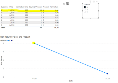
Based on your data believe that the return rate is always the same for each customer so you can do the following measure:
Non Return = COUNT('Table'[Product]) * AVERAGE('Table'[Non-Return Rate])
Be aware that now what comes into action is the way you build your chart. Has you can see in the table below you have a return rate of 8 for january product X customer A then if you select the value in a slicer the line chart returns the correct value.
Regards
Miguel Félix
Did I answer your question? Mark my post as a solution!
Proud to be a Super User!
Check out my blog: Power BI em Português- Mark as New
- Bookmark
- Subscribe
- Mute
- Subscribe to RSS Feed
- Permalink
- Report Inappropriate Content
Helpful resources

Fabric Data Days
Advance your Data & AI career with 50 days of live learning, contests, hands-on challenges, study groups & certifications and more!

Power BI Monthly Update - October 2025
Check out the October 2025 Power BI update to learn about new features.


