FabCon is coming to Atlanta
Join us at FabCon Atlanta from March 16 - 20, 2026, for the ultimate Fabric, Power BI, AI and SQL community-led event. Save $200 with code FABCOMM.
Register now!- Power BI forums
- Get Help with Power BI
- Desktop
- Service
- Report Server
- Power Query
- Mobile Apps
- Developer
- DAX Commands and Tips
- Custom Visuals Development Discussion
- Health and Life Sciences
- Power BI Spanish forums
- Translated Spanish Desktop
- Training and Consulting
- Instructor Led Training
- Dashboard in a Day for Women, by Women
- Galleries
- Data Stories Gallery
- Themes Gallery
- Contests Gallery
- QuickViz Gallery
- Quick Measures Gallery
- Visual Calculations Gallery
- Notebook Gallery
- Translytical Task Flow Gallery
- TMDL Gallery
- R Script Showcase
- Webinars and Video Gallery
- Ideas
- Custom Visuals Ideas (read-only)
- Issues
- Issues
- Events
- Upcoming Events
The Power BI Data Visualization World Championships is back! Get ahead of the game and start preparing now! Learn more
- Power BI forums
- Forums
- Get Help with Power BI
- Desktop
- gauge chart size
- Subscribe to RSS Feed
- Mark Topic as New
- Mark Topic as Read
- Float this Topic for Current User
- Bookmark
- Subscribe
- Printer Friendly Page
- Mark as New
- Bookmark
- Subscribe
- Mute
- Subscribe to RSS Feed
- Permalink
- Report Inappropriate Content
gauge chart size
Hello,
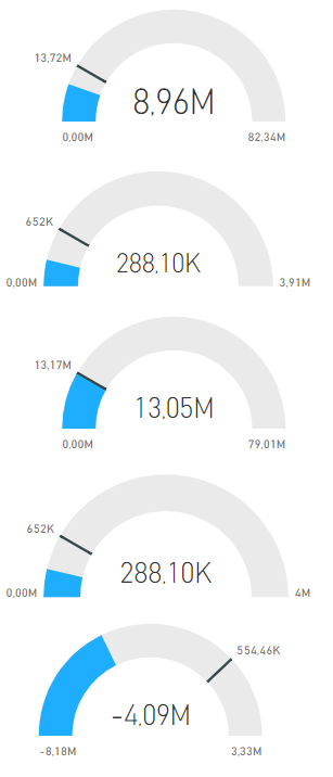
any way to make those the same size and postion? They are aligned in the general tab (both size and x axis), I changed different labels settings (target value and value in the middle of the chart), but didnt manage to allign them.
The issue is minimum and maximum that are shown either under the chart or next to it. Any way to set that? Maximum value is dynamic depening on data and filters and such, so it will change a lot
Solved! Go to Solution.
- Mark as New
- Bookmark
- Subscribe
- Mute
- Subscribe to RSS Feed
- Permalink
- Report Inappropriate Content
@Anonymous,
any way to make those the same size and postion? They are aligned in the general tab (both size and x axis), I changed different labels settings (target value and value in the middle of the chart), but didnt manage to allign them.
The issue is minimum and maximum that are shown either under the chart or next to it. Any way to set that? Maximum value is dynamic depening on data and filters and such, so it will change a lot
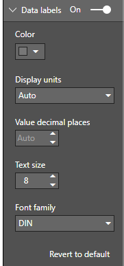
I'm afraid the position of minimun and maximun value can not be changed because currently there're no such options in the format pane of gauge chart.

Community Support Team _ Jimmy Tao
If this post helps, then please consider Accept it as the solution to help the other members find it more quickly.
- Mark as New
- Bookmark
- Subscribe
- Mute
- Subscribe to RSS Feed
- Permalink
- Report Inappropriate Content
very very bad, in 2022 still not fix, this should not be mark as solved, this problem is becuase of target label take the space in the object frame when the target is on the right side then the chart move to left close and when the target is on the left that chart move close to right size. this should add margin buffer for both side constantly. but there is no configuration to adjust margin and this is really really common sense but no option for that.
- Mark as New
- Bookmark
- Subscribe
- Mute
- Subscribe to RSS Feed
- Permalink
- Report Inappropriate Content
Does anyone know if this is still the case? Any workarounds?
- Mark as New
- Bookmark
- Subscribe
- Mute
- Subscribe to RSS Feed
- Permalink
- Report Inappropriate Content
@Anonymous ,
Have you solved your issue by now? If you have, could you please help mark the correct answer to finish the thread? Your contribution will be much appreciated.
Regards,
Jimmy Tao
- Mark as New
- Bookmark
- Subscribe
- Mute
- Subscribe to RSS Feed
- Permalink
- Report Inappropriate Content
@Anonymous,
any way to make those the same size and postion? They are aligned in the general tab (both size and x axis), I changed different labels settings (target value and value in the middle of the chart), but didnt manage to allign them.
The issue is minimum and maximum that are shown either under the chart or next to it. Any way to set that? Maximum value is dynamic depening on data and filters and such, so it will change a lot
I'm afraid the position of minimun and maximun value can not be changed because currently there're no such options in the format pane of gauge chart.

Community Support Team _ Jimmy Tao
If this post helps, then please consider Accept it as the solution to help the other members find it more quickly.
Helpful resources

Power BI Dataviz World Championships
The Power BI Data Visualization World Championships is back! Get ahead of the game and start preparing now!

Power BI Monthly Update - November 2025
Check out the November 2025 Power BI update to learn about new features.

| User | Count |
|---|---|
| 59 | |
| 46 | |
| 42 | |
| 23 | |
| 17 |
| User | Count |
|---|---|
| 190 | |
| 122 | |
| 96 | |
| 66 | |
| 47 |

