FabCon is coming to Atlanta
Join us at FabCon Atlanta from March 16 - 20, 2026, for the ultimate Fabric, Power BI, AI and SQL community-led event. Save $200 with code FABCOMM.
Register now!- Power BI forums
- Get Help with Power BI
- Desktop
- Service
- Report Server
- Power Query
- Mobile Apps
- Developer
- DAX Commands and Tips
- Custom Visuals Development Discussion
- Health and Life Sciences
- Power BI Spanish forums
- Translated Spanish Desktop
- Training and Consulting
- Instructor Led Training
- Dashboard in a Day for Women, by Women
- Galleries
- Data Stories Gallery
- Themes Gallery
- Contests Gallery
- Quick Measures Gallery
- Visual Calculations Gallery
- Notebook Gallery
- Translytical Task Flow Gallery
- TMDL Gallery
- R Script Showcase
- Webinars and Video Gallery
- Ideas
- Custom Visuals Ideas (read-only)
- Issues
- Issues
- Events
- Upcoming Events
Calling all Data Engineers! Fabric Data Engineer (Exam DP-700) live sessions are back! Starting October 16th. Sign up.
- Power BI forums
- Forums
- Get Help with Power BI
- Desktop
- display values in visualization that are in mouse ...
- Subscribe to RSS Feed
- Mark Topic as New
- Mark Topic as Read
- Float this Topic for Current User
- Bookmark
- Subscribe
- Printer Friendly Page
- Mark as New
- Bookmark
- Subscribe
- Mute
- Subscribe to RSS Feed
- Permalink
- Report Inappropriate Content
display values in visualization that are in mouse over preview?
I'm trying to create a visualization that will show the dollar amounts in each status for a particular vendor.
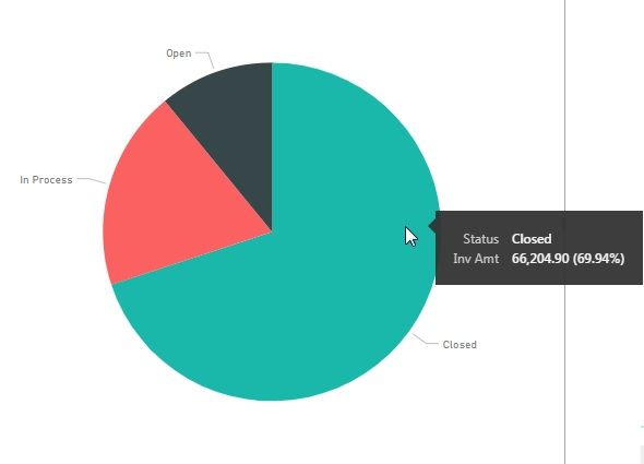
Right now i'm only showing (below) the first data point in the Legend. I wanted to display the dollar amount that shows in the mouse over preview as well (there's plenty of room)

Is that possible to do?
Solved! Go to Solution.
- Mark as New
- Bookmark
- Subscribe
- Mute
- Subscribe to RSS Feed
- Permalink
- Report Inappropriate Content
Hi @MBresnan ,
Sorry for the delay.
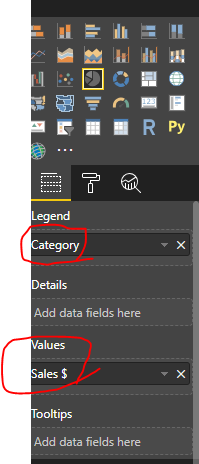
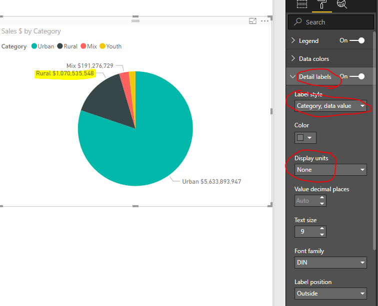
If your pie chart is like below, we may could achieve your desired output.
We could chang the Details label like below, then we could get the output.
Hope this can help you!
Best Regards,
Cherry
If this post helps, then please consider Accept it as the solution to help the other members find it more quickly.
- Mark as New
- Bookmark
- Subscribe
- Mute
- Subscribe to RSS Feed
- Permalink
- Report Inappropriate Content
I actually want the Inv Amt value in the tooltip information to be displayed at all times. So instead of only "Closed" being a label for that green slice, you'd see "Closed - $66,204.90" or something along those lines.
It's a pretty basic dashboard, so i'd like to display as much info as possible at a glance.
- Mark as New
- Bookmark
- Subscribe
- Mute
- Subscribe to RSS Feed
- Permalink
- Report Inappropriate Content
Hi @MBresnan ,
I still have a little confused about your desired output.
If it is convenient, could you share the desired output so that we could help further on it.
Best Regards,
Cherry
If this post helps, then please consider Accept it as the solution to help the other members find it more quickly.
- Mark as New
- Bookmark
- Subscribe
- Mute
- Subscribe to RSS Feed
- Permalink
- Report Inappropriate Content
I'm not sure what i can do to show it. In my screenshot, i have the tooltip up for that section of the graph. What i'm looking to do is have that dollar total for each section showing all the time, rather than only when you mouse over it. for Example, instead of the "Closed" label on the green graph section, it would display "Closed" and then "$66,204.90" directly under it.
I just want users to be able to see the dollar totals of each status at a glance, rather than having to mouse over them.
- Mark as New
- Bookmark
- Subscribe
- Mute
- Subscribe to RSS Feed
- Permalink
- Report Inappropriate Content
Hi @MBresnan ,
Sorry for the delay.
If your pie chart is like below, we may could achieve your desired output.
We could chang the Details label like below, then we could get the output.
Hope this can help you!
Best Regards,
Cherry
If this post helps, then please consider Accept it as the solution to help the other members find it more quickly.
- Mark as New
- Bookmark
- Subscribe
- Mute
- Subscribe to RSS Feed
- Permalink
- Report Inappropriate Content
Hi @MBresnan ,
If I understand your scenario correctly that you want to show the dollar amounts in the tooltip but you don't have the dollar amount in the pie chart field?
If it is, you may try creating the report tooltip page which shoud meet your requirement.
If you still need help, please share your desired output so that we could help further on it.
Best Regards,
Cherry
If this post helps, then please consider Accept it as the solution to help the other members find it more quickly.
Helpful resources

FabCon Global Hackathon
Join the Fabric FabCon Global Hackathon—running virtually through Nov 3. Open to all skill levels. $10,000 in prizes!

Power BI Monthly Update - October 2025
Check out the October 2025 Power BI update to learn about new features.


