Fabric Data Days starts November 4th!
Advance your Data & AI career with 50 days of live learning, dataviz contests, hands-on challenges, study groups & certifications and more!
Get registered- Power BI forums
- Get Help with Power BI
- Desktop
- Service
- Report Server
- Power Query
- Mobile Apps
- Developer
- DAX Commands and Tips
- Custom Visuals Development Discussion
- Health and Life Sciences
- Power BI Spanish forums
- Translated Spanish Desktop
- Training and Consulting
- Instructor Led Training
- Dashboard in a Day for Women, by Women
- Galleries
- Data Stories Gallery
- Themes Gallery
- Contests Gallery
- Quick Measures Gallery
- Visual Calculations Gallery
- Notebook Gallery
- Translytical Task Flow Gallery
- TMDL Gallery
- R Script Showcase
- Webinars and Video Gallery
- Ideas
- Custom Visuals Ideas (read-only)
- Issues
- Issues
- Events
- Upcoming Events
Get Fabric Certified for FREE during Fabric Data Days. Don't miss your chance! Learn more
- Power BI forums
- Forums
- Get Help with Power BI
- Desktop
- display value as it is on y-axis of stacked column...
- Subscribe to RSS Feed
- Mark Topic as New
- Mark Topic as Read
- Float this Topic for Current User
- Bookmark
- Subscribe
- Printer Friendly Page
- Mark as New
- Bookmark
- Subscribe
- Mute
- Subscribe to RSS Feed
- Permalink
- Report Inappropriate Content
display value as it is on y-axis of stacked column chart
Hi ,
I am trying to display values as it is on Y-axis but while displaying either it is summing up or applying aggregate fuctions.
could you please help me how can i display values as it is on y-axis.
eg:
date | product | price
10-2-18 |P01 | 10
11-2-18 |P01 |20
now i am using stacked column chart for displaying , X-axis date,Y-axis price .i.e basically i want to see product price day by day. but it is displaying sum of product for each day.
Could you please help me.
Solved! Go to Solution.
- Mark as New
- Bookmark
- Subscribe
- Mute
- Subscribe to RSS Feed
- Permalink
- Report Inappropriate Content
Hi @ravichandra0788,
Unfortunately, power bi not support handling date/time value on y axis, you also can't apply summarize functions on data/time value.
Please convert your duration value to total second to calculate. After transform duration value, you can write a formula to calculate running total.
Rolling duration per employee =
VAR currDate =
    MAX ( Table[Start time] )
RETURN
    CALCULATE (
        SUM ( Table[Duration] ),
        FILTER ( ALLSELECTED ( Table ), [Start time] <= currDate ),
        VALUES ( Table[Name] )
    )
Extract date part from datetime, create stacked column chart with date to axis, employee to legend, measure to value.
Regards,
Xiaoxin Sheng
- Mark as New
- Bookmark
- Subscribe
- Mute
- Subscribe to RSS Feed
- Permalink
- Report Inappropriate Content
Hi @ravichandra0788,
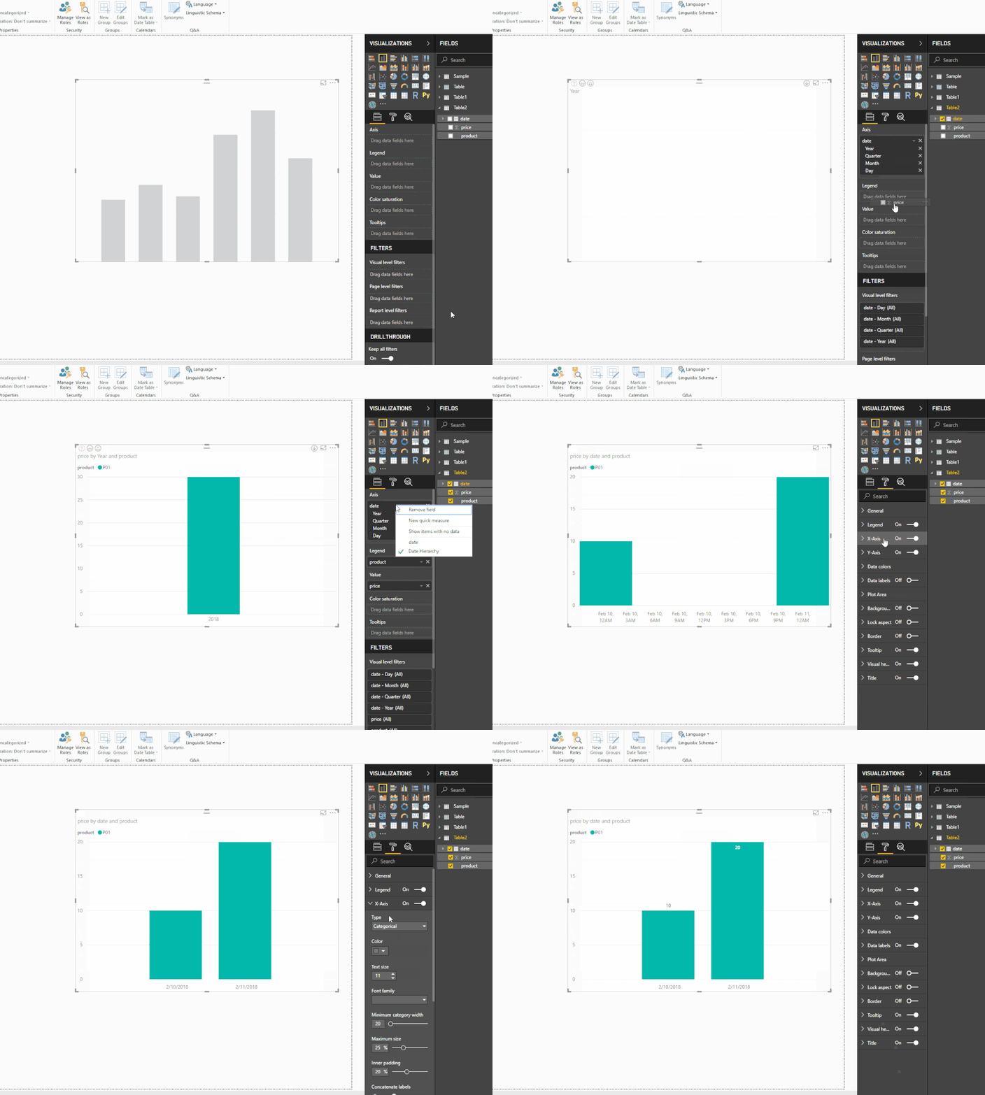
Drag date to axis, product to legend, price to value, then go to format tab and modify x-axis type to categorical.
Regards,
Xiaoxin Sheng
- Mark as New
- Bookmark
- Subscribe
- Mute
- Subscribe to RSS Feed
- Permalink
- Report Inappropriate Content
Hi Xiaoxin Sheng,
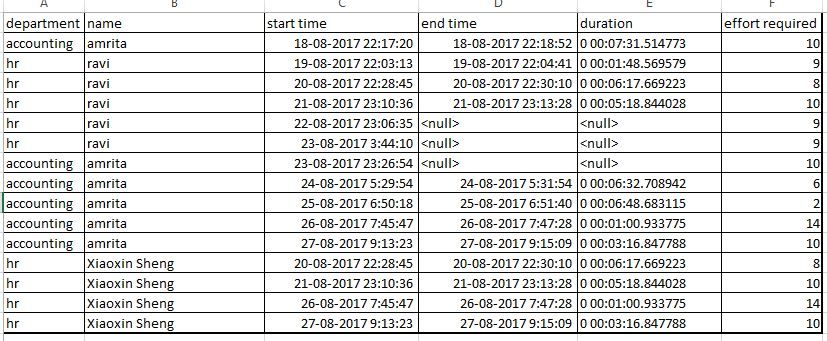
Thanks a lot for quick reply, actually solution what you have suggested is not working, here i have attached sample data and graph as well what i have developed. Please help me
explanation of graph what i have developed.
First i have used 'Cheiclet slicer ' for department
based on department selection it should populate employee details in 'table' chart
next if i click on employee name then it should display only those employee related start-date and duration of that employee on 'stacked column chart'.
i need help in populating these values in 'stacked column chart'
my requirement is :
X-axis should have start date
Y-axis should display duration of employee for past days (employee will be selected from second graph i.e, 'table chart',based on that 'stacked column chart' should display values) so this we can analyse how the employee is spent time on each day
Regards
Ravichandra JL
- Mark as New
- Bookmark
- Subscribe
- Mute
- Subscribe to RSS Feed
- Permalink
- Report Inappropriate Content
Hi @ravichandra0788,
Unfortunately, power bi not support handling date/time value on y axis, you also can't apply summarize functions on data/time value.
Please convert your duration value to total second to calculate. After transform duration value, you can write a formula to calculate running total.
Rolling duration per employee =
VAR currDate =
    MAX ( Table[Start time] )
RETURN
    CALCULATE (
        SUM ( Table[Duration] ),
        FILTER ( ALLSELECTED ( Table ), [Start time] <= currDate ),
        VALUES ( Table[Name] )
    )
Extract date part from datetime, create stacked column chart with date to axis, employee to legend, measure to value.
Regards,
Xiaoxin Sheng
- Mark as New
- Bookmark
- Subscribe
- Mute
- Subscribe to RSS Feed
- Permalink
- Report Inappropriate Content
Thanks a lot Xiaoxin Sheng 🙂
Helpful resources

Fabric Data Days
Advance your Data & AI career with 50 days of live learning, contests, hands-on challenges, study groups & certifications and more!

Power BI Monthly Update - October 2025
Check out the October 2025 Power BI update to learn about new features.


