FabCon is coming to Atlanta
Join us at FabCon Atlanta from March 16 - 20, 2026, for the ultimate Fabric, Power BI, AI and SQL community-led event. Save $200 with code FABCOMM.
Register now!- Power BI forums
- Get Help with Power BI
- Desktop
- Service
- Report Server
- Power Query
- Mobile Apps
- Developer
- DAX Commands and Tips
- Custom Visuals Development Discussion
- Health and Life Sciences
- Power BI Spanish forums
- Translated Spanish Desktop
- Training and Consulting
- Instructor Led Training
- Dashboard in a Day for Women, by Women
- Galleries
- Data Stories Gallery
- Themes Gallery
- Contests Gallery
- Quick Measures Gallery
- Notebook Gallery
- Translytical Task Flow Gallery
- TMDL Gallery
- R Script Showcase
- Webinars and Video Gallery
- Ideas
- Custom Visuals Ideas (read-only)
- Issues
- Issues
- Events
- Upcoming Events
Calling all Data Engineers! Fabric Data Engineer (Exam DP-700) live sessions are back! Starting October 16th. Sign up.
- Power BI forums
- Forums
- Get Help with Power BI
- Desktop
- Re: display calculated values for a timespan
- Subscribe to RSS Feed
- Mark Topic as New
- Mark Topic as Read
- Float this Topic for Current User
- Bookmark
- Subscribe
- Printer Friendly Page
- Mark as New
- Bookmark
- Subscribe
- Mute
- Subscribe to RSS Feed
- Permalink
- Report Inappropriate Content
display calculated values for a timespan
Hello,
I'm new to Power BI and I'm stuck with a problem.
I have a table with calls including the fields customer, start_date and end_date
No I want to see how many call are active during a given period (line chart or similar over the period would be good)
e.g.
| Customer | Start_Date | End_Date |
| A | 27.06.2017 23:31 | 28.06.2017 00:27 |
| A | 27.06.2017 23:31 | 28.06.2017 01:35 |
| B | 27.06.2017 23:43 | 28.06.2017 00:09 |
| B | 27.06.2017 23:45 | 28.06.2017 00:09 |
| C | 27.06.2017 23:48 | 28.06.2017 00:06 |
| C | 27.06.2017 23:48 | 28.06.2017 00:12 |
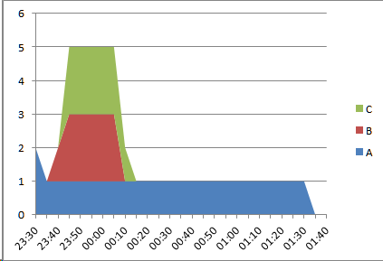
Should result in an image which shows
from 23:31 to 23:43 : 2
from 23:43 to 23:45 : 3
from 23:45 to 23.48 : 4
from 23:48 to 00:06 : 6
from 00:06 to 00:09 : 5
from 00:09 to 00:12 : 3
from 00:12 to 00:27 : 2
from 00:27 to 01:35 : 1
The time should be on X-Axis and the number on Y-Axis (If not all customers are selected they should not be included in the number)
It could be sufficient to have the calculation not for each minute, but for a small delta of 5 minutes
Any ideas how to achieve this?
My idea was to create a temporary table with calculated values for small periods
| Period | A | B | C | |
| 23:30 | 23:35 | 2 | ||
| 23:35 | 23:40 | 2 | ||
| 23:40 | 23:45 | 2 | 1 | |
| 23:45 | 23:50 | 2 | 2 | 2 |
| 23:50 | 23:55 | 2 | 2 | 2 |
| 23:55 | 00:00 | 2 | 2 | 2 |
| 00:00 | 00:05 | 2 | 2 | 2 |
| 00:05 | 00:10 | 2 | 2 | 2 |
| 00:10 | 00:15 | 2 | 1 | |
| 00:15 | 00:20 | 2 | ||
| 00:20 | 00:25 | 2 | ||
| 00:25 | 00:30 | 2 | ||
| 00:30 | 00:35 | 1 | ||
| 00:35 | 00:40 | 1 | ||
| 00:40 | 00:45 | 1 | ||
| 00:45 | 00:50 | 1 | ||
| 00:50 | 00:55 | 1 | ||
| 00:55 | 01:00 | 1 | ||
| 01:00 | 01:05 | 1 | ||
| 01:05 | 01:10 | 1 | ||
| 01:10 | 01:15 | 1 | ||
| 01:15 | 01:20 | 1 | ||
| 01:20 | 01:25 | 1 | ||
| 01:25 | 01:30 | 1 | ||
| 01:30 | 01:35 | 1 | ||
| 01:35 | 01:40 | |||
| 01:40 | 01:45 |
but I don't know how to do that 😞
I need a column for each customer (customers can change) and I need a calculation which includes fields from a differen table.
All I tried with calculated columns was that I can only access fields of the same table.
Any help would be appreciated.
regards
Stephanie
Solved! Go to Solution.
- Mark as New
- Bookmark
- Subscribe
- Mute
- Subscribe to RSS Feed
- Permalink
- Report Inappropriate Content
Hi @sangrick,
You idea is to create a temporary table a small delta of 5 minutes, it's hard to compare the time wiout date. For example, 28.06.2017 00:27 is bigger than 27.06.2017 23:31 obviously. But 00:27 is less than 23:31 when we use time to compare.
So I post my solution, please follow the steps below.
1. Create a time table including all start_time and end_time, create a new table by clicking "New Table" under Modeling on Home Page.
TimeTable = UNION(DISTINCT('Fact'[Start_Date]),DISTINCT('Fact'[End_Date]))
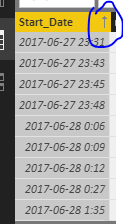
2. Order the Start_Date column Ascending(right click the head name->Ascending), add a rank column, then get the period end time using the rank.
rank = RANKX(TimeTable,TimeTable[Start_Date],,ASC)

End_Time = LOOKUPVALUE(TimeTable[Start_Date],TimeTable[rank],TimeTable[rank]+1)
You will get the TimeTable like the screenshot.
3. Create A,B, C calculated columns using the formulas.
A = CALCULATE(COUNTROWS('Fact'),FILTER('Fact','Fact'[Customer]="A"&&'Fact'[Start_Date]<=TimeTable[End_Time]&&'Fact'[End_Date]>=TimeTable[End_Time]))

B = CALCULATE(COUNTROWS('Fact'),FILTER('Fact','Fact'[Customer]="B"&&'Fact'[Start_Date]<=TimeTable[End_Time]&&'Fact'[End_Date]>=TimeTable[End_Time]))

C = CALCULATE(COUNTROWS('Fact'),FILTER('Fact','Fact'[Customer]="C"&&'Fact'[Start_Date]<=TimeTable[End_Time]&&'Fact'[End_Date]>=TimeTable[End_Time]))
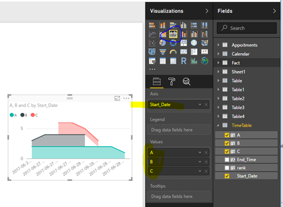
4. Create a stacked area chart using the TimeTable, select the start_time as Axis, and display it as category. Please see the following screenshot.
Best Regards,
Angelia
- Mark as New
- Bookmark
- Subscribe
- Mute
- Subscribe to RSS Feed
- Permalink
- Report Inappropriate Content
works nearly perfect.
Sometimes I have a timestamp in start_date and in end_date, this causes that the lookup for End_Time doesn't work.
e.g with my real data I have
Start Date; rank; End_Time
28.09.2016 09:00:54; 30; 28.09.2016 09:00:59
28.09.2016 09:00:59; 31;
28.09.2016 09:00:59; 31;
28.09.2016 09:01:01; 33; 28.09.2016 09:01:06
I change the table creation to
TimeTable = DISTINCT(UNION(DISTINCT('Fact'[Start_Date]),DISTINCT('Fact'[End_Date])))
Additionally I added columns for hour and minute to drill down
🙂
many thanks
Helpful resources

FabCon Global Hackathon
Join the Fabric FabCon Global Hackathon—running virtually through Nov 3. Open to all skill levels. $10,000 in prizes!

Power BI Monthly Update - September 2025
Check out the September 2025 Power BI update to learn about new features.


