FabCon is coming to Atlanta
Join us at FabCon Atlanta from March 16 - 20, 2026, for the ultimate Fabric, Power BI, AI and SQL community-led event. Save $200 with code FABCOMM.
Register now!- Power BI forums
- Get Help with Power BI
- Desktop
- Service
- Report Server
- Power Query
- Mobile Apps
- Developer
- DAX Commands and Tips
- Custom Visuals Development Discussion
- Health and Life Sciences
- Power BI Spanish forums
- Translated Spanish Desktop
- Training and Consulting
- Instructor Led Training
- Dashboard in a Day for Women, by Women
- Galleries
- Data Stories Gallery
- Themes Gallery
- Contests Gallery
- QuickViz Gallery
- Quick Measures Gallery
- Visual Calculations Gallery
- Notebook Gallery
- Translytical Task Flow Gallery
- TMDL Gallery
- R Script Showcase
- Webinars and Video Gallery
- Ideas
- Custom Visuals Ideas (read-only)
- Issues
- Issues
- Events
- Upcoming Events
Get Fabric Certified for FREE during Fabric Data Days. Don't miss your chance! Request now
- Power BI forums
- Forums
- Get Help with Power BI
- Desktop
- difference between counts of previous month data
- Subscribe to RSS Feed
- Mark Topic as New
- Mark Topic as Read
- Float this Topic for Current User
- Bookmark
- Subscribe
- Printer Friendly Page
- Mark as New
- Bookmark
- Subscribe
- Mute
- Subscribe to RSS Feed
- Permalink
- Report Inappropriate Content
difference between counts of previous month data
Hi Everyone,
I can't quite make an existing post work on this one, can anyone shed some light?
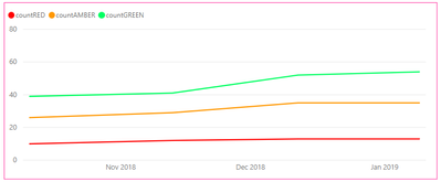
I've got a table [ProjectSnapshots] that reports an overall status (red, amber, green) that run for each project within our portfolio, in every month. I've plotted a graph with measures I created to show the count of each status across our portfolio in each month, and I want to compare these counts between the current and previous months (and display this as a trend with an up or down arrow icon next to the graph).
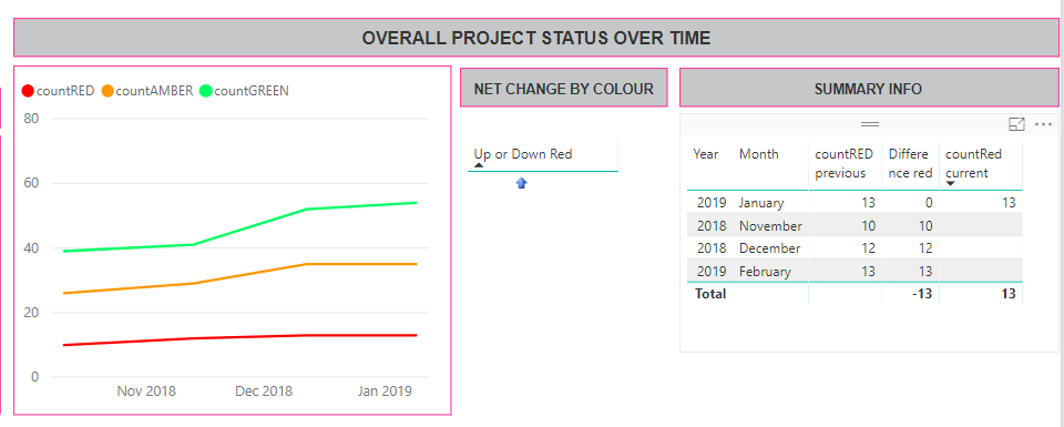
I've been around in circles with my DAX but this is how I want it to look:

thanks in advance
Faye
- Mark as New
- Bookmark
- Subscribe
- Mute
- Subscribe to RSS Feed
- Permalink
- Report Inappropriate Content
Hi @Faye1901,
Could you please share a sample data to have a test and post your desired result if possible?
Regards,
Daniel He
If this post helps, then please consider Accept it as the solution to help the other members find it more quickly.
- Mark as New
- Bookmark
- Subscribe
- Mute
- Subscribe to RSS Feed
- Permalink
- Report Inappropriate Content
Hmmm not easily for IP reasons. I'm trying to make a (working) IF statement evaluate for a second condition.
1. Graph showing count of Projects with a given status (red, amber, green) per month.
2. My desired result - this icon should be showing a cf_50p (blank circle) icon referenced in my IF statement, because as you can see from the summary table, the result for this month = 0. I'd like to know how to make my IF statement consider the context of the current month. At the moment I think the IF statement is summing all the values across all months, hence it's reporting an increase.
3. My summary table - I inserted to check that my maths was right for the measures calculating count of each for previous and current months (you can see they're right from the graph).
Helpful resources

Power BI Monthly Update - November 2025
Check out the November 2025 Power BI update to learn about new features.

Fabric Data Days
Advance your Data & AI career with 50 days of live learning, contests, hands-on challenges, study groups & certifications and more!


