- Power BI forums
- Get Help with Power BI
- Desktop
- Service
- Report Server
- Power Query
- Mobile Apps
- Developer
- DAX Commands and Tips
- Custom Visuals Development Discussion
- Health and Life Sciences
- Power BI Spanish forums
- Translated Spanish Desktop
- Training and Consulting
- Instructor Led Training
- Dashboard in a Day for Women, by Women
- Galleries
- Data Stories Gallery
- Themes Gallery
- Contests Gallery
- QuickViz Gallery
- Quick Measures Gallery
- Visual Calculations Gallery
- Notebook Gallery
- Translytical Task Flow Gallery
- TMDL Gallery
- R Script Showcase
- Webinars and Video Gallery
- Ideas
- Custom Visuals Ideas (read-only)
- Issues
- Issues
- Events
- Upcoming Events
We've captured the moments from FabCon & SQLCon that everyone is talking about, and we are bringing them to the community, live and on-demand. Starts on April 14th. Register now
- Power BI forums
- Forums
- Get Help with Power BI
- Desktop
- data representation
- Subscribe to RSS Feed
- Mark Topic as New
- Mark Topic as Read
- Float this Topic for Current User
- Bookmark
- Subscribe
- Printer Friendly Page
- Mark as New
- Bookmark
- Subscribe
- Mute
- Subscribe to RSS Feed
- Permalink
- Report Inappropriate Content
data representation
Hi , I have the following raw data with me
| Donor Name | Relationship | Donation Amount(S$) | Campaign | Programme |
| Emma Rock | 50,000.00 | ASD Distinguished Lecture Series | ||
| 3D Technology | CEO - Emma Rock | 60,000.00 | ||
| Steve Rock | Parent of Emma Rock | |||
| Rachel Rock | Brother/Sister of Emma Rock | 5,600.00 | ||
| Rachel Rock | Brother/Sister of Emma Rock | 5,800.00 | ||
| Eric Chew | Influencer of Rachel Rock | 18,888.00 | ||
| Eric Chew | Influencer of Rachel Rock | 10,888.00 | Class of 2016 Giving | Class of 2016 Alumus Scholarship |
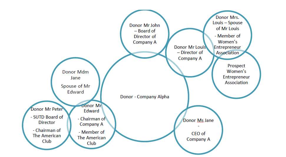
I want to represent it as
Can some one help me which visual should I use in order to representation the data simmilar to how its done in the above image.
- Mark as New
- Bookmark
- Subscribe
- Mute
- Subscribe to RSS Feed
- Permalink
- Report Inappropriate Content
@RashmitaR The closest visual i can see that might fit your needs would be the "Cluster Map" custom visual. You can download it from the Custom Visuals Gallery
Helpful resources

New to Fabric Survey
If you have recently started exploring Fabric, we'd love to hear how it's going. Your feedback can help with product improvements.

Power BI DataViz World Championships - June 2026
A new Power BI DataViz World Championship is coming this June! Don't miss out on submitting your entry.

Join our Fabric User Panel
Share feedback directly with Fabric product managers, participate in targeted research studies and influence the Fabric roadmap.

| User | Count |
|---|---|
| 57 | |
| 38 | |
| 33 | |
| 19 | |
| 16 |
| User | Count |
|---|---|
| 67 | |
| 66 | |
| 40 | |
| 34 | |
| 25 |

