FabCon is coming to Atlanta
Join us at FabCon Atlanta from March 16 - 20, 2026, for the ultimate Fabric, Power BI, AI and SQL community-led event. Save $200 with code FABCOMM.
Register now!- Power BI forums
- Get Help with Power BI
- Desktop
- Service
- Report Server
- Power Query
- Mobile Apps
- Developer
- DAX Commands and Tips
- Custom Visuals Development Discussion
- Health and Life Sciences
- Power BI Spanish forums
- Translated Spanish Desktop
- Training and Consulting
- Instructor Led Training
- Dashboard in a Day for Women, by Women
- Galleries
- Data Stories Gallery
- Themes Gallery
- Contests Gallery
- Quick Measures Gallery
- Notebook Gallery
- Translytical Task Flow Gallery
- TMDL Gallery
- R Script Showcase
- Webinars and Video Gallery
- Ideas
- Custom Visuals Ideas (read-only)
- Issues
- Issues
- Events
- Upcoming Events
To celebrate FabCon Vienna, we are offering 50% off select exams. Ends October 3rd. Request your discount now.
- Power BI forums
- Forums
- Get Help with Power BI
- Desktop
- Re: cumulative line chart with nominal values
- Subscribe to RSS Feed
- Mark Topic as New
- Mark Topic as Read
- Float this Topic for Current User
- Bookmark
- Subscribe
- Printer Friendly Page
- Mark as New
- Bookmark
- Subscribe
- Mute
- Subscribe to RSS Feed
- Permalink
- Report Inappropriate Content
cumulative line chart with nominal values
Hi,
I 've got problem with creating cumulative line chart. The variable has nominal values between 0 and 10 and I want to create a chart with share of nominal values in such a pattern:
if value equals 0 this observation is only in 0,
if value equals 1 this observation is in 1 and 0,
if value equals 2 this observation is in 2, 1 and 0,
... etc
if value equals 10 this observation is in 10,9,8,7,6,5,4,3,2,1,0 (in all)
The following plot contains shares of distinct values, I want to accumulate values according to described pattern.
- Mark as New
- Bookmark
- Subscribe
- Mute
- Subscribe to RSS Feed
- Permalink
- Report Inappropriate Content
Hi @Anonymous ,
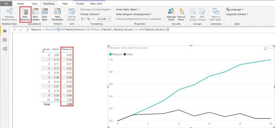
Do you want to calculate cumulative share of observation? If so, you can reference my sample to modify yours.
Measure = CALCULATE(SUM(Table1[share]),FILTER(ALL(Table1),Table1[values] <= MAX(Table1[values])))
If I understand incorrectly , please post some sample data and excepted output. Then we can help you as soon as possible.
Best Regards,
Xue Ding
If this post helps, then please consider Accept it as the solution to help the other members find it more quickly.
Xue Ding
If this post helps, then please consider Accept it as the solution to help the other members find it more quickly.
- Mark as New
- Bookmark
- Subscribe
- Mute
- Subscribe to RSS Feed
- Permalink
- Report Inappropriate Content
Almost good, but in opposite way 🙂
In zero's should be all values - from 0 to 10,
in 1 all except 0,
in 2 all except 0 and 1
...
in 9 only 9 and 10
and in 10 only ten's
Helpful resources
| User | Count |
|---|---|
| 98 | |
| 75 | |
| 69 | |
| 50 | |
| 27 |


