- Subscribe to RSS Feed
- Mark Topic as New
- Mark Topic as Read
- Float this Topic for Current User
- Bookmark
- Subscribe
- Printer Friendly Page
- Mark as New
- Bookmark
- Subscribe
- Mute
- Subscribe to RSS Feed
- Permalink
- Report Inappropriate Content
create Jobs Duration Time Series Graph
Hi!
I have dataset that looks like this:
| Job Name | Start | End | Duration (days) |
| JOB24 | 12.07.2018 03:00:53 | 12.07.2018 03:30:53 | 0,020833333 |
| JOB23 | 12.07.2018 02:37:36 | 12.07.2018 02:38:09 | 0,000381944 |
| JOB22 | 12.07.2018 02:37:36 | 12.07.2018 02:38:04 | 0,000324074 |
| JOB21 | 12.07.2018 02:37:13 | 12.07.2018 02:37:14 | 1,15741E-05 |
..........
Start and End have DateTime type. Duration is simply End minus Start.
Some Jobs overlap in time.
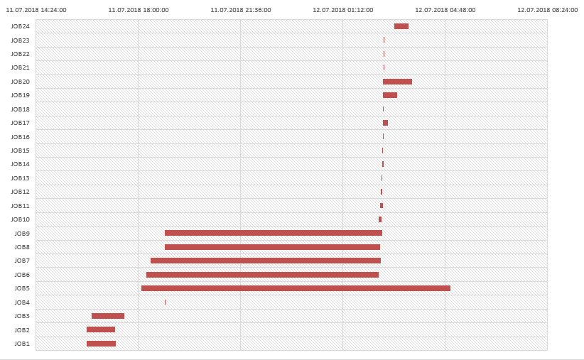
I am trying to visualize Jobs Flow using Stacked Bar Chart. Ideally (reproduced in Excel) it should look like this:
Please help to create similar Graph in Power BI Desktop.
In Excel I set 'Start' and 'Duration' to Legend and then 'No fill' Start. In Power BI Desktop only one variable possible to add to the Legend.
Solved! Go to Solution.
- Mark as New
- Bookmark
- Subscribe
- Mute
- Subscribe to RSS Feed
- Permalink
- Report Inappropriate Content
Hi k0ater,
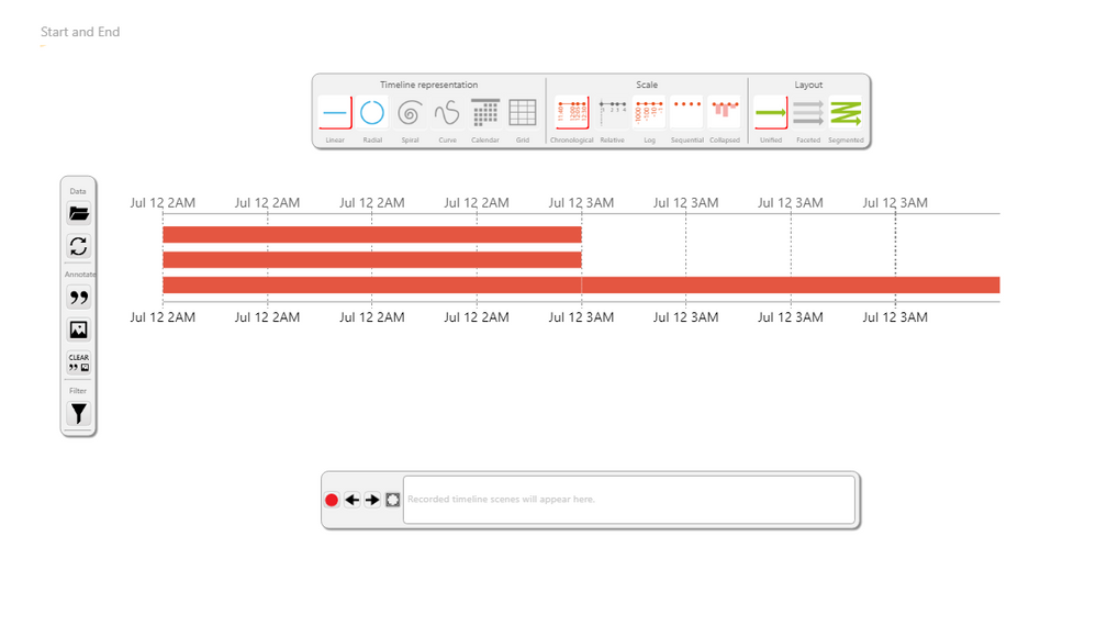
Add this custom visual to your report:
You just have to put the start date and the end date.
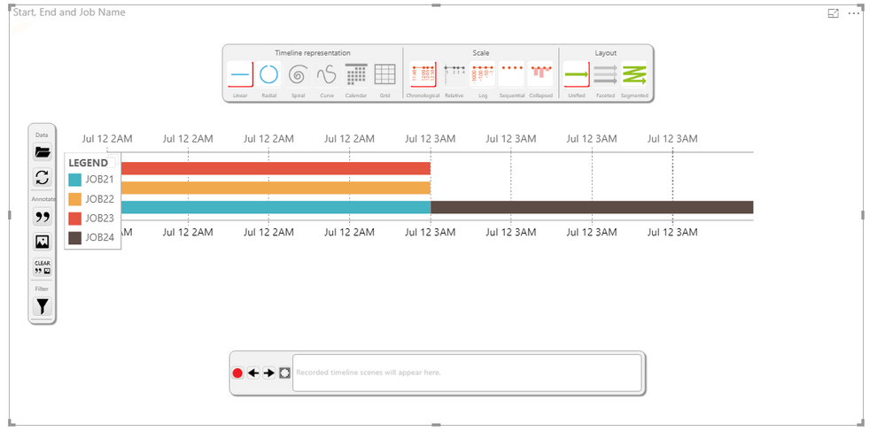
The visual is very powerful, so I let the configuration of the visual to you.
But you should be able to see somenthing like this:
or this:
If my answer is what you where looking for, please mark it as accepted. Like this, others can benefit from my answer too.
Regards
- Mark as New
- Bookmark
- Subscribe
- Mute
- Subscribe to RSS Feed
- Permalink
- Report Inappropriate Content
Thanks! Thats exactly what I need
Helpful resources
| Subject | Author | Posted | |
|---|---|---|---|
| 07-12-2024 01:30 PM | |||
| 09-24-2024 08:44 PM | |||
| 11-14-2023 01:39 PM | |||
| 02-14-2024 04:28 AM | |||
| 03-11-2024 06:09 AM |
| User | Count |
|---|---|
| 121 | |
| 102 | |
| 88 | |
| 52 | |
| 46 |


