A new Data Days event is coming soon!
This time we’re going bigger than ever. Fabric, Power BI, SQL, AI and more. We're covering it all. You won't want to miss it.
Learn more- Power BI forums
- Get Help with Power BI
- Desktop
- Service
- Report Server
- Power Query
- Mobile Apps
- Developer
- DAX Commands and Tips
- Custom Visuals Development Discussion
- Health and Life Sciences
- Power BI Spanish forums
- Translated Spanish Desktop
- Training and Consulting
- Instructor Led Training
- Dashboard in a Day for Women, by Women
- Galleries
- Data Stories Gallery
- Themes Gallery
- Contests Gallery
- QuickViz Gallery
- Quick Measures Gallery
- Visual Calculations Gallery
- Notebook Gallery
- Translytical Task Flow Gallery
- TMDL Gallery
- R Script Showcase
- Webinars and Video Gallery
- Ideas
- Custom Visuals Ideas (read-only)
- Issues
- Issues
- Events
- Upcoming Events
Did you hear? There's a new SQL AI Developer certification (DP-800). Start preparing now and be one of the first to get certified. Register now
- Power BI forums
- Forums
- Get Help with Power BI
- Desktop
- Re: conditional color Stack column chart
- Subscribe to RSS Feed
- Mark Topic as New
- Mark Topic as Read
- Float this Topic for Current User
- Bookmark
- Subscribe
- Printer Friendly Page
- Mark as New
- Bookmark
- Subscribe
- Mute
- Subscribe to RSS Feed
- Permalink
- Report Inappropriate Content
conditional color Stack column chart
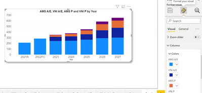
Hello Everyone, how do i color first 2 bars exactly like this and rest of the bar in the stack,please help me out with a solution.If possible explain indetail.
Solved! Go to Solution.
- Mark as New
- Bookmark
- Subscribe
- Mute
- Subscribe to RSS Feed
- Permalink
- Report Inappropriate Content
Hi @Anonymous ,
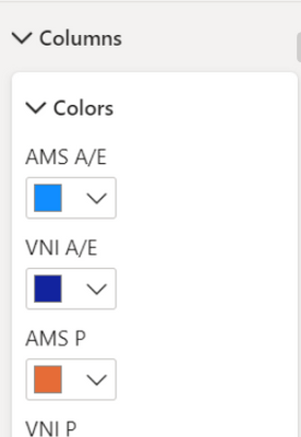
According to your screenshot, I think you have added a column into Legend field in your Stacked Column Chart. So we can see multiple colors in Color in Columns.
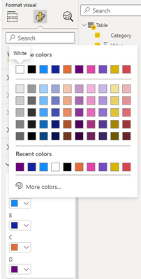
As far as I know, Power BI doesn't support us to use conditional formatting after we use Legend in Statcked Column Chart. Power BI will determind the color for each legend based on theme. If we need to change the color for legends, we need to select the legend and choose the color we need manually.
Your demand is a good idea, while it is not supported to implement in Power BI currently.
You can vote up this idea for this function :
Enable Conditional formatting for Legends and columns series in Stacked bar
Or you can submit a new idea to improve the Power BI.
It is a place for customers provide feedback about Microsoft Office products . What’s more, if a feedback is high voted there by other customers, it will be promising that Microsoft Product Team will take it into consideration when designing the next version in the future.
Best Regards,
Rico Zhou
If this post helps, then please consider Accept it as the solution to help the other members find it more quickly.
- Mark as New
- Bookmark
- Subscribe
- Mute
- Subscribe to RSS Feed
- Permalink
- Report Inappropriate Content
@Anonymous ,
Write a simple measure using selected value in switch function along with your condition and use it in condtional formatting.
Thanks,
Arul
- Mark as New
- Bookmark
- Subscribe
- Mute
- Subscribe to RSS Feed
- Permalink
- Report Inappropriate Content
please could breif it in step by step.
- Mark as New
- Bookmark
- Subscribe
- Mute
- Subscribe to RSS Feed
- Permalink
- Report Inappropriate Content
@Anonymous ,
1. Write a measure like this for your requirement
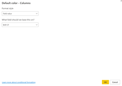
2. Use that measure in conditional formatting (fx).
3. Set your measure in field value category.
Thanks,
Arul
- Mark as New
- Bookmark
- Subscribe
- Mute
- Subscribe to RSS Feed
- Permalink
- Report Inappropriate Content
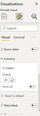
If you could see my snippet, thier is no option of conditional formating
- Mark as New
- Bookmark
- Subscribe
- Mute
- Subscribe to RSS Feed
- Permalink
- Report Inappropriate Content
Hi @Anonymous ,
According to your screenshot, I think you have added a column into Legend field in your Stacked Column Chart. So we can see multiple colors in Color in Columns.
As far as I know, Power BI doesn't support us to use conditional formatting after we use Legend in Statcked Column Chart. Power BI will determind the color for each legend based on theme. If we need to change the color for legends, we need to select the legend and choose the color we need manually.
Your demand is a good idea, while it is not supported to implement in Power BI currently.
You can vote up this idea for this function :
Enable Conditional formatting for Legends and columns series in Stacked bar
Or you can submit a new idea to improve the Power BI.
It is a place for customers provide feedback about Microsoft Office products . What’s more, if a feedback is high voted there by other customers, it will be promising that Microsoft Product Team will take it into consideration when designing the next version in the future.
Best Regards,
Rico Zhou
If this post helps, then please consider Accept it as the solution to help the other members find it more quickly.
- Mark as New
- Bookmark
- Subscribe
- Mute
- Subscribe to RSS Feed
- Permalink
- Report Inappropriate Content
I also have the same problem.
I also need this feature. My work like I have 4 columns, first is DateTime (every hour 2023-8-17 00:00, 2023-08-17 01:00...), second is Silo No. (silo1, silo2,...), third is Quantity (ton) of product produced in each silo each hour, fourth is Quality (%) each hour each silo. when plot in stacked bar chart x-axis-->Silo No., y-axis-->Quantity (ton), legend-->DateTime, tootip--> Quality. I need to set condition format for each column in case quality 0%-50% Red, 51%-75% Yellow, >75% Green. something like this. the problem i found limitation of legend only 60 items and cannot set the condition format of columns.
- Mark as New
- Bookmark
- Subscribe
- Mute
- Subscribe to RSS Feed
- Permalink
- Report Inappropriate Content
have you figured how to do this?
Helpful resources

Power BI Monthly Update - April 2026
Check out the April 2026 Power BI update to learn about new features.

New to Fabric Survey
If you have recently started exploring Fabric, we'd love to hear how it's going. Your feedback can help with product improvements.

| User | Count |
|---|---|
| 37 | |
| 37 | |
| 31 | |
| 21 | |
| 16 |
| User | Count |
|---|---|
| 66 | |
| 56 | |
| 31 | |
| 26 | |
| 23 |

