FabCon is coming to Atlanta
Join us at FabCon Atlanta from March 16 - 20, 2026, for the ultimate Fabric, Power BI, AI and SQL community-led event. Save $200 with code FABCOMM.
Register now!- Power BI forums
- Get Help with Power BI
- Desktop
- Service
- Report Server
- Power Query
- Mobile Apps
- Developer
- DAX Commands and Tips
- Custom Visuals Development Discussion
- Health and Life Sciences
- Power BI Spanish forums
- Translated Spanish Desktop
- Training and Consulting
- Instructor Led Training
- Dashboard in a Day for Women, by Women
- Galleries
- Data Stories Gallery
- Themes Gallery
- Contests Gallery
- Quick Measures Gallery
- Visual Calculations Gallery
- Notebook Gallery
- Translytical Task Flow Gallery
- TMDL Gallery
- R Script Showcase
- Webinars and Video Gallery
- Ideas
- Custom Visuals Ideas (read-only)
- Issues
- Issues
- Events
- Upcoming Events
Calling all Data Engineers! Fabric Data Engineer (Exam DP-700) live sessions are back! Starting October 16th. Sign up.
- Power BI forums
- Forums
- Get Help with Power BI
- Desktop
- compare values
- Subscribe to RSS Feed
- Mark Topic as New
- Mark Topic as Read
- Float this Topic for Current User
- Bookmark
- Subscribe
- Printer Friendly Page
- Mark as New
- Bookmark
- Subscribe
- Mute
- Subscribe to RSS Feed
- Permalink
- Report Inappropriate Content
compare values
Hi Dears,
I have the following case and looking for your expertise. Suppose I have the following table I need to compare how much days resources has booked against the forecast
Period Name Number of hours
Aug X 8
Aug X 8
Aug X 8
Aug Y 7
Aug Y 5
Sept
. .
So X booked 3 days, and Y booked 1.6 days.
Now my forecast is as follow
Aug X 5days
Aug Y 4 days
Sept X 3 days
. .
How can I represent that graphically? I am looking to show each resource how much he booked against the forecast. As well as to show the total number of days because by all resources against the total forecast. Many thanks in advance
- Mark as New
- Bookmark
- Subscribe
- Mute
- Subscribe to RSS Feed
- Permalink
- Report Inappropriate Content
hi,@abukapsoun
After my research, you can do these as below:
Step1:
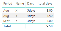
use this formula to create a table as below:
Table = FILTER(GENERATE(SUMMARIZE(Table1,Table1[Period],Table1[Name],"total days",CALCULATE(SUM(Table1[Number of hours]))/8),Table2),Table1[Period]=Table2[Period1]&&Table1[Name]=Table2[Name1])
Step2;
drag the fields into table
Here is pbix, please try it.
https://www.dropbox.com/s/srap6ny87r45mla/compare%20values.pbix?dl=0
Regards,
Lin
If this post helps, then please consider Accept it as the solution to help the other members find it more quickly.
- Mark as New
- Bookmark
- Subscribe
- Mute
- Subscribe to RSS Feed
- Permalink
- Report Inappropriate Content
Thank you very much @v-lili6-msft that looks exactly what I am looking for.
Now I will try to mirror your proposal on my file.. I hope it works 🙂
- Mark as New
- Bookmark
- Subscribe
- Mute
- Subscribe to RSS Feed
- Permalink
- Report Inappropriate Content
hi, @abukapsoun
Could you please tell me if your problem has been solved? If it is, could you please mark the helpful replies as Answered?
Best Regards,
Lin
If this post helps, then please consider Accept it as the solution to help the other members find it more quickly.
Helpful resources

FabCon Global Hackathon
Join the Fabric FabCon Global Hackathon—running virtually through Nov 3. Open to all skill levels. $10,000 in prizes!

Power BI Monthly Update - October 2025
Check out the October 2025 Power BI update to learn about new features.


