FabCon is coming to Atlanta
Join us at FabCon Atlanta from March 16 - 20, 2026, for the ultimate Fabric, Power BI, AI and SQL community-led event. Save $200 with code FABCOMM.
Register now!- Power BI forums
- Get Help with Power BI
- Desktop
- Service
- Report Server
- Power Query
- Mobile Apps
- Developer
- DAX Commands and Tips
- Custom Visuals Development Discussion
- Health and Life Sciences
- Power BI Spanish forums
- Translated Spanish Desktop
- Training and Consulting
- Instructor Led Training
- Dashboard in a Day for Women, by Women
- Galleries
- Data Stories Gallery
- Themes Gallery
- Contests Gallery
- QuickViz Gallery
- Quick Measures Gallery
- Visual Calculations Gallery
- Notebook Gallery
- Translytical Task Flow Gallery
- TMDL Gallery
- R Script Showcase
- Webinars and Video Gallery
- Ideas
- Custom Visuals Ideas (read-only)
- Issues
- Issues
- Events
- Upcoming Events
Vote for your favorite vizzies from the Power BI Dataviz World Championship submissions. Vote now!
- Power BI forums
- Forums
- Get Help with Power BI
- Desktop
- column chart format data labels individually?
- Subscribe to RSS Feed
- Mark Topic as New
- Mark Topic as Read
- Float this Topic for Current User
- Bookmark
- Subscribe
- Printer Friendly Page
- Mark as New
- Bookmark
- Subscribe
- Mute
- Subscribe to RSS Feed
- Permalink
- Report Inappropriate Content
column chart format data labels individually?
Somewhat new to Power BI. Inherited a report from someone where they formatted so labels falling inside the column are white and outside are gray. Having a hard time figuring out how it was done.
See image below. How can I get data labels on a column chart to have variable font colors like you see? I have other visuals requiring the same treatment. Thanks!
Solved! Go to Solution.
- Mark as New
- Bookmark
- Subscribe
- Mute
- Subscribe to RSS Feed
- Permalink
- Report Inappropriate Content
HI @MarkEvansHW,
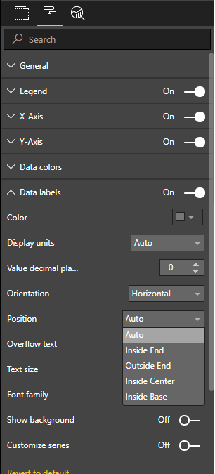
On the format options:
- Data Labels
- Position
- Auto - will adjust to the size of the chart
- Inside end - Always on top of the bar inside
- Outside end - Always on top of the bar outside
- Inside center - On the middle of the bar inside
- Inside base - In the bottom of the bar inside:
Depending on the visuals these options are different.
Regards,
MFelix
Regards
Miguel Félix
Did I answer your question? Mark my post as a solution!
Proud to be a Super User!
Check out my blog: Power BI em Português- Mark as New
- Bookmark
- Subscribe
- Mute
- Subscribe to RSS Feed
- Permalink
- Report Inappropriate Content
HI @MarkEvansHW,
On the format options:
- Data Labels
- Position
- Auto - will adjust to the size of the chart
- Inside end - Always on top of the bar inside
- Outside end - Always on top of the bar outside
- Inside center - On the middle of the bar inside
- Inside base - In the bottom of the bar inside:
Depending on the visuals these options are different.
Regards,
MFelix
Regards
Miguel Félix
Did I answer your question? Mark my post as a solution!
Proud to be a Super User!
Check out my blog: Power BI em PortuguêsHelpful resources

Power BI Dataviz World Championships
Vote for your favorite vizzies from the Power BI World Championship submissions!

Join our Community Sticker Challenge 2026
If you love stickers, then you will definitely want to check out our Community Sticker Challenge!

Power BI Monthly Update - January 2026
Check out the January 2026 Power BI update to learn about new features.

| User | Count |
|---|---|
| 58 | |
| 53 | |
| 43 | |
| 17 | |
| 16 |
| User | Count |
|---|---|
| 123 | |
| 107 | |
| 44 | |
| 32 | |
| 24 |


