FabCon is coming to Atlanta
Join us at FabCon Atlanta from March 16 - 20, 2026, for the ultimate Fabric, Power BI, AI and SQL community-led event. Save $200 with code FABCOMM.
Register now!- Power BI forums
- Get Help with Power BI
- Desktop
- Service
- Report Server
- Power Query
- Mobile Apps
- Developer
- DAX Commands and Tips
- Custom Visuals Development Discussion
- Health and Life Sciences
- Power BI Spanish forums
- Translated Spanish Desktop
- Training and Consulting
- Instructor Led Training
- Dashboard in a Day for Women, by Women
- Galleries
- Data Stories Gallery
- Themes Gallery
- Contests Gallery
- QuickViz Gallery
- Quick Measures Gallery
- Visual Calculations Gallery
- Notebook Gallery
- Translytical Task Flow Gallery
- TMDL Gallery
- R Script Showcase
- Webinars and Video Gallery
- Ideas
- Custom Visuals Ideas (read-only)
- Issues
- Issues
- Events
- Upcoming Events
The Power BI Data Visualization World Championships is back! Get ahead of the game and start preparing now! Learn more
- Power BI forums
- Forums
- Get Help with Power BI
- Desktop
- clustered bar chart - multiple columns from two so...
- Subscribe to RSS Feed
- Mark Topic as New
- Mark Topic as Read
- Float this Topic for Current User
- Bookmark
- Subscribe
- Printer Friendly Page
- Mark as New
- Bookmark
- Subscribe
- Mute
- Subscribe to RSS Feed
- Permalink
- Report Inappropriate Content
clustered bar chart - multiple columns from two sources
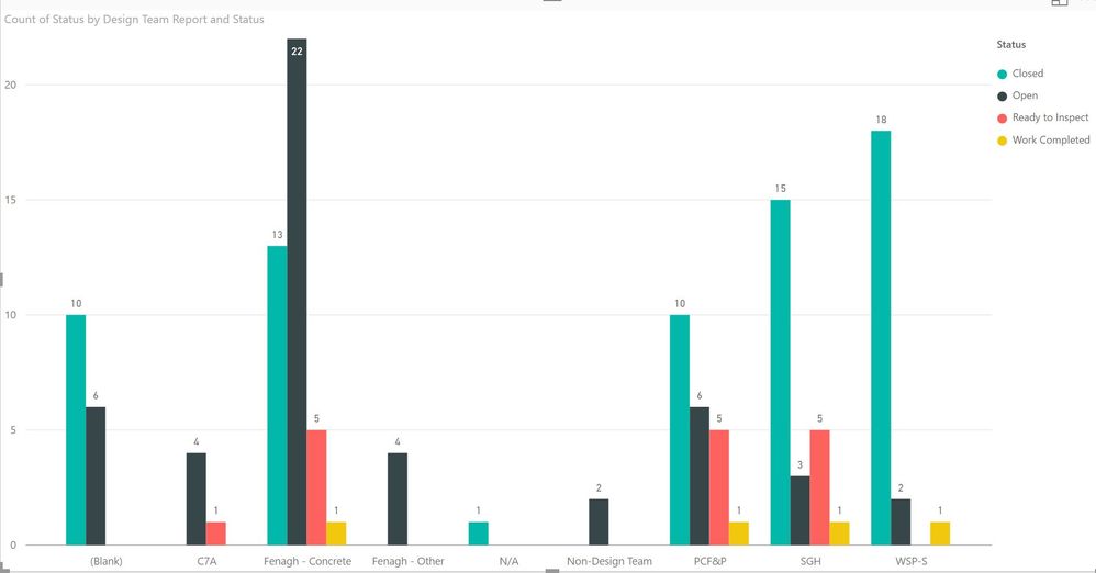
I have a bar chart that shows the number of items of a particular status by Design team (see chart below). I would like to had columns by Design team that counts items by of a particular type as well. For each team, it would show a column for each of the following:
- Open
- Closed
- Ready to Inspect
- Work Completed
- Non-Conforming
- RFI
Is there a way to do this?
Solved! Go to Solution.
- Mark as New
- Bookmark
- Subscribe
- Mute
- Subscribe to RSS Feed
- Permalink
- Report Inappropriate Content
Hi @thehowlerr,
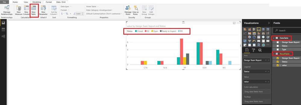
You could create a new table, which will summarize the table by "type" and "status". Then you can create visuals with the new table. Any new data added into the old table will be updated in the new table automatically. Please have a try.
ResultTable =
UNION (
    SUMMARIZE (
        'DataTable',
        'DataTable'[Status],
        'DataTable'[Design Team Report],
        "value", COUNT ( 'DataTable'[Status] )
    ),
    SUMMARIZE (
        'DataTable',
        'DataTable'[Type],
        'DataTable'[Design Team Report],
        "value", COUNT ( 'DataTable'[Type] )
    )
)
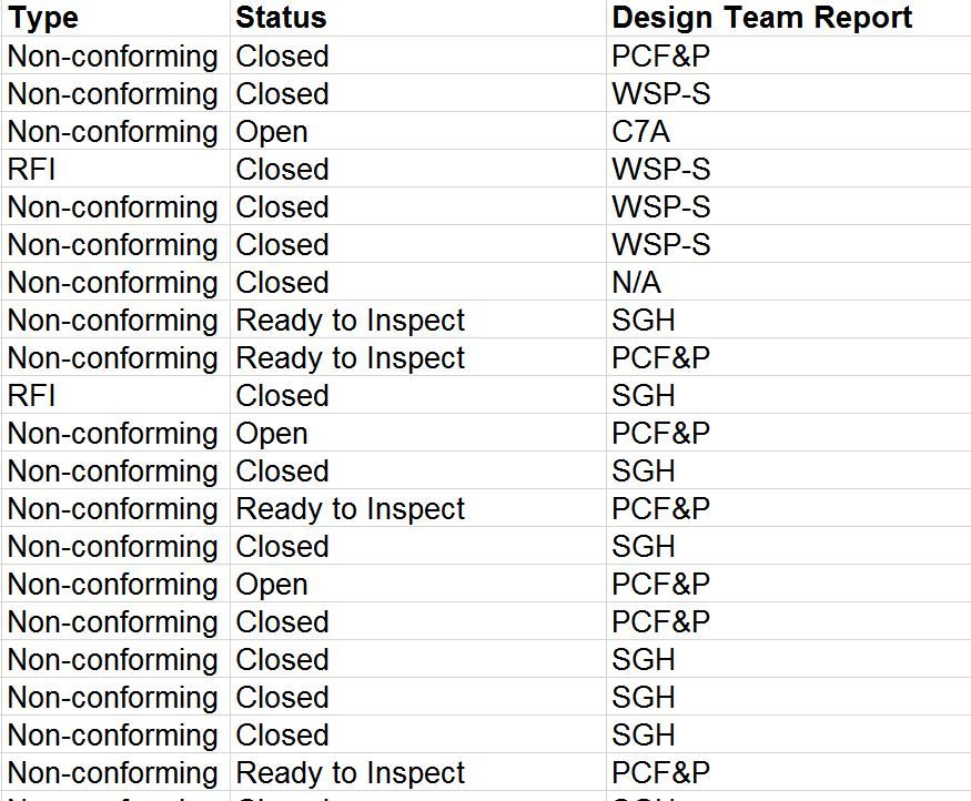
I paste your data in text mode in case somebody wants to have a try.
Type	Status	Design Team Report
NC	Open	C7A
NC	Closed	N/A
NC	Closed	PP
RFI	Closed	WS
NC	Ready to Inspect	PP
NC	Open	PP
NC	Ready to Inspect	PP
NC	Open	PP
NC	Closed	PP
RFI	Closed	SGH
NC	Ready to Inspect	PP
NC	Ready to Inspect	SGH
NC	Closed	SGH
NC	Closed	SGH
NC	Closed	SGH
NC	Closed	SGH
NC	Closed	SGH
NC	Closed	WS
NC	Closed	WS
NC	Closed	WS
Best Regards!
Dale
If this post helps, then please consider Accept it as the solution to help the other members find it more quickly.
Helpful resources

Power BI Dataviz World Championships
The Power BI Data Visualization World Championships is back! Get ahead of the game and start preparing now!

| User | Count |
|---|---|
| 39 | |
| 38 | |
| 38 | |
| 28 | |
| 27 |
| User | Count |
|---|---|
| 124 | |
| 88 | |
| 73 | |
| 66 | |
| 65 |


