Get Fabric certified for FREE!
Don't miss your chance to take the Fabric Data Engineer (DP-600) exam for FREE! Find out how by attending the DP-600 session on April 23rd (pacific time), live or on-demand.
Learn more- Power BI forums
- Get Help with Power BI
- Desktop
- Service
- Report Server
- Power Query
- Mobile Apps
- Developer
- DAX Commands and Tips
- Custom Visuals Development Discussion
- Health and Life Sciences
- Power BI Spanish forums
- Translated Spanish Desktop
- Training and Consulting
- Instructor Led Training
- Dashboard in a Day for Women, by Women
- Galleries
- Data Stories Gallery
- Themes Gallery
- Contests Gallery
- QuickViz Gallery
- Quick Measures Gallery
- Visual Calculations Gallery
- Notebook Gallery
- Translytical Task Flow Gallery
- TMDL Gallery
- R Script Showcase
- Webinars and Video Gallery
- Ideas
- Custom Visuals Ideas (read-only)
- Issues
- Issues
- Events
- Upcoming Events
Next up in the FabCon + SQLCon recap series: The roadmap for Microsoft SQL and Maximizing Developer experiences in Fabric. All sessions are available on-demand after the live show. Register now
- Power BI forums
- Forums
- Get Help with Power BI
- Desktop
- Re: chart column width
- Subscribe to RSS Feed
- Mark Topic as New
- Mark Topic as Read
- Float this Topic for Current User
- Bookmark
- Subscribe
- Printer Friendly Page
- Mark as New
- Bookmark
- Subscribe
- Mute
- Subscribe to RSS Feed
- Permalink
- Report Inappropriate Content
chart column width
I am have created my first dashboard with a simple chart.
I have a column for each month.
I place a chart on the power bi desktop and expand it to the width (11").
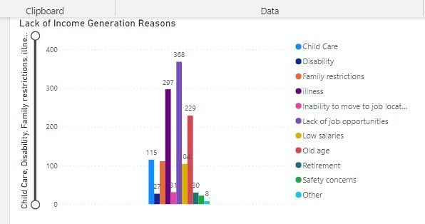
Then I turn on my first column. The width is 2 1/4"
Then I turn on my second column and each column changes to 1 1/8" each totalling 2 1/4 for both columns.
This happens for each column I add (the width of the column reduces).
I end up with 12 columns in the same width which is 2 1/4"
How do I spread the columns over the width of the chart??
I look at other examples and cannot find anyone with this issue.
Seems crazy to me.
What am I doing wrong??
Solved! Go to Solution.
- Mark as New
- Bookmark
- Subscribe
- Mute
- Subscribe to RSS Feed
- Permalink
- Report Inappropriate Content
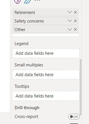
Ah, I see the issue now and was able to recreate what you are seeing. Basically this is happening because you do not have anything on the Axis. For example, if you had a column "Month" and another column "Value" then you would put Month in your Axis and Value in your Value and then you would not have this issue. You might try pivoting your data on import.
Follow on LinkedIn
@ me in replies or I'll lose your thread!!!
Instead of a Kudo, please vote for this idea
Become an expert!: Enterprise DNA
External Tools: MSHGQM
YouTube Channel!: Microsoft Hates Greg
Latest book!: DAX For Humans
DAX is easy, CALCULATE makes DAX hard...
- Mark as New
- Bookmark
- Subscribe
- Mute
- Subscribe to RSS Feed
- Permalink
- Report Inappropriate Content
I have the same problem and nothing seems to be working
I don't have "axis" and "values" fields; I have "x-axis" and "y-axis." I actually don't want anything on the x-axis for this visualization and it's really frustrating me.
Please help :'(
- Mark as New
- Bookmark
- Subscribe
- Mute
- Subscribe to RSS Feed
- Permalink
- Report Inappropriate Content
How are you expanding the column visualization to 11". I can only set this in terms of pixels. Generally, you place the chart visualization (I assuming column chart here, is this a different visualization?), add your Axis and Value and the drag the visualization to be the desired width and your columns will get wider or narrower. Are you on the January update of Power BI Desktop?
Follow on LinkedIn
@ me in replies or I'll lose your thread!!!
Instead of a Kudo, please vote for this idea
Become an expert!: Enterprise DNA
External Tools: MSHGQM
YouTube Channel!: Microsoft Hates Greg
Latest book!: DAX For Humans
DAX is easy, CALCULATE makes DAX hard...
- Mark as New
- Bookmark
- Subscribe
- Mute
- Subscribe to RSS Feed
- Permalink
- Report Inappropriate Content
yes just a standard clustered column chart and the chart is 11 inches.
This works perfect in excel using the same datasource.
But in power Bi, all the columns remain very narrow and only in the center of the chart (2 1/4" out of 11 ").
- Mark as New
- Bookmark
- Subscribe
- Mute
- Subscribe to RSS Feed
- Permalink
- Report Inappropriate Content
Sorry yes, I updated the latest version yesterday
- Mark as New
- Bookmark
- Subscribe
- Mute
- Subscribe to RSS Feed
- Permalink
- Report Inappropriate Content
Ah, I see the issue now and was able to recreate what you are seeing. Basically this is happening because you do not have anything on the Axis. For example, if you had a column "Month" and another column "Value" then you would put Month in your Axis and Value in your Value and then you would not have this issue. You might try pivoting your data on import.
Follow on LinkedIn
@ me in replies or I'll lose your thread!!!
Instead of a Kudo, please vote for this idea
Become an expert!: Enterprise DNA
External Tools: MSHGQM
YouTube Channel!: Microsoft Hates Greg
Latest book!: DAX For Humans
DAX is easy, CALCULATE makes DAX hard...
- Mark as New
- Bookmark
- Subscribe
- Mute
- Subscribe to RSS Feed
- Permalink
- Report Inappropriate Content
Thanks so much.
I brought in the data again and allowed power bi to do the work and this solved the issue.
Thanks!!!
- Mark as New
- Bookmark
- Subscribe
- Mute
- Subscribe to RSS Feed
- Permalink
- Report Inappropriate Content
What did you actually do, cause i have the same problem as you had...
Helpful resources

New to Fabric Survey
If you have recently started exploring Fabric, we'd love to hear how it's going. Your feedback can help with product improvements.

Power BI DataViz World Championships - June 2026
A new Power BI DataViz World Championship is coming this June! Don't miss out on submitting your entry.

FabCon &SQLCon Highlights
Experience the highlights from FabCon & SQLCon, available live and on-demand starting April 14th.

| User | Count |
|---|---|
| 48 | |
| 40 | |
| 37 | |
| 20 | |
| 16 |
| User | Count |
|---|---|
| 70 | |
| 67 | |
| 32 | |
| 27 | |
| 25 |


