Fabric Data Days starts November 4th!
Advance your Data & AI career with 50 days of live learning, dataviz contests, hands-on challenges, study groups & certifications and more!
Get registered- Power BI forums
- Get Help with Power BI
- Desktop
- Service
- Report Server
- Power Query
- Mobile Apps
- Developer
- DAX Commands and Tips
- Custom Visuals Development Discussion
- Health and Life Sciences
- Power BI Spanish forums
- Translated Spanish Desktop
- Training and Consulting
- Instructor Led Training
- Dashboard in a Day for Women, by Women
- Galleries
- Data Stories Gallery
- Themes Gallery
- Contests Gallery
- QuickViz Gallery
- Quick Measures Gallery
- Visual Calculations Gallery
- Notebook Gallery
- Translytical Task Flow Gallery
- TMDL Gallery
- R Script Showcase
- Webinars and Video Gallery
- Ideas
- Custom Visuals Ideas (read-only)
- Issues
- Issues
- Events
- Upcoming Events
Get Fabric Certified for FREE during Fabric Data Days. Don't miss your chance! Request now
- Power BI forums
- Forums
- Get Help with Power BI
- Desktop
- Re: change x-axis labels of a clustered column cha...
- Subscribe to RSS Feed
- Mark Topic as New
- Mark Topic as Read
- Float this Topic for Current User
- Bookmark
- Subscribe
- Printer Friendly Page
- Mark as New
- Bookmark
- Subscribe
- Mute
- Subscribe to RSS Feed
- Permalink
- Report Inappropriate Content
change x-axis labels of a clustered column chart (type continuous)
Hi,
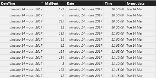
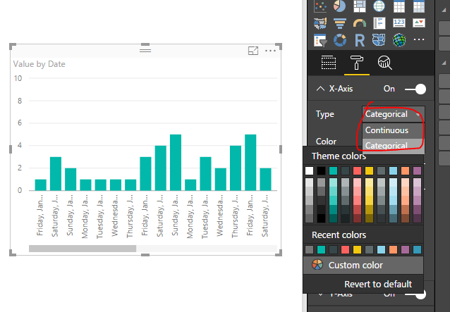
I have a data set of timestamps and emails sent. I would like to show 2 weeks of detailed data (type continuous on the x-axis) as shown in the chart below. Since the day name is relevant for the pattern I want to show "Mon 13 mrt" instead of "13 mrt" (mrt = March). How can I do that? (I tried changing data format and some calculated colums, but regrettably without succes..)
Thanks in advance!
Jasper
- Mark as New
- Bookmark
- Subscribe
- Mute
- Subscribe to RSS Feed
- Permalink
- Report Inappropriate Content
Hi @Jasper,
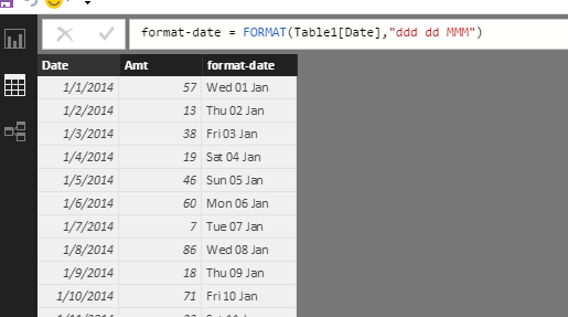
You'd better create a calculated column to get the format what you like.
format-date = FORMAT(Table1[Date],"ddd dd MMM")
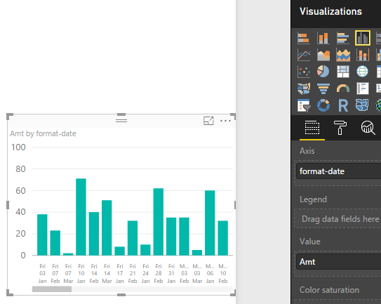
Then add the format-date as x-axis level, please see the following screenshot.
If you have other issues, please feel free to ask.
Best Regards,
Angelia
- Mark as New
- Bookmark
- Subscribe
- Mute
- Subscribe to RSS Feed
- Permalink
- Report Inappropriate Content
Hi @v-huizhn-msft,
Thanks a lot for your reply! The suggested sollution does not fit my situation though. My data is made of timestamps and I would like to see every data point plotted (as the image below). When I use the calculated column the data gets summarized per day and the x-axis is per day, not chronological anymore. Is it possible to keep the detailed level and change the (continuous) x-axis? (to include the day abbreviation).
Best, Jasper


- Mark as New
- Bookmark
- Subscribe
- Mute
- Subscribe to RSS Feed
- Permalink
- Report Inappropriate Content
Hi @Jasper,
In Power BI desktop, for date value on x-asix, we can only set it as Categorical or Continuous. For your requirement, we can't achieve it.
Best Regards,
Angelia
- Mark as New
- Bookmark
- Subscribe
- Mute
- Subscribe to RSS Feed
- Permalink
- Report Inappropriate Content
Hi Angelia,
Thanks for your reply. I'll try to find another way.
Jasper
- Mark as New
- Bookmark
- Subscribe
- Mute
- Subscribe to RSS Feed
- Permalink
- Report Inappropriate Content
Hi @Jasper,
Got it. Please share it if you find other solution to resolve your issue. Please feel free to ask if you have any other issue.
Best Regards,
Angelia
Helpful resources

Fabric Data Days
Advance your Data & AI career with 50 days of live learning, contests, hands-on challenges, study groups & certifications and more!

Power BI Monthly Update - October 2025
Check out the October 2025 Power BI update to learn about new features.


