Join us at FabCon Vienna from September 15-18, 2025
The ultimate Fabric, Power BI, SQL, and AI community-led learning event. Save €200 with code FABCOMM.
Get registered- Power BI forums
- Get Help with Power BI
- Desktop
- Service
- Report Server
- Power Query
- Mobile Apps
- Developer
- DAX Commands and Tips
- Custom Visuals Development Discussion
- Health and Life Sciences
- Power BI Spanish forums
- Translated Spanish Desktop
- Training and Consulting
- Instructor Led Training
- Dashboard in a Day for Women, by Women
- Galleries
- Data Stories Gallery
- Themes Gallery
- Contests Gallery
- Quick Measures Gallery
- Notebook Gallery
- Translytical Task Flow Gallery
- TMDL Gallery
- R Script Showcase
- Webinars and Video Gallery
- Ideas
- Custom Visuals Ideas (read-only)
- Issues
- Issues
- Events
- Upcoming Events
Enhance your career with this limited time 50% discount on Fabric and Power BI exams. Ends August 31st. Request your voucher.
- Power BI forums
- Forums
- Get Help with Power BI
- Desktop
- Re: can I hide a visual's axies?
- Subscribe to RSS Feed
- Mark Topic as New
- Mark Topic as Read
- Float this Topic for Current User
- Bookmark
- Subscribe
- Printer Friendly Page
- Mark as New
- Bookmark
- Subscribe
- Mute
- Subscribe to RSS Feed
- Permalink
- Report Inappropriate Content
can I hide a visual's axies?
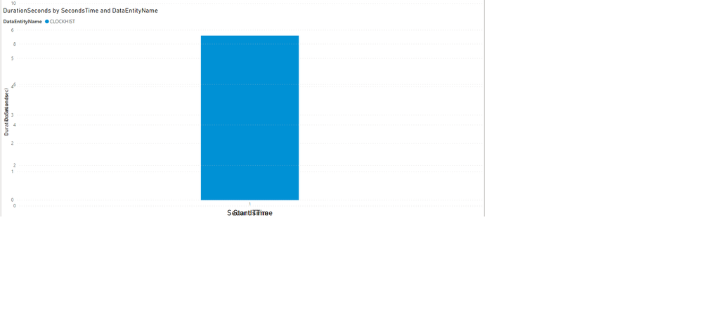
I have two Visuals that are exactely on the same spot , I use DAX functions to let the one appear and the other one dissapear based on what the user selected in the slicers
my problem is the title's of the axes both show , so they look very untidy , how do hide one of them ?
Solved! Go to Solution.
- Mark as New
- Bookmark
- Subscribe
- Mute
- Subscribe to RSS Feed
- Permalink
- Report Inappropriate Content
Hi @Anonymous ,
What you can do as a workaround is to setup a measure with the dax formula for both titles then turn of the title on the graphs and add a card visualization with the dax formula that changes the axis title. Using a group by user won't realize they are seeing two visualizations.
Also check the video below with an explanation on how to have dynamics axis.
Regards
Miguel Félix
Did I answer your question? Mark my post as a solution!
Proud to be a Super User!
Check out my blog: Power BI em Português- Mark as New
- Bookmark
- Subscribe
- Mute
- Subscribe to RSS Feed
- Permalink
- Report Inappropriate Content
Hi @Anonymous,
I don't think you can use dax formula to direct interaction with visual axis. You can write the formula to replace some records of specific categories to blank to let power bi auto hide this category, but it impossible to only hide data category label.
Regards,
Xiaoxin Sheng
- Mark as New
- Bookmark
- Subscribe
- Mute
- Subscribe to RSS Feed
- Permalink
- Report Inappropriate Content
Hi @Anonymous ,
What you can do as a workaround is to setup a measure with the dax formula for both titles then turn of the title on the graphs and add a card visualization with the dax formula that changes the axis title. Using a group by user won't realize they are seeing two visualizations.
Also check the video below with an explanation on how to have dynamics axis.
Regards
Miguel Félix
Did I answer your question? Mark my post as a solution!
Proud to be a Super User!
Check out my blog: Power BI em Português- Mark as New
- Bookmark
- Subscribe
- Mute
- Subscribe to RSS Feed
- Permalink
- Report Inappropriate Content
Hi @Anonymous ,
Looking at what you are saying how don't you use a single chart with the measure making the switch between measures? would be much more tidy.
But looking at your question if you go to the options of the chart you can turn on/off the axis and also the title of the axis (X or Y).
Regards
Miguel Félix
Did I answer your question? Mark my post as a solution!
Proud to be a Super User!
Check out my blog: Power BI em Português- Mark as New
- Bookmark
- Subscribe
- Mute
- Subscribe to RSS Feed
- Permalink
- Report Inappropriate Content
Thanks but the thing is I need to display the Axies of the seperate graphs for the users to understand the data they are looking at , is ther not a way for me to hide the Titles using a Dax function or something ?
- Mark as New
- Bookmark
- Subscribe
- Mute
- Subscribe to RSS Feed
- Permalink
- Report Inappropriate Content
Use bookmarks to display which visual is showing based on slicer selection.
Helpful resources
| User | Count |
|---|---|
| 78 | |
| 74 | |
| 42 | |
| 32 | |
| 28 |
| User | Count |
|---|---|
| 104 | |
| 93 | |
| 52 | |
| 50 | |
| 46 |


