FabCon is coming to Atlanta
Join us at FabCon Atlanta from March 16 - 20, 2026, for the ultimate Fabric, Power BI, AI and SQL community-led event. Save $200 with code FABCOMM.
Register now!- Power BI forums
- Get Help with Power BI
- Desktop
- Service
- Report Server
- Power Query
- Mobile Apps
- Developer
- DAX Commands and Tips
- Custom Visuals Development Discussion
- Health and Life Sciences
- Power BI Spanish forums
- Translated Spanish Desktop
- Training and Consulting
- Instructor Led Training
- Dashboard in a Day for Women, by Women
- Galleries
- Data Stories Gallery
- Themes Gallery
- Contests Gallery
- QuickViz Gallery
- Quick Measures Gallery
- Visual Calculations Gallery
- Notebook Gallery
- Translytical Task Flow Gallery
- TMDL Gallery
- R Script Showcase
- Webinars and Video Gallery
- Ideas
- Custom Visuals Ideas (read-only)
- Issues
- Issues
- Events
- Upcoming Events
The Power BI Data Visualization World Championships is back! Get ahead of the game and start preparing now! Learn more
- Power BI forums
- Forums
- Get Help with Power BI
- Desktop
- calendar list for a specified date range
- Subscribe to RSS Feed
- Mark Topic as New
- Mark Topic as Read
- Float this Topic for Current User
- Bookmark
- Subscribe
- Printer Friendly Page
- Mark as New
- Bookmark
- Subscribe
- Mute
- Subscribe to RSS Feed
- Permalink
- Report Inappropriate Content
calendar list for a specified date range
Hello All,
I want to have a list of dates as my calendar so that the user would be able to click each of these ranges and the outcome would be for my bar chart to dynamically change based on the selection:
The date ranges i want are:
< 14 days - 14 days ago to present day
15 - 29 days - 29 days ago to 15 days ago
30 + days - Anything that falls into 30 days ago or older
I have a calendar table available, the table that it will be filtering on has a due_date column also - these are linked via a relationship of Calendar[date] -> wkaw[due_date]
Any help would be appreciated.Thanks
Kevin
Solved! Go to Solution.
- Mark as New
- Bookmark
- Subscribe
- Mute
- Subscribe to RSS Feed
- Permalink
- Report Inappropriate Content
Hi @sullynivek,
You can refer to below steps to achieve your requirement, if it suitable for your requirement.
Steps:
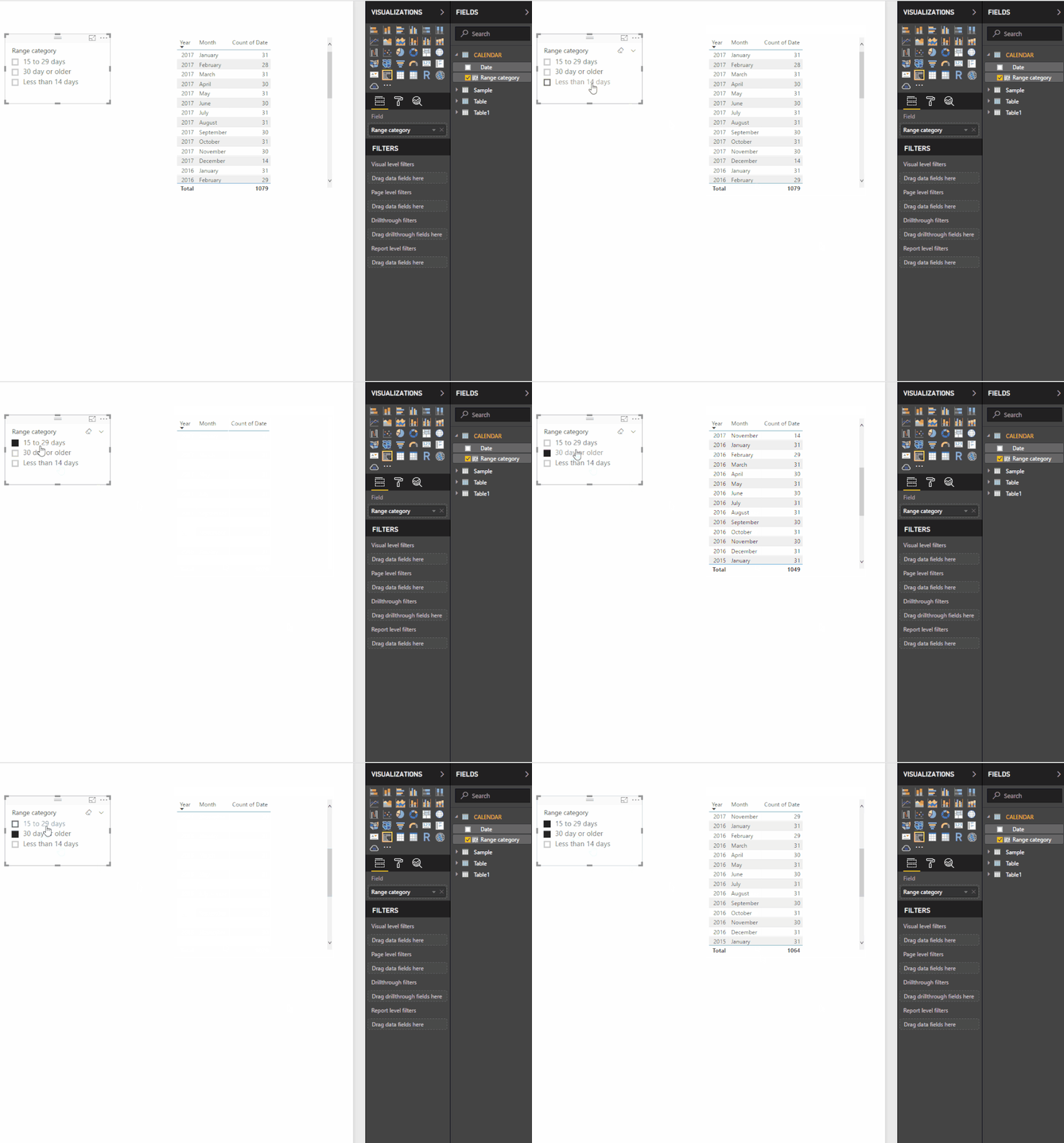
1. Write dax formula to create calculated column to store range tag.
Range category =
VAR diff =
    DATEDIFF ( [Date], TODAY (), DAY )
RETURN
    IF (
        diff <= 14,
        "Less than 14 days",
        IF ( diff <= 29, "15 to 29 days", "30 day or older" )
    )
3. Use above column to create a slicer to enable the filter effect.
Notice: above filter effect also works on other related tables.
Regards,
Xiaoxin Sheng
- Mark as New
- Bookmark
- Subscribe
- Mute
- Subscribe to RSS Feed
- Permalink
- Report Inappropriate Content
Hi @Anonymous,
This didn't work for me unfortunately, the graphs did pick up on the change but it would wipe out all the bars. When looking at the table it would return 14 days or less for some spurious dates i.e. 12/07/2017?
Not sure why it is doing this.
Could you share you demo with me?
kevin
- Mark as New
- Bookmark
- Subscribe
- Mute
- Subscribe to RSS Feed
- Permalink
- Report Inappropriate Content
hi @Anonymous,
It wasn't your solution that was the problem, it was my date table; for some reason it was changing the 1st 12 date entries of the month to the US format i.e. mm/dd/yyyy and the remainder of the month the format was dd/mm/yyyy?
I have recitified the date table and your solution is just perfect - thanks.
Kevin.
P.S. Wonder if you could look at another problem that i have - see it at this post:
https://community.powerbi.com/t5/Desktop/Calculating-mean-time-between-failures/m-p/320235#M142518
Would be appreciated if you could help with that please - K
Helpful resources

Power BI Dataviz World Championships
The Power BI Data Visualization World Championships is back! Get ahead of the game and start preparing now!

| User | Count |
|---|---|
| 38 | |
| 38 | |
| 37 | |
| 28 | |
| 28 |
| User | Count |
|---|---|
| 124 | |
| 89 | |
| 73 | |
| 66 | |
| 65 |


