Party with Power BI’s own Guy in a Cube
Power BI is turning 10! Tune in for a special live episode on July 24 with behind-the-scenes stories, product evolution highlights, and a sneak peek at what’s in store for the future.
Save the date- Power BI forums
- Get Help with Power BI
- Desktop
- Service
- Report Server
- Power Query
- Mobile Apps
- Developer
- DAX Commands and Tips
- Custom Visuals Development Discussion
- Health and Life Sciences
- Power BI Spanish forums
- Translated Spanish Desktop
- Training and Consulting
- Instructor Led Training
- Dashboard in a Day for Women, by Women
- Galleries
- Data Stories Gallery
- Themes Gallery
- Contests Gallery
- Quick Measures Gallery
- Notebook Gallery
- Translytical Task Flow Gallery
- TMDL Gallery
- R Script Showcase
- Webinars and Video Gallery
- Ideas
- Custom Visuals Ideas (read-only)
- Issues
- Issues
- Events
- Upcoming Events
Enhance your career with this limited time 50% discount on Fabric and Power BI exams. Ends August 31st. Request your voucher.
- Power BI forums
- Forums
- Get Help with Power BI
- Desktop
- Re: add an average line on a Line and Clustered Co...
- Subscribe to RSS Feed
- Mark Topic as New
- Mark Topic as Read
- Float this Topic for Current User
- Bookmark
- Subscribe
- Printer Friendly Page
- Mark as New
- Bookmark
- Subscribe
- Mute
- Subscribe to RSS Feed
- Permalink
- Report Inappropriate Content
add an average line on a Line and Clustered Column Chart
Hi,
I'm using a Line and Cluster Column Chart to display three different data categories. The x axis is the date.
Example: data is in the form below
Date A B C
8/1/17 5 3 7
8/2/17 4 8 2
8/3/17 6 5 9
etc
I want to add an average line for one of the data categories. The Line and Cluster Column Chart does not have an Average Line in the Analytics, only a trend line. When I try to calculate an average measure or use Quick measures i just get the data values returend because I'm including date in the graph
Is there a way to add an average line in?
Thanks
Solved! Go to Solution.
- Mark as New
- Bookmark
- Subscribe
- Mute
- Subscribe to RSS Feed
- Permalink
- Report Inappropriate Content
Hi @mbd,
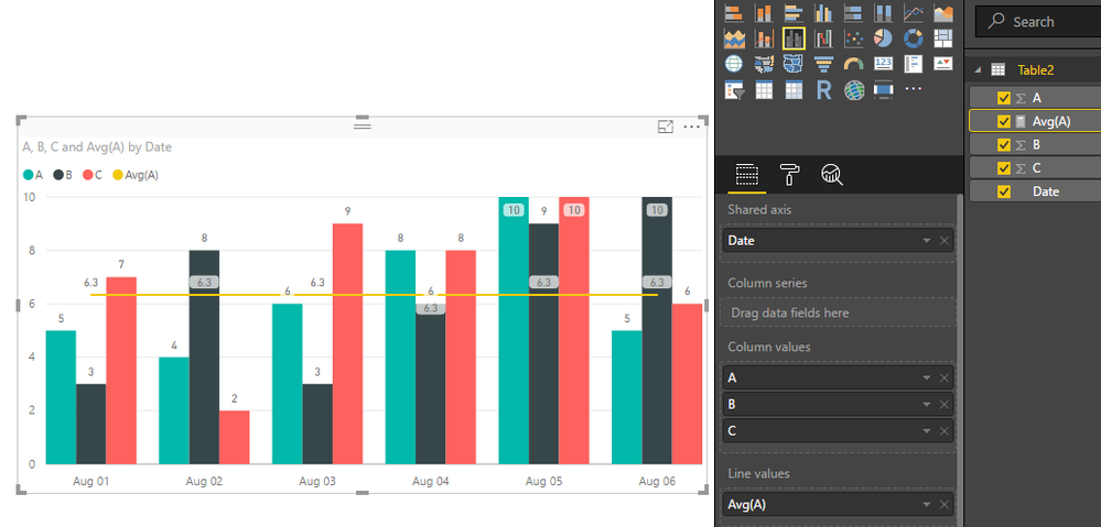
You can create a measure to calculate average values, take the column A as a example:
Avg(A) = CALCULATE(AVERAGE('Table2'[A]),ALLSELECTED('Table2'))
Then drag this measure to the Line Values property of the combo chart. For details, you can download attached pbix file to have a look.
Best Regards,
Qiuyun Yu
If this post helps, then please consider Accept it as the solution to help the other members find it more quickly.
- Mark as New
- Bookmark
- Subscribe
- Mute
- Subscribe to RSS Feed
- Permalink
- Report Inappropriate Content
Hi,
Ignore my question on Shade Area. I just needed to update my desktop version.
Thanks for the help
- Mark as New
- Bookmark
- Subscribe
- Mute
- Subscribe to RSS Feed
- Permalink
- Report Inappropriate Content
Thanks!, that worked.
I have two of my data sets as lines and one as a column. I want to shade one of the line data sets.
In Format, I've turned Shade Area on, but it won't let me turn off Shade Area for my other data set. It shades both of them and now the Avg measure also.
Is there a way to add shade area to only on line?


