A new Data Days event is coming soon!
This time we’re going bigger than ever. Fabric, Power BI, SQL, AI and more. We're covering it all. You won't want to miss it.
Learn more- Power BI forums
- Get Help with Power BI
- Desktop
- Service
- Report Server
- Power Query
- Mobile Apps
- Developer
- DAX Commands and Tips
- Custom Visuals Development Discussion
- Health and Life Sciences
- Power BI Spanish forums
- Translated Spanish Desktop
- Training and Consulting
- Instructor Led Training
- Dashboard in a Day for Women, by Women
- Galleries
- Data Stories Gallery
- Themes Gallery
- Contests Gallery
- QuickViz Gallery
- Quick Measures Gallery
- Visual Calculations Gallery
- Notebook Gallery
- Translytical Task Flow Gallery
- TMDL Gallery
- R Script Showcase
- Webinars and Video Gallery
- Ideas
- Custom Visuals Ideas (read-only)
- Issues
- Issues
- Events
- Upcoming Events
Did you hear? There's a new SQL AI Developer certification (DP-800). Start preparing now and be one of the first to get certified. Register now
- Power BI forums
- Forums
- Get Help with Power BI
- Desktop
- Re: Zip Code Heat Map
- Subscribe to RSS Feed
- Mark Topic as New
- Mark Topic as Read
- Float this Topic for Current User
- Bookmark
- Subscribe
- Printer Friendly Page
- Mark as New
- Bookmark
- Subscribe
- Mute
- Subscribe to RSS Feed
- Permalink
- Report Inappropriate Content
Zip Code Heat Map
I have a table Companies that contains the fields company_name and zip_codes. zip_codes contains all the zip codes that they provide service in, separated by commas. Some companies have 300 zip codes.
I want to be able to display a map that shows the areas those companies provide service in, and have it shaded by the amount of companies serving in that area, heat map-style.
Example: Company A services zip codes 1, 2, 3, 4, 5. Company B services zip codes 3, 4, 5, 6, 7. The map should have color in zip codes 1-7, with 3-5 being darker than 1, 2, 6, and 7.
I've tried doing this with the heat map feature on the bubble map visual, but in order to do this, I have to first separate all the zip codes into separate columns, giving me 300+ columns of zip codes. Going through each one and transforming them into Data Category Postal Code with Don't Summarize is slow and painful, and dragging each of them to Location takes 2 minutes to load each time.
I've also tried using ArcGIS, but it doesn't recognize multiple zip codes in a value.
Is there any other way to do this, or do I just have to buckle down and do it the first way that I tried?
Solved! Go to Solution.
- Mark as New
- Bookmark
- Subscribe
- Mute
- Subscribe to RSS Feed
- Permalink
- Report Inappropriate Content
I just posted an answer here which should help.
If you get the data in the format:
Company Zip
A 1
B 1
A 2
A 3
I think you can use the heat map to plot zip codes and Count of Company
- Mark as New
- Bookmark
- Subscribe
- Mute
- Subscribe to RSS Feed
- Permalink
- Report Inappropriate Content
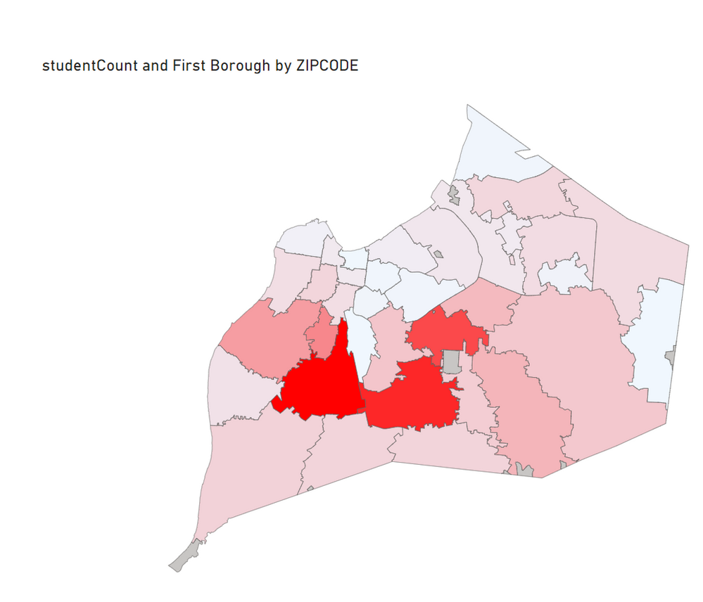
I'm working on my first PowerBI app and have to do something similar -- I need to show the number of English-Learning students in each zip code area in Jefferson County, Kentucky. I'm using PBi Version 2.1 and haven't found any mapping solutions that shade zip codes with an even "heat signature". Just curious what map you used to accomplish your task?
- Mark as New
- Bookmark
- Subscribe
- Mute
- Subscribe to RSS Feed
- Permalink
- Report Inappropriate Content
As a follow-up for anybody else looking for a similar solution, I ended up using Shape Map which is already provided in powerBI. It's a preview feature though so you may have to pull it in through the options if it's not already showing in your Visualizations.
- Mark as New
- Bookmark
- Subscribe
- Mute
- Subscribe to RSS Feed
- Permalink
- Report Inappropriate Content
- Mark as New
- Bookmark
- Subscribe
- Mute
- Subscribe to RSS Feed
- Permalink
- Report Inappropriate Content
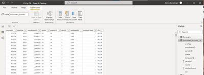
I Googled and found a site that had the latitude/longitude coordinates of the zips I needed. I was able to download via csv file, then uploaded these into a SQL database that I then imported into PB.
The only other data involved is a second sql table -- no aggregations -- every record counts as "1" and is summed together in the shape file.
For mapping I put the Zip Code field from the Boroughs table into the Location and the # Students from the Enrollment table into Color Saturation. And like magic I had a nice map!!
- Mark as New
- Bookmark
- Subscribe
- Mute
- Subscribe to RSS Feed
- Permalink
- Report Inappropriate Content
There is no 'Data category' for zipcode, so what do you set it as? Postal code?
- Mark as New
- Bookmark
- Subscribe
- Mute
- Subscribe to RSS Feed
- Permalink
- Report Inappropriate Content
Yes, Postal code is what I set it to...sorry about that!!
- Mark as New
- Bookmark
- Subscribe
- Mute
- Subscribe to RSS Feed
- Permalink
- Report Inappropriate Content
Thank you so much. I haven't had much luck with the shape map to show the zip codes yet. I will keep trying.
- Mark as New
- Bookmark
- Subscribe
- Mute
- Subscribe to RSS Feed
- Permalink
- Report Inappropriate Content
Would you be able to share a demo pbix file?
- Mark as New
- Bookmark
- Subscribe
- Mute
- Subscribe to RSS Feed
- Permalink
- Report Inappropriate Content
I don't think I have the ability to -- I just tried to drag in a pbix and got the message "The file type (.pbix) is not supported...
- Mark as New
- Bookmark
- Subscribe
- Mute
- Subscribe to RSS Feed
- Permalink
- Report Inappropriate Content
I just posted an answer here which should help.
If you get the data in the format:
Company Zip
A 1
B 1
A 2
A 3
I think you can use the heat map to plot zip codes and Count of Company
Helpful resources

Power BI Monthly Update - April 2026
Check out the April 2026 Power BI update to learn about new features.

Data Days 2026 coming soon!
Sign up to receive a private message when registration opens and key events begin.

New to Fabric Survey
If you have recently started exploring Fabric, we'd love to hear how it's going. Your feedback can help with product improvements.

| User | Count |
|---|---|
| 35 | |
| 32 | |
| 25 | |
| 23 | |
| 16 |
| User | Count |
|---|---|
| 65 | |
| 50 | |
| 30 | |
| 24 | |
| 23 |


