FabCon is coming to Atlanta
Join us at FabCon Atlanta from March 16 - 20, 2026, for the ultimate Fabric, Power BI, AI and SQL community-led event. Save $200 with code FABCOMM.
Register now!- Power BI forums
- Get Help with Power BI
- Desktop
- Service
- Report Server
- Power Query
- Mobile Apps
- Developer
- DAX Commands and Tips
- Custom Visuals Development Discussion
- Health and Life Sciences
- Power BI Spanish forums
- Translated Spanish Desktop
- Training and Consulting
- Instructor Led Training
- Dashboard in a Day for Women, by Women
- Galleries
- Data Stories Gallery
- Themes Gallery
- Contests Gallery
- QuickViz Gallery
- Quick Measures Gallery
- Visual Calculations Gallery
- Notebook Gallery
- Translytical Task Flow Gallery
- TMDL Gallery
- R Script Showcase
- Webinars and Video Gallery
- Ideas
- Custom Visuals Ideas (read-only)
- Issues
- Issues
- Events
- Upcoming Events
View all the Fabric Data Days sessions on demand. View schedule
- Power BI forums
- Forums
- Get Help with Power BI
- Desktop
- YTD combining data issue
- Subscribe to RSS Feed
- Mark Topic as New
- Mark Topic as Read
- Float this Topic for Current User
- Bookmark
- Subscribe
- Printer Friendly Page
- Mark as New
- Bookmark
- Subscribe
- Mute
- Subscribe to RSS Feed
- Permalink
- Report Inappropriate Content
YTD combining data issue
Hi all,
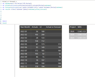
I have several projects (in sample data only one project called CBLR) for which I have for every month in 2022 Actuals data (until 01.04.2022) and Forecast data (after 01.04.2022).
What I would like to achieve is a YTD trend line chart per project that shows the YTD data over the whole period. Hence, until 01.04.2022 I would need to see YTD Actuals and after that it should add Forecast data (YTD).
Note that the YTD period table will be manually updated every month (hence, next month it will be 01.05.2022).
I was before able with support of the forum to create a measure that shows on a full year Actuals and Forecast per month, but it failed for YTD values.
Below shared sample data :
https://1drv.ms/u/s!Anx9rs5Lmt-ilVxBSVTpdlXuYdXP?e=Px7bei
Solved! Go to Solution.
- Mark as New
- Bookmark
- Subscribe
- Mute
- Subscribe to RSS Feed
- Permalink
- Report Inappropriate Content
- Mark as New
- Bookmark
- Subscribe
- Mute
- Subscribe to RSS Feed
- Permalink
- Report Inappropriate Content
Hi again ybz
We meet again !
Try this
Click here to download my solution
I have added some date to test more than one project
You need to delete the YTD table relationship and then add these 2 measure.
I have added comments so can learn DAX
Create line graph with
xaxis = Calendar [Date]
Yaxis = Trend
Legen = Project list [project]
Please click thumbs up and accept as solution buttons. Thank you ! 😎
- Mark as New
- Bookmark
- Subscribe
- Mute
- Subscribe to RSS Feed
- Permalink
- Report Inappropriate Content
Hi again YBZ
I have updated my example with the solution
Click here to download my solution
I have added this DAX measure to get the YTD Trend
and added lots of comments so you can learn DAX.
I prefer to teach on this furum rather than just give solutions.
Please click thumbs up and accept as solution button. Thank you ! 😎
You will still need these measures ....
- Mark as New
- Bookmark
- Subscribe
- Mute
- Subscribe to RSS Feed
- Permalink
- Report Inappropriate Content
Hi again ybz
We meet again !
Try this
Click here to download my solution
I have added some date to test more than one project
You need to delete the YTD table relationship and then add these 2 measure.
I have added comments so can learn DAX
Create line graph with
xaxis = Calendar [Date]
Yaxis = Trend
Legen = Project list [project]
Please click thumbs up and accept as solution buttons. Thank you ! 😎
- Mark as New
- Bookmark
- Subscribe
- Mute
- Subscribe to RSS Feed
- Permalink
- Report Inappropriate Content
@speedramps @Anonymous
thanks a lot for sharing the solution and explaining the steps. It is really appreciated as a beginner 🙂
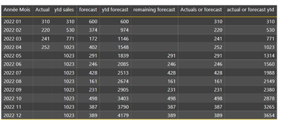
I understand both your logic on how to get the actuals / forecast per month (based on YTD period). What I do not understand is how to get the actuals or forecast YTD (last column) as in below table from @Anonymous
- Mark as New
- Bookmark
- Subscribe
- Mute
- Subscribe to RSS Feed
- Permalink
- Report Inappropriate Content
Hi again YBZ
I have updated my example with the solution
Click here to download my solution
I have added this DAX measure to get the YTD Trend
and added lots of comments so you can learn DAX.
I prefer to teach on this furum rather than just give solutions.
Please click thumbs up and accept as solution button. Thank you ! 😎
You will still need these measures ....
- Mark as New
- Bookmark
- Subscribe
- Mute
- Subscribe to RSS Feed
- Permalink
- Report Inappropriate Content
thanks a lot, I copied it to my data source and it is working!
- Mark as New
- Bookmark
- Subscribe
- Mute
- Subscribe to RSS Feed
- Permalink
- Report Inappropriate Content
Thank you.
- Mark as New
- Bookmark
- Subscribe
- Mute
- Subscribe to RSS Feed
- Permalink
- Report Inappropriate Content
I continue on this project and i made this
- Mark as New
- Bookmark
- Subscribe
- Mute
- Subscribe to RSS Feed
- Permalink
- Report Inappropriate Content
Hi
Try this
Helpful resources

Power BI Monthly Update - November 2025
Check out the November 2025 Power BI update to learn about new features.

Fabric Data Days
Advance your Data & AI career with 50 days of live learning, contests, hands-on challenges, study groups & certifications and more!


