Become a Certified Power BI Data Analyst!
Join us for an expert-led overview of the tools and concepts you'll need to pass exam PL-300. The first session starts on June 11th. See you there!
Get registered- Power BI forums
- Get Help with Power BI
- Desktop
- Service
- Report Server
- Power Query
- Mobile Apps
- Developer
- DAX Commands and Tips
- Custom Visuals Development Discussion
- Health and Life Sciences
- Power BI Spanish forums
- Translated Spanish Desktop
- Training and Consulting
- Instructor Led Training
- Dashboard in a Day for Women, by Women
- Galleries
- Webinars and Video Gallery
- Data Stories Gallery
- Themes Gallery
- Contests Gallery
- Quick Measures Gallery
- Notebook Gallery
- Translytical Task Flow Gallery
- R Script Showcase
- Ideas
- Custom Visuals Ideas (read-only)
- Issues
- Issues
- Events
- Upcoming Events
Power BI is turning 10! Let’s celebrate together with dataviz contests, interactive sessions, and giveaways. Register now.
- Power BI forums
- Forums
- Get Help with Power BI
- Desktop
- Re: X Axis - Date in X Axis - Removal of AM PM gra...
- Subscribe to RSS Feed
- Mark Topic as New
- Mark Topic as Read
- Float this Topic for Current User
- Bookmark
- Subscribe
- Printer Friendly Page
- Mark as New
- Bookmark
- Subscribe
- Mute
- Subscribe to RSS Feed
- Permalink
- Report Inappropriate Content
X Axis - Date in X Axis - Removal of AM PM granularity
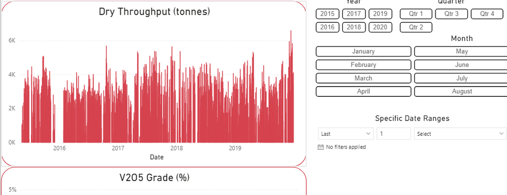
right now, i have a bar graph with a date (mmmmm dd yyyy) in the x axis, going back to January 1, 2015.
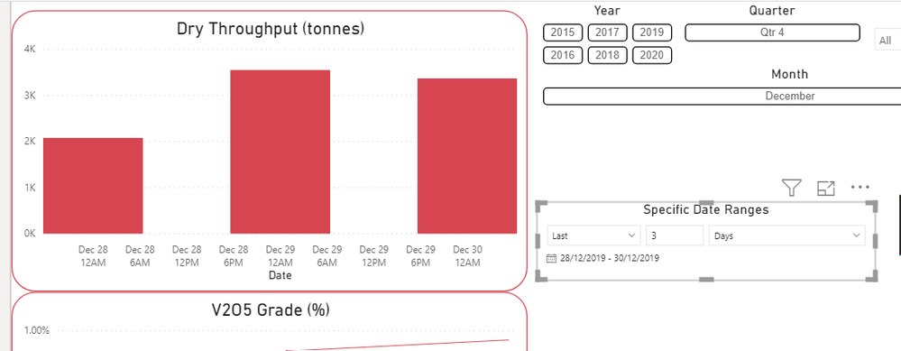
I have a number of filters set, with relative filtering as well. when i filter the graph to only show any 2 or 3 days (since Jan 1, 2015), the x axis shows the day i chose but also 12 am 6pm 12pm, etc.
How can I remove this?
Note: right now I do not have the Date Heirarchy in the x axis, simply date. I do not wish to use a date heirarchy, as right now the x axis adjusts its units (years, quarter, months, etc.) based on the whats filtered (ie. show quarters if filtering 1 year only; show months if filtering 2 quarters only)
thanks,
- Mark as New
- Bookmark
- Subscribe
- Mute
- Subscribe to RSS Feed
- Permalink
- Report Inappropriate Content
In the Format section of the Visualizations pane, expand the X axis card and change the Type option from Continuous to Categorical.
If this post helps, then please consider Accept it as the solution to help the other members find it more quickly.
- Mark as New
- Bookmark
- Subscribe
- Mute
- Subscribe to RSS Feed
- Permalink
- Report Inappropriate Content
- Mark as New
- Bookmark
- Subscribe
- Mute
- Subscribe to RSS Feed
- Permalink
- Report Inappropriate Content
The information you have provided is not making the problem clear to me. Can you please explain with an example. If possible please share a sample pbix file after removing sensitive information.
Thanks.
My Recent Blog -
https://community.powerbi.com/t5/Community-Blog/Winner-Topper-on-Map-How-to-Color-States-on-a-Map-wi...
https://community.powerbi.com/t5/Community-Blog/HR-Analytics-Active-Employee-Hire-and-Termination-tr...
- Mark as New
- Bookmark
- Subscribe
- Mute
- Subscribe to RSS Feed
- Permalink
- Report Inappropriate Content
There is too much confidential information so i will share a screenshot. See the "without filtering" and "with filtering" screen shots. How do I get rid of the 12pm and 6pm on the x axis in the "with filtering" screen shot?
Again, I do not have a date heirarchy because I wish the x axis to remain responsive and as is like in the "without filtering" screenshot.
- Mark as New
- Bookmark
- Subscribe
- Mute
- Subscribe to RSS Feed
- Permalink
- Report Inappropriate Content
does anyone have a solution?
or am i not expaining this adequatly?
Helpful resources
| User | Count |
|---|---|
| 85 | |
| 78 | |
| 70 | |
| 49 | |
| 41 |
| User | Count |
|---|---|
| 111 | |
| 56 | |
| 50 | |
| 42 | |
| 40 |


