FabCon is coming to Atlanta
Join us at FabCon Atlanta from March 16 - 20, 2026, for the ultimate Fabric, Power BI, AI and SQL community-led event. Save $200 with code FABCOMM.
Register now!- Power BI forums
- Get Help with Power BI
- Desktop
- Service
- Report Server
- Power Query
- Mobile Apps
- Developer
- DAX Commands and Tips
- Custom Visuals Development Discussion
- Health and Life Sciences
- Power BI Spanish forums
- Translated Spanish Desktop
- Training and Consulting
- Instructor Led Training
- Dashboard in a Day for Women, by Women
- Galleries
- Data Stories Gallery
- Themes Gallery
- Contests Gallery
- QuickViz Gallery
- Quick Measures Gallery
- Visual Calculations Gallery
- Notebook Gallery
- Translytical Task Flow Gallery
- TMDL Gallery
- R Script Showcase
- Webinars and Video Gallery
- Ideas
- Custom Visuals Ideas (read-only)
- Issues
- Issues
- Events
- Upcoming Events
The Power BI Data Visualization World Championships is back! Get ahead of the game and start preparing now! Learn more
- Power BI forums
- Forums
- Get Help with Power BI
- Desktop
- Re: X-Axis Date Format Changes after Publishing
- Subscribe to RSS Feed
- Mark Topic as New
- Mark Topic as Read
- Float this Topic for Current User
- Bookmark
- Subscribe
- Printer Friendly Page
- Mark as New
- Bookmark
- Subscribe
- Mute
- Subscribe to RSS Feed
- Permalink
- Report Inappropriate Content
X-Axis Date Format Changes after Publishing
Hello experts,
I am hoping to get some help with a problem where my x-axis in the desktop version of my report is not matching the published version.
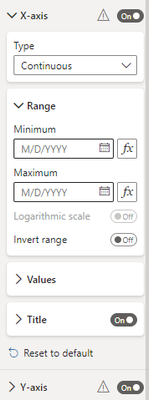
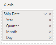
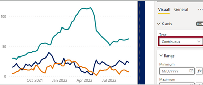
In my desktop version I have a continuous type x-axis, showing a hierarical date:
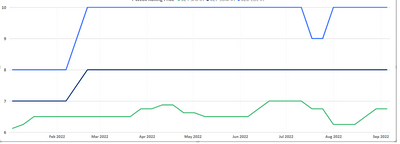
Which shows with nice sparse labels:
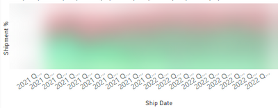
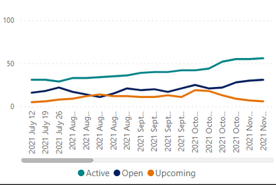
However when I publish it, it seems the settings change to categorical and make the x-axis unreadable:
I am suspecting this is a recent global bug, because I have not changed this visual and been publishing it for the last 12 months without issue.
Thanks in advance!
Solved! Go to Solution.
- Mark as New
- Bookmark
- Subscribe
- Mute
- Subscribe to RSS Feed
- Permalink
- Report Inappropriate Content
Hi @Jrmar ,
I have submitted your issue to ICM , the ID is 336190051 . I'll be back with an update if there's any progress .
Best regards,
Community Support Team Selina zhu
If this post helps, then please consider Accept it as the solution to help the other members find it more quickly
- Mark as New
- Bookmark
- Subscribe
- Mute
- Subscribe to RSS Feed
- Permalink
- Report Inappropriate Content
Thank you for this Selina! Is there any update/timeline for the fix?
- Mark as New
- Bookmark
- Subscribe
- Mute
- Subscribe to RSS Feed
- Permalink
- Report Inappropriate Content
Same issue. The only way to fix the date format was to change the date hierarchy into a regular date.
- Mark as New
- Bookmark
- Subscribe
- Mute
- Subscribe to RSS Feed
- Permalink
- Report Inappropriate Content
Facing the same issue.
The labels of the x-axis change after publishing the App, from "Continous" to "Categorical".
Before:
After:
I can't seem to change it back to continous on app.powerbi.com either.
Thanks
- Mark as New
- Bookmark
- Subscribe
- Mute
- Subscribe to RSS Feed
- Permalink
- Report Inappropriate Content
I am experiencing the same issue. This is what it looks like in my desktop version before I publish.
Once I publish, it looks like this:
It doesn't make any sense. I have been publishing this report for month and not changed any settings. Why isn't it working? The continuous x-axis seems to have some sort of bug.
- Mark as New
- Bookmark
- Subscribe
- Mute
- Subscribe to RSS Feed
- Permalink
- Report Inappropriate Content
Yup looks like the same issue - I have not had a resolution on my end yet.
- Mark as New
- Bookmark
- Subscribe
- Mute
- Subscribe to RSS Feed
- Permalink
- Report Inappropriate Content
Any resolution to this? I am experiencing the same issue. Been publishing the same report for 8 months now, where I have a graph using the "continuous" x-axis type, but suddenly starting today, my published version is changing the axis to categorical.
- Mark as New
- Bookmark
- Subscribe
- Mute
- Subscribe to RSS Feed
- Permalink
- Report Inappropriate Content
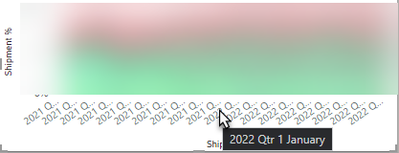
it looks like in your visual in the service you have the hierarchy expanded with the quarter in it, but the visual above only shows the month. You probably need to drill down another level.
If I took the time to answer your question and I came up with a solution, please mark my post as a solution and /or give kudos freely for the effort 🙂 Thank you!
Proud to be a Super User!
- Mark as New
- Bookmark
- Subscribe
- Mute
- Subscribe to RSS Feed
- Permalink
- Report Inappropriate Content
Thank you so much for the response!
The drill down in the visual is drilled down to the month level, and technically showing the data correctly at the month level, just displaying the label improperly.
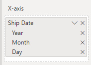
If I take quarter out of my hierarchy
It looks a little better:
but still is not matching what I had in the desktop version.
Helpful resources

Power BI Dataviz World Championships
The Power BI Data Visualization World Championships is back! Get ahead of the game and start preparing now!

| User | Count |
|---|---|
| 38 | |
| 38 | |
| 36 | |
| 28 | |
| 28 |
| User | Count |
|---|---|
| 124 | |
| 88 | |
| 74 | |
| 66 | |
| 65 |
