FabCon is coming to Atlanta
Join us at FabCon Atlanta from March 16 - 20, 2026, for the ultimate Fabric, Power BI, AI and SQL community-led event. Save $200 with code FABCOMM.
Register now!- Power BI forums
- Get Help with Power BI
- Desktop
- Service
- Report Server
- Power Query
- Mobile Apps
- Developer
- DAX Commands and Tips
- Custom Visuals Development Discussion
- Health and Life Sciences
- Power BI Spanish forums
- Translated Spanish Desktop
- Training and Consulting
- Instructor Led Training
- Dashboard in a Day for Women, by Women
- Galleries
- Data Stories Gallery
- Themes Gallery
- Contests Gallery
- QuickViz Gallery
- Quick Measures Gallery
- Visual Calculations Gallery
- Notebook Gallery
- Translytical Task Flow Gallery
- TMDL Gallery
- R Script Showcase
- Webinars and Video Gallery
- Ideas
- Custom Visuals Ideas (read-only)
- Issues
- Issues
- Events
- Upcoming Events
The Power BI Data Visualization World Championships is back! Get ahead of the game and start preparing now! Learn more
- Power BI forums
- Forums
- Get Help with Power BI
- Desktop
- Re: X-Axis Bar Chart Groupings
- Subscribe to RSS Feed
- Mark Topic as New
- Mark Topic as Read
- Float this Topic for Current User
- Bookmark
- Subscribe
- Printer Friendly Page
- Mark as New
- Bookmark
- Subscribe
- Mute
- Subscribe to RSS Feed
- Permalink
- Report Inappropriate Content
X-Axis Bar Chart Groupings
Hi Community!
I have a table of data similar to the below:
Name Speed Agility Purpose
John 4 3 2
John's Manager 3 2 3
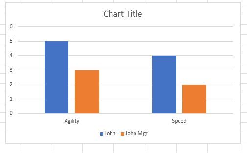
In excel, the layout of this data would allow for a simple barchart where the X-axis is Speed, Agility, Purpose... and the bars for Speed, for example, would be side-by-side for easy visual comparison of differences in scores - even if the names were the fields and the scores, the rows. Excel does the below with either layout.
For the life of me, I cannot figure how to do this in PBI.... Do I need to pivot my data in PQ in some way to achieve this?
I just want to see John's self rating for Speed next to his manager's rating, then John's rating for Agilty next to his manager's rating for Agility and so on... Is this possible with my data layout as it is in my table?
Thank you!
Solved! Go to Solution.
- Mark as New
- Bookmark
- Subscribe
- Mute
- Subscribe to RSS Feed
- Permalink
- Report Inappropriate Content
Hi, @samdep
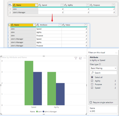
Yes, you need to unpivot the columns. But for what you mentioned above, I would recommend to unpivot all three fields( Speed,Agility,Purpose), and then filter the fields you want to compare.
Result:
Best Regards,
Community Support Team _ Zeon Zheng
If this post helps, then please consider Accept it as the solution to help the other members find it more quickly.
- Mark as New
- Bookmark
- Subscribe
- Mute
- Subscribe to RSS Feed
- Permalink
- Report Inappropriate Content
This is very helpful, thank you!
- Mark as New
- Bookmark
- Subscribe
- Mute
- Subscribe to RSS Feed
- Permalink
- Report Inappropriate Content
Figured it out. If anyone stumbles on this and is looking for an answer, I unpivoted my data in PQ and the field (Agility, Speed) became rows and from there, I was able to group by row and compare the same data point for two users side-by-side.
Helpful resources

Power BI Dataviz World Championships
The Power BI Data Visualization World Championships is back! Get ahead of the game and start preparing now!

| User | Count |
|---|---|
| 41 | |
| 38 | |
| 36 | |
| 31 | |
| 28 |
| User | Count |
|---|---|
| 129 | |
| 88 | |
| 79 | |
| 68 | |
| 63 |


