FabCon is coming to Atlanta
Join us at FabCon Atlanta from March 16 - 20, 2026, for the ultimate Fabric, Power BI, AI and SQL community-led event. Save $200 with code FABCOMM.
Register now!- Power BI forums
- Get Help with Power BI
- Desktop
- Service
- Report Server
- Power Query
- Mobile Apps
- Developer
- DAX Commands and Tips
- Custom Visuals Development Discussion
- Health and Life Sciences
- Power BI Spanish forums
- Translated Spanish Desktop
- Training and Consulting
- Instructor Led Training
- Dashboard in a Day for Women, by Women
- Galleries
- Data Stories Gallery
- Themes Gallery
- Contests Gallery
- QuickViz Gallery
- Quick Measures Gallery
- Visual Calculations Gallery
- Notebook Gallery
- Translytical Task Flow Gallery
- TMDL Gallery
- R Script Showcase
- Webinars and Video Gallery
- Ideas
- Custom Visuals Ideas (read-only)
- Issues
- Issues
- Events
- Upcoming Events
The Power BI Data Visualization World Championships is back! Get ahead of the game and start preparing now! Learn more
- Power BI forums
- Forums
- Get Help with Power BI
- Desktop
- Work around multiple datatypes calculation in Powe...
- Subscribe to RSS Feed
- Mark Topic as New
- Mark Topic as Read
- Float this Topic for Current User
- Bookmark
- Subscribe
- Printer Friendly Page
- Mark as New
- Bookmark
- Subscribe
- Mute
- Subscribe to RSS Feed
- Permalink
- Report Inappropriate Content
Work around multiple datatypes calculation in Power BI
I am new to power bi.
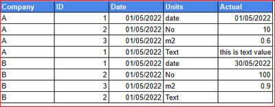
Please below table:
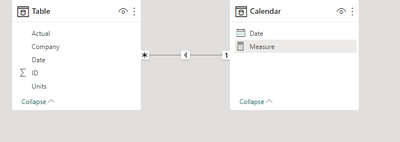
my data model relationship is datetable is linked with the above table by Date.
I want to create a line chart base on the Actual column. However, there are different datatype.
How can I achieve this for example,
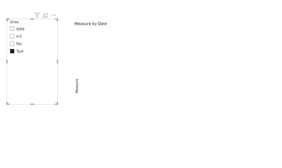
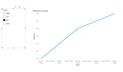
when i click on units "No", the chart should shiw line chart base on unit "No" on y-axis and date on the x-axis. the same applies to units "date" but with units "Text" is should be blank
Solved! Go to Solution.
- Mark as New
- Bookmark
- Subscribe
- Mute
- Subscribe to RSS Feed
- Permalink
- Report Inappropriate Content
Hi , @timEalll
According to your description, you want to "when i click on units "No", the chart should shiw line chart base on unit "No" on y-axis and date on the x-axis. the same applies to units "date" but with units "Text" is should be blank".
Here are the steps you can refer to :
(1)This is my test data:
(2)We can create a measure like this:
Measure = var _slicer = SELECTEDVALUE('Table'[Units])
return
IF(_slicer ="Text", BLANK() , IF( _slicer ="date" , COUNTROWS('Table') , SUMX('Table' , VALUE('Table'[Actual]))))
Then we can put the measure on the visual and the result is as follows:
If this method does not meet your needs, you can provide us with your special sample data and the desired output sample data in the form of tables, so that we can better help you solve the problem. (You can also upload you sample .pbix [without sensitive data] to the OneDrive and share with the OneDrive link to me ! )
Thank you for your time and sharing, and thank you for your support and understanding of PowerBI!
Best Regards,
Aniya Zhang
If this post helps, then please consider Accept it as the solution to help the other members find it more quickly
Helpful resources

Power BI Dataviz World Championships
The Power BI Data Visualization World Championships is back! Get ahead of the game and start preparing now!

Power BI Monthly Update - November 2025
Check out the November 2025 Power BI update to learn about new features.

| User | Count |
|---|---|
| 66 | |
| 46 | |
| 42 | |
| 26 | |
| 19 |
| User | Count |
|---|---|
| 196 | |
| 127 | |
| 102 | |
| 67 | |
| 49 |


