FabCon is coming to Atlanta
Join us at FabCon Atlanta from March 16 - 20, 2026, for the ultimate Fabric, Power BI, AI and SQL community-led event. Save $200 with code FABCOMM.
Register now!- Power BI forums
- Get Help with Power BI
- Desktop
- Service
- Report Server
- Power Query
- Mobile Apps
- Developer
- DAX Commands and Tips
- Custom Visuals Development Discussion
- Health and Life Sciences
- Power BI Spanish forums
- Translated Spanish Desktop
- Training and Consulting
- Instructor Led Training
- Dashboard in a Day for Women, by Women
- Galleries
- Data Stories Gallery
- Themes Gallery
- Contests Gallery
- Quick Measures Gallery
- Notebook Gallery
- Translytical Task Flow Gallery
- TMDL Gallery
- R Script Showcase
- Webinars and Video Gallery
- Ideas
- Custom Visuals Ideas (read-only)
- Issues
- Issues
- Events
- Upcoming Events
Calling all Data Engineers! Fabric Data Engineer (Exam DP-700) live sessions are back! Starting October 16th. Sign up.
- Power BI forums
- Forums
- Get Help with Power BI
- Desktop
- Re: Where are the values on chart? Values not show...
- Subscribe to RSS Feed
- Mark Topic as New
- Mark Topic as Read
- Float this Topic for Current User
- Bookmark
- Subscribe
- Printer Friendly Page
- Mark as New
- Bookmark
- Subscribe
- Mute
- Subscribe to RSS Feed
- Permalink
- Report Inappropriate Content
Where are the values on chart? Values not showing up on chart
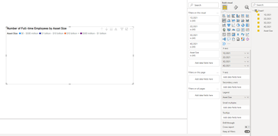
I am new here and need help. There is no values section on my visualization pane. How do I get values to be added to my chart? It's empty. I want a line with numbers or something.
It's a very small dataset. I am trying to create a simple line graph with quarters on the x axis and asset size on the y axis with the values being plotted. What do I do?
Solved! Go to Solution.
- Mark as New
- Bookmark
- Subscribe
- Mute
- Subscribe to RSS Feed
- Permalink
- Report Inappropriate Content
Hi @dandreas ,
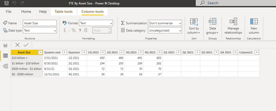
It is suggested to unpivot the 1Q 2021 column, the 2Q 2021 column, the 3Q 2021 column and the 4Q 2021 column.
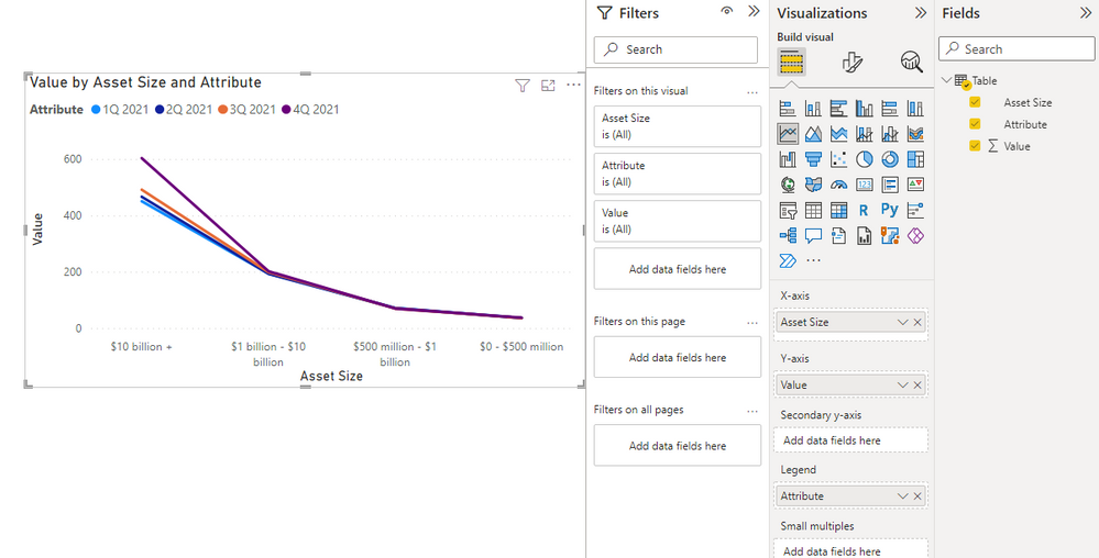
After unpivoting, you'll get the following.
The line chart:
You can check more details from my attachment.
Best Regards,
Stephen Tao
If this post helps, then please consider Accept it as the solution to help the other members find it more quickly.
- Mark as New
- Bookmark
- Subscribe
- Mute
- Subscribe to RSS Feed
- Permalink
- Report Inappropriate Content
I searched for the answer to how to not default to Count and it says change to don't summarize which I did already and it still defaults to Count. What do I do?
- Mark as New
- Bookmark
- Subscribe
- Mute
- Subscribe to RSS Feed
- Permalink
- Report Inappropriate Content
Hi @dandreas
It might be a little quicker for you send over the PBIX file and then I can help make the changes and explain the steps I took to get the result you are looking for. Would this be possible?
If so please make sure you are not sending any sensitive data over.
- Mark as New
- Bookmark
- Subscribe
- Mute
- Subscribe to RSS Feed
- Permalink
- Report Inappropriate Content
Sorry, I am not able to upload it. Any suggestions?
- Mark as New
- Bookmark
- Subscribe
- Mute
- Subscribe to RSS Feed
- Permalink
- Report Inappropriate Content
Hi @dandreas
I would suggest uploading it to DropBox or Google Drive, then you can paste the link here.
- Mark as New
- Bookmark
- Subscribe
- Mute
- Subscribe to RSS Feed
- Permalink
- Report Inappropriate Content
Which column should I bring in? I am trying to create a simple line graph with quarters on the x axis and asset size on the y axis with the values being plotted. When I bring something in the y-axis as you suggest, it defaults to Count and does not let me change it. Also, I can only bring in one column/measure when I want to bring in each asset size category. What do I do?
- Mark as New
- Bookmark
- Subscribe
- Mute
- Subscribe to RSS Feed
- Permalink
- Report Inappropriate Content
You need to bring in some column/measure into your y- axis for area charts.


