FabCon is coming to Atlanta
Join us at FabCon Atlanta from March 16 - 20, 2026, for the ultimate Fabric, Power BI, AI and SQL community-led event. Save $200 with code FABCOMM.
Register now!- Power BI forums
- Get Help with Power BI
- Desktop
- Service
- Report Server
- Power Query
- Mobile Apps
- Developer
- DAX Commands and Tips
- Custom Visuals Development Discussion
- Health and Life Sciences
- Power BI Spanish forums
- Translated Spanish Desktop
- Training and Consulting
- Instructor Led Training
- Dashboard in a Day for Women, by Women
- Galleries
- Data Stories Gallery
- Themes Gallery
- Contests Gallery
- QuickViz Gallery
- Quick Measures Gallery
- Visual Calculations Gallery
- Notebook Gallery
- Translytical Task Flow Gallery
- TMDL Gallery
- R Script Showcase
- Webinars and Video Gallery
- Ideas
- Custom Visuals Ideas (read-only)
- Issues
- Issues
- Events
- Upcoming Events
Get Fabric Certified for FREE during Fabric Data Days. Don't miss your chance! Request now
- Power BI forums
- Forums
- Get Help with Power BI
- Desktop
- What is the DAX expression equivalent to drag and ...
- Subscribe to RSS Feed
- Mark Topic as New
- Mark Topic as Read
- Float this Topic for Current User
- Bookmark
- Subscribe
- Printer Friendly Page
- Mark as New
- Bookmark
- Subscribe
- Mute
- Subscribe to RSS Feed
- Permalink
- Report Inappropriate Content
What is the DAX expression equivalent to drag and drop in Power BI?
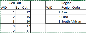
Hi all, I have a question. Suppose we have 2 table like this with Relationship (1 to Many) by WID from Region to Sell Out
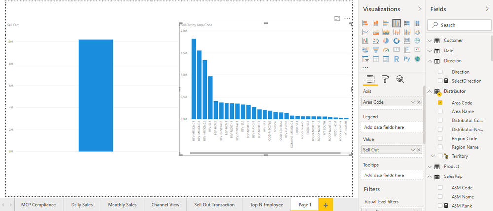
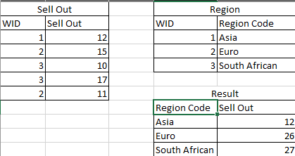
Normally, if we want to visualize the Sell Out by Region Code, we just need to drag the Sell Out into Value, Region Code as Axis. But what is the equivalent DAX function for this action? Sum then summarize? Please help me
Solved! Go to Solution.
- Mark as New
- Bookmark
- Subscribe
- Mute
- Subscribe to RSS Feed
- Permalink
- Report Inappropriate Content
Hi @Anonymous ,
Your demand is a good idea, while it is not supported to implement in Power BI currently. You can post your new idea here https://ideas.powerbi.com/forums/265200-power-bi-ideas , to improve the Power BI.
It is a place for customers provide feedback about Microsoft Office products . What’s more, if a feedback is high voted there by other customers, it will be promising that Microsoft Product Team will take it into consideration when designing the next version in the future.
Best Regards,
Amy
If this post helps, then please consider Accept it as the solution to help the other members find it more quickly.
- Mark as New
- Bookmark
- Subscribe
- Mute
- Subscribe to RSS Feed
- Permalink
- Report Inappropriate Content
Hi @Anonymous ,
Does that make sense? If so, kindly mark my answer as a solution to help others having the similar issue and close the case. If not, let me know and I'll try to help you further.
Best regards
Amy
- Mark as New
- Bookmark
- Subscribe
- Mute
- Subscribe to RSS Feed
- Permalink
- Report Inappropriate Content
I was asking these question because I want to implemented them on a different problem.
Dynamic X axis chart. Imagine with the same metric, you can drag or write some dynamic function to change the axis in presentation.
But seems as the current time there is no solution to that.
- Mark as New
- Bookmark
- Subscribe
- Mute
- Subscribe to RSS Feed
- Permalink
- Report Inappropriate Content
Hi @Anonymous ,
Your demand is a good idea, while it is not supported to implement in Power BI currently. You can post your new idea here https://ideas.powerbi.com/forums/265200-power-bi-ideas , to improve the Power BI.
It is a place for customers provide feedback about Microsoft Office products . What’s more, if a feedback is high voted there by other customers, it will be promising that Microsoft Product Team will take it into consideration when designing the next version in the future.
Best Regards,
Amy
If this post helps, then please consider Accept it as the solution to help the other members find it more quickly.
- Mark as New
- Bookmark
- Subscribe
- Mute
- Subscribe to RSS Feed
- Permalink
- Report Inappropriate Content
It is simply
=SUM(‘sell out’[sell out])
* Matt is an 8 times Microsoft MVP (Power BI) and author of the Power BI Book Supercharge Power BI.
I will not give you bad advice, even if you unknowingly ask for it.
- Mark as New
- Bookmark
- Subscribe
- Mute
- Subscribe to RSS Feed
- Permalink
- Report Inappropriate Content
Sum just give you a scalar number as result, How can I show the result to be grouped by region, without choosing the axis.
@MattAllington wrote:It is simply
=SUM(‘sell out’[sell out])
- Mark as New
- Bookmark
- Subscribe
- Mute
- Subscribe to RSS Feed
- Permalink
- Report Inappropriate Content
Hi @Anonymous ,
You can create measure or column like DAX below in table Region .
Measure1 = CALCULATE(SUM('Sell Out'[Sell Out]),FILTER(ALLSELECTED(Region), Region[Region Code] =MAX(Region[Region Code])))
Column1 = CALCULATE(SUM('Sell Out'[Sell Out]),FILTER(ALLSELECTED(Region), Region[Region Code] =EARLIER(Region[Region Code])))
Best Regards,
Amy
If this post helps, then please consider Accept it as the solution to help the other members find it more quickly.
Helpful resources

Power BI Monthly Update - November 2025
Check out the November 2025 Power BI update to learn about new features.

Fabric Data Days
Advance your Data & AI career with 50 days of live learning, contests, hands-on challenges, study groups & certifications and more!


